Recommended resources
The freely available resources this lesson will direct you to.
Hello! This course builds a stock-analysis workflow around the chart principles associated with John Murphy: establish the larger trend, examine the shorter-term structure, and use volume and other evidence to test what price appears to be saying. We begin with the workspace. A useful analysis depends on comparing the same stock across timeframes, with price history and volume displayed consistently.
By the end of this lesson, you should have a TradingView layout for an NSE-listed stock with a weekly chart, a daily chart, an explicit price-adjustment setting, and volume on both charts. Allow about 40 minutes, including time to build and check the layout.
Start with the right instrument
A ticker alone is not enough to identify a chart. Search results can include similarly named securities, another exchange’s listing, an index, or a derivative. For this workspace, choose the NSE cash-market stock listing and check the instrument description and exchange before studying its price.
TradingView Symbol Search: tips for finding assets — TradingView
Read TradingView’s guide to distinguish a company’s name from the exchange-specific symbol you need to chart.
In “What are symbols,” read the exchange example. In “How to access Symbol Search,” read how to open search. Then continue below the search examples to the paragraph beginning “To make sure you find the desired symbol”; read the filter guidance. Focus on checking both the stock asset type and the NSE exchange or data source.
Open TradingView’s chart and search for an NSE-listed stock you want to follow. Where available, narrow the results to Stocks and NSE. Select the cash equity rather than a similarly named futures contract or index. The symbol header on the finished chart should make the company and exchange unambiguous. A stock such as NSE:INFY can serve as a workspace example; selecting it here is not a trading recommendation.
Give each timeframe a separate job
For position analysis, a weekly candle gathers one trading week’s price action into a single bar. It helps you see the broader movement without every daily fluctuation competing for attention. A daily candle shows one trading day and lets you inspect the more detailed swings within that broader picture. Keeping the two visible together makes it easier to avoid mistaking a short daily move for a change in the longer-term picture. We will learn to classify those trends in a later lesson; for now, the goal is a reliable comparison.
TradingView’s multi-chart menu offers a side-by-side arrangement. The interface image below shows the layout control at the upper right and the synchronization choices beneath the arrangements. Its example is a US stock; use an NSE listing in your own layout.
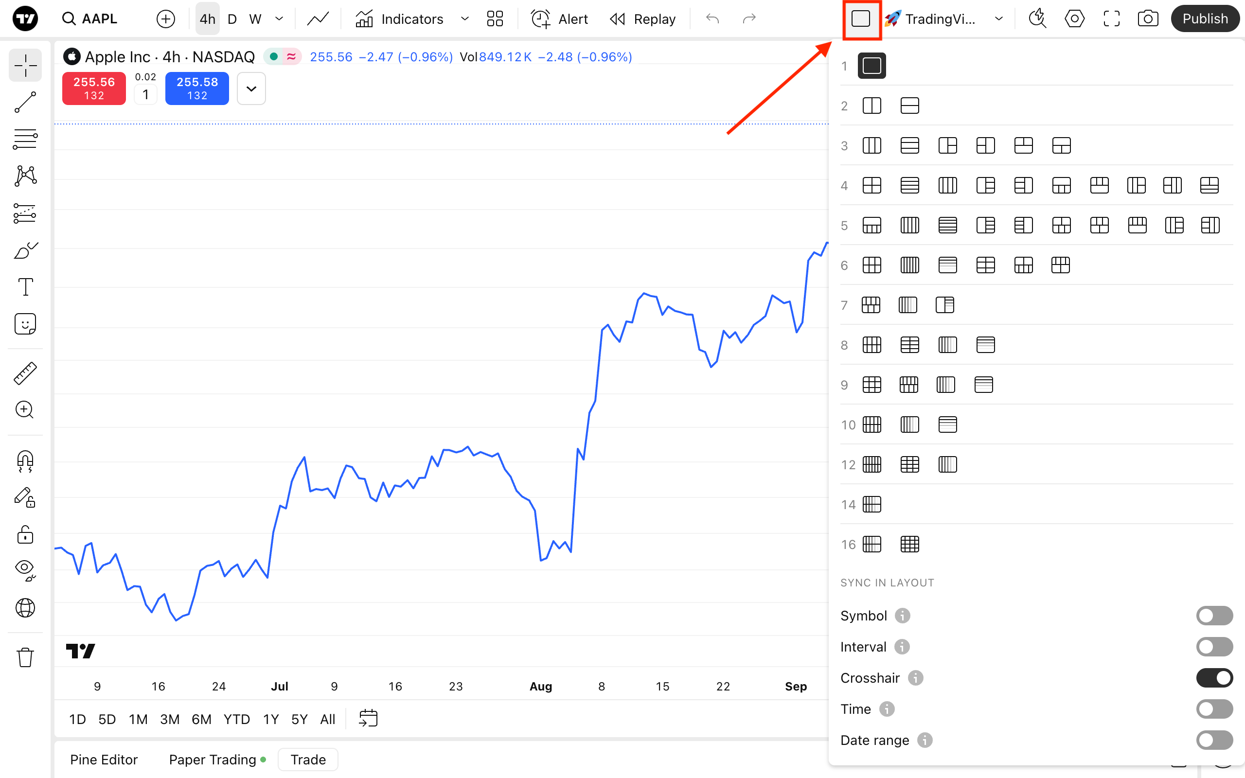
Master The Multiple Chart Layout: Tutorial
Watch TradingView’s “Master The Multiple Chart Layout: Tutorial” for the two-panel controls and, especially, the difference between synchronizing a symbol and synchronizing an interval.
Watch two-chart setup for selecting and resizing adjacent charts. In the synchronization demonstration, interval syncing shows why linking intervals would defeat a weekly/daily pair; symbol syncing introduces the control that can keep both charts on one stock. Finally, different timeframes shows the same multi-timeframe idea with other intervals. Substitute weekly and daily intervals for this lesson’s position-analysis layout.
Set up the workspace as follows:
- Choose a two-chart, side-by-side layout. Widen a panel if its candles or volume are difficult to read.
- Put the same NSE cash-stock symbol in both panels. Select the left panel and set its interval to 1W (weekly); select the right panel and set it to 1D (daily). Check each panel’s symbol header after changing it.
- In the layout synchronization menu, keep Interval sync off. Otherwise, changing one panel to weekly may change the other to weekly too. You may turn Symbol sync on so that changing stocks updates both panels together. If you prefer to change symbols manually, leave it off—but verify both headers each time.
- Keep enough history visible to judge each chart at its intended scale: roughly a few years on the weekly panel and several months to a year on the daily panel is a practical starting point. You can zoom and refine this later.
TradingView may copy indicators from the initial chart when you create another panel, but do not assume it copies every chart-specific setting. Inspect both panels separately. If your account or device does not offer a two-chart layout, save a single-chart workspace and switch between 1W and 1D on the same NSE symbol; you can still perform the comparison, though not simultaneously.
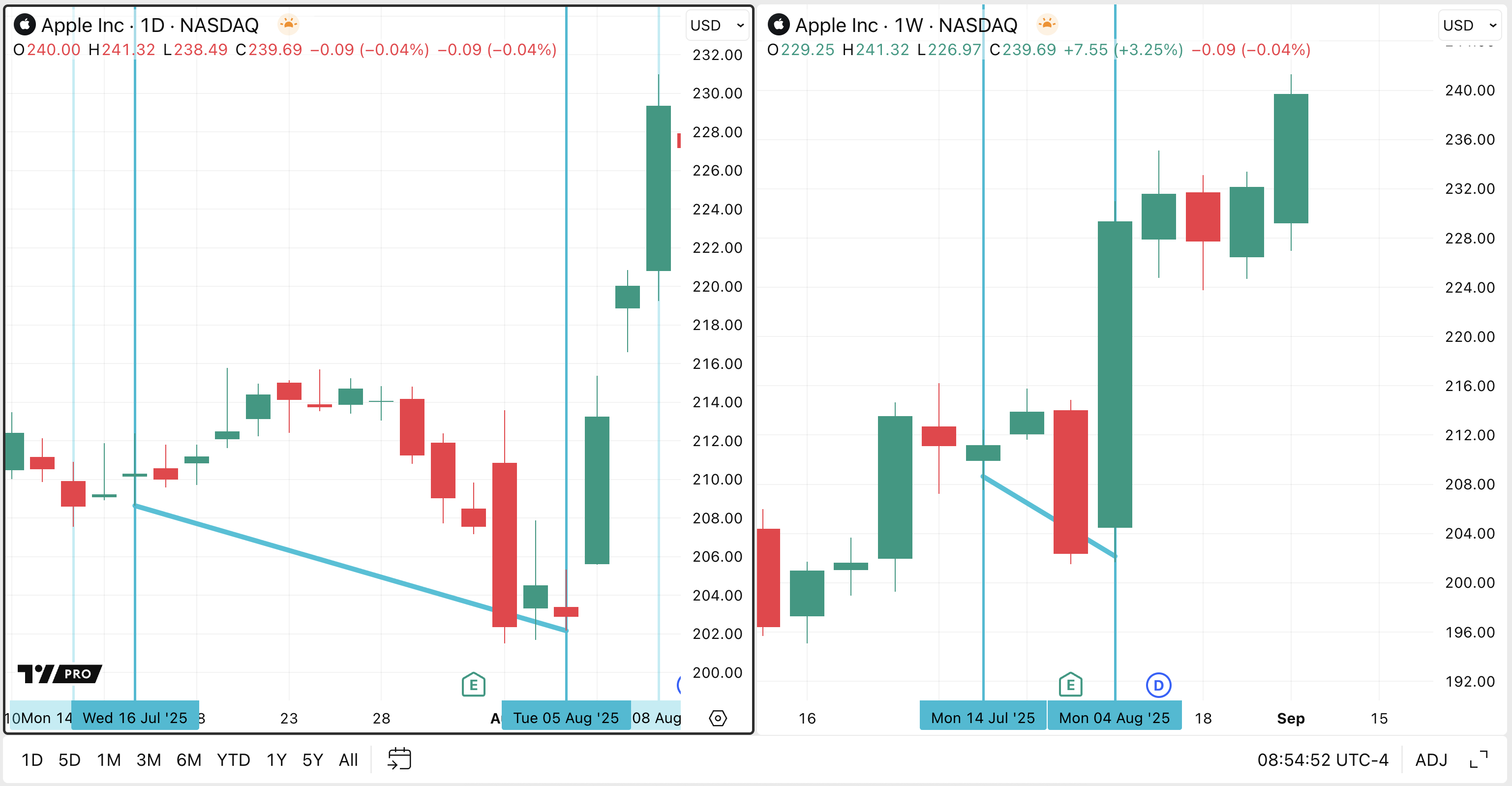
The image below shows what the finished timeframe pairing looks like. It is an interface illustration, not an NSE stock example.
Decide what “adjusted price” means on your charts
Corporate actions can make historical prices difficult to compare with current ones. A share split, for example, changes the price per share without creating an equivalent loss in the value of a holding. Split-adjusted history puts older prices on a comparable per-share basis. A dividend adjustment, where available, changes historical plotted prices to account for dividends; it is a different choice from split adjustment.
For this course’s workspace, use the following explicit convention:
- Check that the displayed history accounts for splits. TradingView’s treatment may depend on the instrument and data feed; inspect the chart’s available adjustment information rather than assuming a toggle exists.
- If “ADJ,” dividend adjustment, or a comparable option is available, enable the same choice on both panels. For a consistent starting layout, turn dividend adjustment on in both panels and note that choice in the layout name or your chart notes. If it is unavailable for the selected NSE listing, record that limitation rather than labeling the data dividend-adjusted.
- Verify the two panels agree. On an overlapping historical date, the weekly chart and daily chart should reflect the same adjustment convention. A chart mixing adjusted and unadjusted history can create an apparent price discrepancy that comes from settings, not market action.
Depending on the current TradingView interface, look for an ADJ control near the chart or for adjustment options in the chart’s Settings, often under symbol-related settings. The exact controls and available adjustments can vary by instrument. Adjusted historical prices are analytical values: an older adjusted price need not be the price at which a share actually traded on that date. That distinction matters when you later interpret historical price levels.
Add volume, then test the finished layout
Price tells you where a stock moved; volume tells you how many shares traded during the chart’s period. On a daily chart, each volume bar belongs to a trading day. On a weekly chart, it belongs to a trading week. The two bars therefore represent different time spans and should not be compared as though they were equal-length observations.
Watch TradingView’s “How to Trade Volume: Tutorial” to add the basic volume indicator and understand what its bars represent on each timeframe.
Watch adding volume for the indicator and its basic meaning. Then watch volume by interval for how the displayed volume changes between daily and weekly charts. You do not need extra volume indicators for this layout.
Use Indicators to add the standard Volume indicator. Confirm that volume bars are visible under price in both panels; if they appeared in only one, select the other panel and add them there. Leave enough vertical space to see both the price candles and volume bars. The basic indicator is sufficient—we will examine what volume confirms, and what it does not, later in the course.
Finish with a short workspace check:
- Both headers show the same company and NSE cash-stock listing.
- One panel says 1W and the other 1D; changing or refreshing a symbol does not make their intervals identical.
- Both charts use the same stated adjustment convention.
- Both show price candles and volume bars.
- The latest weekly candle is understood as unfinished until that trading week closes; during a live session, the latest daily candle is unfinished too.
- Save the layout with a recognizable name, such as NSE Weekly–Daily Volume, if your TradingView account offers layout saving.
Where this leaves you
You now have a repeatable viewing setup: the correct NSE stock on two timeframes, a consistent basis for historical prices, and volume measured at each timeframe. The layout does not issue a buy or sell signal. It gives you trustworthy charts from which to make observations.
In the next lesson, you will compare arithmetic and logarithmic price scales and decide which better represents the move you are examining.