Recommended resources
The freely available resources this lesson will direct you to.
Hello! Let's dive into your next lesson.
In our last session, we explored how to make layouts adaptive using media queries. We focused on a "desktop-down" approach with max-width to adjust a design for smaller screens. This was a great way to understand the mechanics of media queries.
Today, we're going to flip that strategy on its head and learn the modern, standard approach to responsive design: mobile-first. This method aligns perfectly with core UX principles of prioritization and constraint-based design.
This lesson will teach you how to implement a mobile-first design approach by writing CSS for small screens first and progressively enhancing for larger screens. You'll learn the philosophy behind this strategy and the practical steps to build cleaner, more efficient, and better-performing responsive websites.
1. What is Mobile-First? A Shift in Philosophy
In the previous lesson, we started with a desktop layout and "subtracted" or simplified it for smaller screens. This is known as graceful degradation.
The mobile-first approach does the opposite. You start by designing and building for the most constrained environment—the mobile screen—and then progressively enhance the layout as more screen space becomes available.
This isn't just a coding technique; it's a design philosophy that forces you to prioritize what's truly essential.
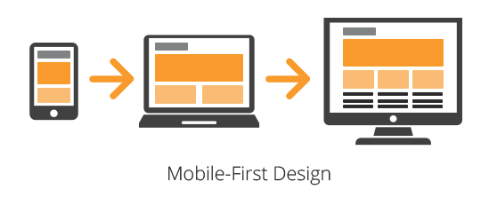
To understand this philosophy, let's look at two resources that frame the concept.
A Hands-On Guide to Mobile-First Responsive Design
This article from UXPin, a tool you might be familiar with, clearly defines the mobile-first approach as a form of 'progressive enhancement' and contrasts it with 'graceful degradation'. It also explains how this naturally leads to a content-first strategy.
Read the sections 'What is Mobile-First Approach?' and 'Mobile-First means Content-First'. Focus on the distinction between progressive enhancement and graceful degradation.
Is Mobile-First Design Still Relevant in 2025?
This video expands on the idea, explaining that mobile-first is about more than just CSS. It's a holistic approach that considers content, design, and performance, all centered on the mobile user experience.
Watch from 00:26 to 03:13. Pay attention to how the speaker connects mobile-first principles to content strategy, thumb-friendly design, and website performance—all key areas in product design.
As you can see, starting with mobile forces you to answer the most important question first: "What is the core purpose and content of this page?" By solving for the tightest constraints first, you ensure the user experience is solid on all devices, rather than treating mobile as an afterthought.
2. The Mobile-First Workflow in CSS
Now let's translate this philosophy into code. The mobile-first workflow changes how we structure our CSS and use media queries.
The Old Way (Desktop-First with max-width):
- Write all styles for the desktop layout.
- Use
@media (max-width: ...)to override or remove styles for smaller screens.
The New Way (Mobile-First with min-width):
- Write base styles for the mobile layout. This code lives outside of any media query.
- Use
@media (min-width: ...)to add or override styles as the screen gets larger.
This article provides a clear, practical guide to structuring your CSS this way.
How to build a mobile first and responsive website
This guide from Oakharbor Web Designs gets straight to the technical details. It explains how to set up your CSS file and why min-width is the key to a clean, mobile-first implementation.
Read the sections 'Structuring your css for mobile first' and 'Setting up your media queries'. The key takeaway is how styles from smaller breakpoints cascade up to larger ones.
Code Example: Mobile-First vs. Desktop-First
Let's revisit a simple two-column layout.
Desktop-First (max-width) Approach:
/* Base styles are for desktop */
.card-container {
  display: grid;
  grid-template-columns: 1fr 1fr;
  gap: 1rem;
}

/* Media query for mobile */
@media (max-width: 768px) {
  .card-container {
    grid-template-columns: 1fr; /* Override for mobile */
  }
}
Mobile-First (min-width) Approach:
/* Base styles are for mobile */
.card-container {
  display: grid;
  grid-template-columns: 1fr;
  gap: 1rem;
}

/* Media query for desktop */
@media (min-width: 768px) {
  .card-container {
    grid-template-columns: 1fr 1fr; /* Add complexity for desktop */
  }
}
Notice how the mobile-first approach feels more additive. You start with a simple base and layer on complexity. This often leads to less CSS and fewer style overrides, making your code easier to maintain.
3. From Design Mockup to Mobile-First Code
As a designer, you often start with a complete vision, perhaps a desktop mockup in Figma. How do you translate that into a mobile-first build?
The process involves mentally deconstructing your desktop design.
- Analyze the Layout: Look at each section of your desktop design.
- Prioritize for Mobile: Identify the essential elements. What's the natural stacking order for these elements in a single column?
- Structure the HTML: Write your HTML to reflect that mobile stacking order. Elements that appear first in the HTML will appear at the top of the mobile view.
This article has an excellent section that walks through this exact thought process.
How to build a mobile first and responsive website
Let's return to the Oakharbor Web Designs article. This section is invaluable as it shows you how to look at a finished desktop design and plan your HTML structure for a mobile-first build.
Read the section 'How to plan your html for mobile first'. Focus on the visual breakdown of the desktop design into containers and how that translates to a natural stacking order for mobile.
Once your HTML is structured for mobile, you can begin styling the mobile view. The following video demonstrates this process, taking a design from Figma and building out the mobile layout in HTML and CSS.
Mobile First Web Design Tutorial
This tutorial by Adrian Twarog shows the practical application of building the mobile view first. He works from a Figma file, a workflow you're very familiar with.
Watch the section on 'Designing Interactive Buttons' from 10:58 to 17:56. You don't need to code along, but observe the process: he creates the HTML for a row of buttons and uses Flexbox to style them for the mobile view. This is the 'base CSS' part of the mobile-first workflow in action.
After building the mobile view as shown in the video, the next step would be to add a min-width media query to rearrange those buttons for a tablet or desktop layout, perhaps by adjusting the flex-direction or container width.
Conclusion
You've now learned the most important strategic approach in modern responsive web development. By embracing a mobile-first mindset, you not only write better code but also create more thoughtful, user-centric products.
Key Takeaways:
- Mobile-first is a strategy of progressive enhancement, starting with a baseline experience for small screens and adding features for larger ones.
- The technical implementation involves writing base CSS for mobile and using
min-widthmedia queries to apply styles for larger screens. - This approach forces content prioritization, which aligns with core UX design principles.
- To start, analyze your desktop design to determine the HTML stacking order for the mobile view.
In our next lesson, we'll dive into making your components feel more alive by styling interactive elements using pseudo-classes like :hover, :focus, and :active. This is a perfect example of progressive enhancement, as you'll often apply effects like :hover only for devices that support it, typically within a media query for larger screens.