Recommended resources
The freely available resources this lesson will direct you to.
- Onboarding Best Practices from 200+ Top Apps!www.youtube.com
- What is User Onboarding? (UX Designer Explains)www.youtube.com
- SaaS Onboarding UX: Best Practices, Mistakes, Examplescieden.com
- 7 User Onboarding Mistakes and How to Avoid Themmedium.com
- 6 user onboarding best practices to boost your activation and retentionwww.youtube.com
- I studied the UX/UI of over 200 onboarding flowsdesignerup.co
Hello! Welcome back.
In our last session, we explored how decision fatigue and choice overload can derail a user journey by overwhelming the user's cognitive capacity. We learned that even a logically structured flow can fail if it presents too many choices, leading to analysis paralysis.
Today, we'll apply this understanding to one of the most critical parts of the user experience: the onboarding flow. This is often a user's first direct interaction with your product, and it's where initial impressions are forged. A weak onboarding flow can cause high drop-off rates before users ever experience the product's core value.
Our learning outcome for this lesson is to pinpoint onboarding flow weaknesses that hinder user activation and engagement. We will deconstruct what makes an onboarding flow effective and build a framework for identifying common failure points.
1. The Purpose and Stakes of Onboarding
Before we can diagnose weaknesses, we must agree on what a successful onboarding flow is meant to achieve. It's much more than a simple sign-up process or a feature tour.
I studied the UX/UI of over 200 onboarding flows
To start, let's establish a clear definition. The article 'I studied the UX/UI of over 200 onboarding flows' from DesignerUp provides a concise explanation of what onboarding is and why it's so critical for retention.
Please read the sections 'Why Onboarding Matters' and 'The Golden Rule of Onboarding'. Focus on the distinction between onboarding and account setup, the retention statistics, and the core principle: 'You can’t onboard someone you do not understand.'
As the article highlights, the goal of onboarding is not to show off features, but to get the user to the result they care about. This is often called the "Aha!" moment—the point where the user first experiences the core value of your product. A weak onboarding flow fails to deliver this moment, leading to user churn.
The first step in crafting a journey to that "Aha!" moment is understanding the user's goals and motivations.
6 user onboarding best practices to boost your activation and retention
This video from Appcues, '6 user onboarding best practices', reinforces the importance of starting with the user journey before designing any onboarding elements.
Watch the sections 'Map out user journey' (00:42 - 01:41) and 'Provide a compelling quick win' (02:53 - 03:45). Notice how understanding the user's desired outcome is directly linked to guiding them to their 'Aha!' moment.
2. A Framework for Diagnosing Onboarding Weaknesses
With the goal of onboarding clearly defined—guiding users to their "Aha!" moment—we can now build a framework for spotting common weaknesses that prevent this from happening. These are the "pathologies" you'll look for when analyzing a flow.
Weakness 1: The "One-Size-Fits-All" Approach
This is perhaps the most common and critical weakness. It ignores the "Golden Rule" we just established. Different users come to a product with different goals, roles, and technical skills. A generic onboarding flow will feel irrelevant to many of them.
A strong onboarding flow often begins by asking the user to self-segment.
Onboarding Best Practices from 200+ Top Apps!
Let's watch a segment from 'Onboarding Best Practices from 200+ Top Apps!' by DesignerUp. It shows how top products like Notion and Fotor use simple questions to create a personalized experience from the very beginning.
Watch the section 'Understanding Users for Effective Onboarding' from 01:21 to 03:18. Pay close attention to how Notion asks about the user's role and use case to tailor the initial workspace.
How to spot this weakness:
- The flow is identical for every user, regardless of their potential goals (e.g., a project management tool that doesn't ask if you're a solo user or part of a large team).
- There are no questions about the user's role, industry, or intent.
- The initial experience is a blank slate, offering no templates or guidance relevant to specific use cases.
Weakness 2: Information Overload and Poor Pacing
This weakness connects directly to our last lesson on decision fatigue. An onboarding flow that bombards the user with too much information, too many steps, or too many decisions will cause cognitive overload and lead to abandonment.
The DesignerUp article you read earlier identifies three common traps related to this.
I studied the UX/UI of over 200 onboarding flows
Let's revisit the DesignerUp article, 'I studied the UX/UI of over 200 onboarding flows', to look at specific examples of information overload.
Read the section 'Common Onboarding Mistakes to Avoid'. Focus on the descriptions of the 'Too Many Steps' Trap, the 'Wall of Text' Problem, and the 'No Escape Room'.
An alternative to a long, front-loaded product tour is an onboarding checklist. This gives the user a sense of control and progress while still guiding them through key activation steps. The ProductFruits article, "Common user onboarding mistakes to avoid," discusses this as a solution to overwhelming product tours.
How to spot this weakness:
- Complex Sign-up: The initial registration form asks for excessive, non-essential information.
- Overlong Product Tours: The flow forces the user through a multi-step tour explaining every single feature before they can interact with the product.
- No "Skip" Option: The user is locked into a rigid onboarding sequence without the ability to explore on their own. This is the "No Escape Room" scenario.
Weakness 3: Misaligned Business Goals and User Value
Sometimes, friction is intentionally introduced to serve a business goal, such as driving subscriptions. When this is done too aggressively or too early, it can alienate users before they understand the product's value. This is a delicate balance, and getting it wrong is a significant weakness.
Onboarding Best Practices from 200+ Top Apps!
The 'Onboarding Best Practices' video provides an excellent comparison of two apps in the same category that handle this differently.
Watch the section 'Aligning Onboarding with Business Model and Strategy' (06:10 - 11:46). Contrast the experience of VSCO, which immediately hits you with a paywall, with Fotor, which allows you to try features and clearly marks what's premium.
How to spot this weakness:
- Premature Paywall: The user is forced to subscribe before they can access or even preview the product's core functionality.
- Unclear Value Proposition: It's not obvious what is free and what is paid, leading to frustrating dead-ends where a user tries to perform an action only to be blocked by a paywall.
- Aggressive Upselling: The flow is littered with pop-ups and prompts to upgrade, distracting from the initial learning experience.
Weakness 4: Lack of Ongoing Support
Onboarding isn't just a one-time event at sign-up. It's a continuous process of helping users discover value over time. A flow that provides no in-app help or feedback mechanisms leaves users stranded after the initial tour.
Common user onboarding mistakes to avoid and how to fix ...
The article 'Common user onboarding mistakes to avoid' from ProductFruits highlights the danger of neglecting feedback and in-app assistance.
Read mistake #4, 'Skip the crucial step of collecting feedback from new users', and mistake #6, 'Neglect the importance of in-app assistance and customer success support'. Focus on the idea that support should be continuous and easily accessible.
How to spot this weakness:
- No Help Center: There is no easily accessible knowledge base, FAQ, or help widget within the app.
- No Proactive Guidance: The app doesn't use tooltips, hints, or contextual guides to help users who might be struggling with a specific feature.
- No Feedback Channels: There are no prompts for feedback (e.g., micro-surveys) to understand where users are getting stuck.
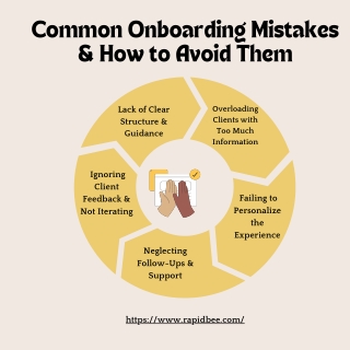
3. Visualizing the Weaknesses
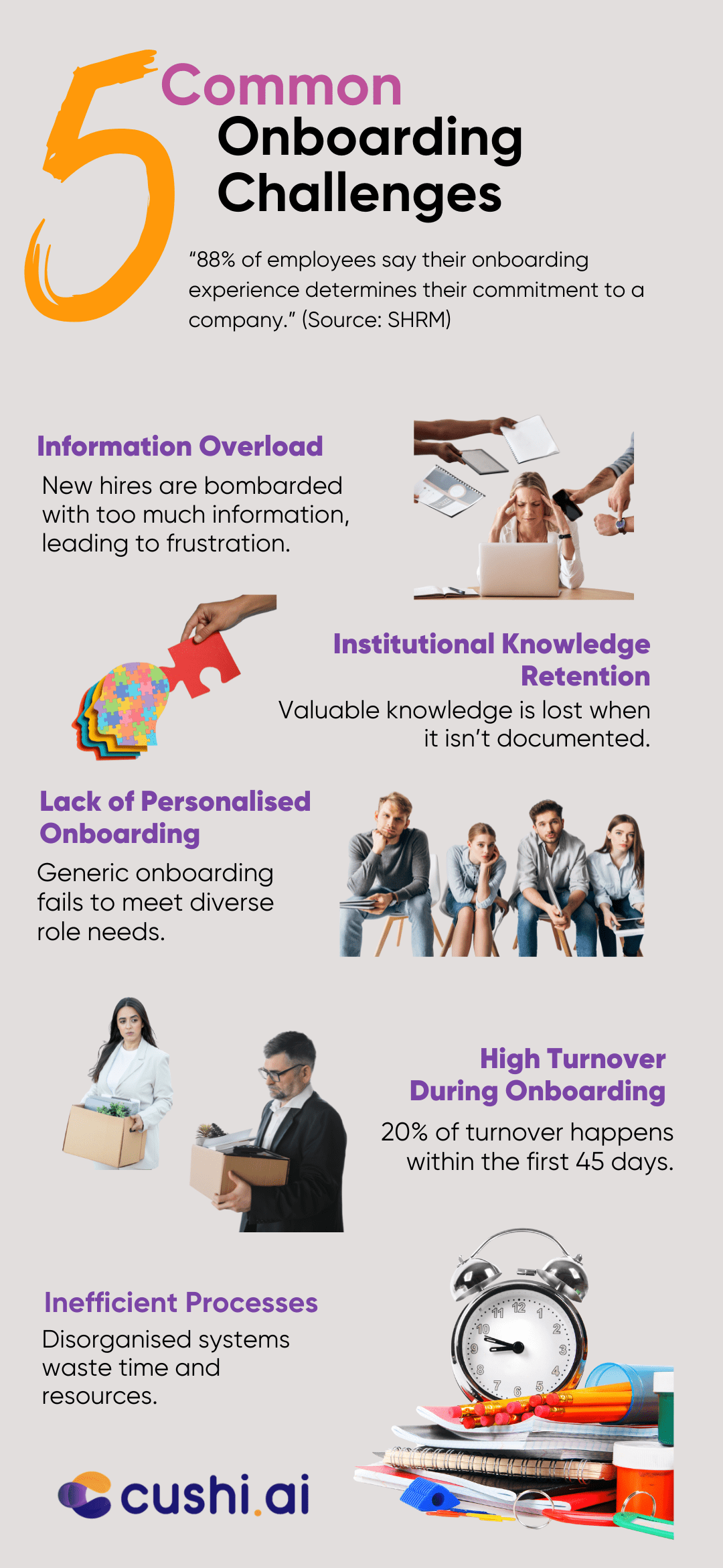
To help synthesize these points, let's look at a couple of diagrams that summarize common onboarding issues.
The next image discusses employee onboarding, but the challenges are directly analogous to user onboarding in product design.
Conclusion
Analyzing an onboarding flow requires looking beyond the UI to understand its effectiveness in achieving a crucial goal: guiding a new user to experience the product's value. By failing to do so, even the most powerful products can lose the vast majority of their potential users at the front door.
Key Takeaways:
- The Goal is Activation: Successful onboarding isn't about feature education; it's about guiding the user to their "Aha!" moment as quickly and smoothly as possible.
- Personalization is Key: A "one-size-fits-all" flow is a major weakness. Effective onboarding segments users and tailors the experience to their goals.
- Respect Cognitive Load: Onboarding flows are prime locations for decision fatigue. Look for weaknesses like excessive steps, overwhelming tours, and a lack of user control.
- Balance Business and User Needs: A flow that is too aggressive with monetization before demonstrating value will backfire and hinder user engagement.
- Onboarding is Continuous: A lack of accessible, in-app support and feedback mechanisms is a weakness that can lead to long-term churn.
In our next lesson, we will zoom in on a specific type of friction that often appears at the very beginning of an onboarding flow: authentication and permission hurdles that disrupt task completion. We'll examine how poorly designed login, sign-up, and permission request patterns can create significant barriers for users.