Recommended resources
The freely available resources this lesson will direct you to.
- How to Build Stunning Material 3 Apps with Jetpack Compose - Android Studio Tutorialwww.youtube.com
- Introduction to Material 3 (Color Theming, Typography, Shapes)www.youtube.com
- Theming in Compose with Material 3 | Android Developersdeveloper.android.com
- Material Theming with Jetpack Compose | Android Developersdeveloper.android.com
Hello! Your marketplace app now has a listings destination and a detail destination connected by type-safe navigation. The listings screen still renders state and reports taps through callbacks; the navigation graph decides what happens next.
In this final lesson of the project-foundations module, you’ll give both destinations a custom Material 3 theme. You’ll define light and dark color schemes, make deliberate choices for typography and shapes, and apply the theme once around the navigation host. Allow about 40 minutes, including time to inspect the app in both display modes.
Think in roles, not isolated colors
Material 3 themes have three main parts: a color scheme, typography, and shapes. A theme is more useful than setting a hex color on each button because components can draw from the same set of design decisions. Change the theme, and components that use its roles change together.
Color roles describe where a color belongs. primary can color a prominent button; onPrimary is for content drawn on that button. primaryContainer provides a less prominent colored area, with onPrimaryContainer for its content. Neutral roles such as background, surface, and their corresponding “on” colors support the rest of the screen. These pairs matter in both light and dark mode: a color that reads well on a light surface may not read well on a dark one.
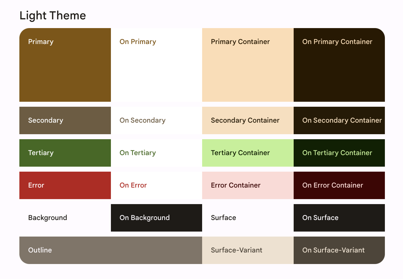
Study the selected parts of Android Developers’ Theming in Compose with Material 3. Its sample app is different from your marketplace, so focus on the theming pattern rather than its screen-specific code.
Theming in Compose with Material 3 | Android Developers
Android Developers explains how color roles become a theme and how to apply that theme around an app.
Start in “3. Material 3 Theming” with the three subsystems. In “4. Color schemes,” read from the opening explanation of five key colors through the tonal overview. Under “Generating color schemes,” read the export guidance; skim the long generated color listings rather than copying the sample app’s files. Then find the AppTheme example near the end of that section and “4. Color schemes”’ following instructions for applying the theme in MainActivity.kt. Finally, in “Color roles and accessibility,” read the role guidance. Notice which colors are intended for containers and which belong on top of them.
Generating a scheme from one chosen color is more reliable than independently guessing every light- and dark-mode role. The Material Theme Builder lets you supply a source color, inspect the resulting screens, and export Jetpack Compose code.
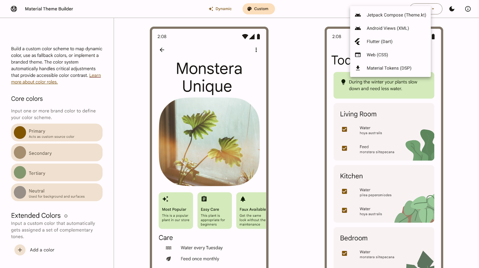
Generate and install the marketplace’s color schemes
For a reproducible first pass, use the codelab’s warm primary seed, #825500, or choose another color appropriate for your marketplace. In Material Theme Builder, select Custom, set the Primary core color, inspect its light and dark previews, and export Jetpack Compose. The builder may offer additional source colors, but you need not invent a separate value for every role.
Place the exported color definitions in your app’s ui.theme package. If your project already has Color.kt and Theme.kt, merge or replace the relevant theme definitions rather than keeping two competing app themes. Update the exported package declaration to match your project. Generated names and the roles exported can vary; use the actual names in your files. The codelab’s export calls its schemes LightColors and DarkColors, which are the names used below.
Do not copy only the primary color and assume the job is finished. Keep the exported light and dark role definitions, including their matching content colors. For example, the codelab’s seed produces different primary and onPrimary values in each mode; a single hard-coded text color would defeat that pairing.
Next, replace the generated theme composable—or adapt your existing one—to select the appropriate scheme. Keep the exported LightColors and DarkColors declarations above this function in Theme.kt:
import android.os.Build
import androidx.compose.foundation.isSystemInDarkTheme
import androidx.compose.material3.MaterialTheme
import androidx.compose.material3.dynamicDarkColorScheme
import androidx.compose.material3.dynamicLightColorScheme
import androidx.compose.runtime.Composable
import androidx.compose.ui.platform.LocalContext

@Composable
fun MarketplaceTheme(
    darkTheme: Boolean = isSystemInDarkTheme(),
    dynamicColor: Boolean = false,
    content: @Composable () -> Unit
) {
    val colorScheme = when {
        dynamicColor && Build.VERSION.SDK_INT >= Build.VERSION_CODES.S -> {
            val context = LocalContext.current
            if (darkTheme) {
                dynamicDarkColorScheme(context)
            } else {
                dynamicLightColorScheme(context)
            }
        }
        darkTheme -> DarkColors
        else -> LightColors
    }

    MaterialTheme(
        colorScheme = colorScheme,
        typography = MarketplaceTypography,
        shapes = MarketplaceShapes,
        content = content
    )
}
MarketplaceTypography and MarketplaceShapes are defined in the next section; add them before building. The default dynamicColor = false is intentional. It lets you see your custom exported colors on every supported device. If you later opt in to dynamic color, Android 12 and newer can derive colors from the device wallpaper instead; older devices still use your exported schemes. Dynamic color and a fixed custom palette are two choices with different visual results, not two effects that stack.
Give text and containers a consistent vocabulary
Colors alone will not distinguish a listing title from its price or give a listing container a recognizable shape. Material 3’s type scale supplies named styles such as headlineSmall, titleLarge, and bodyMedium. Its shape scale supplies sizes such as small and medium. You can override only the styles you intend to use; the others retain Material 3 defaults.
Read the typography and shape portions of the same Android Developers codelab before defining yours.
Theming in Compose with Material 3 | Android Developers
The typography and shapes sections show how reusable styles enter MaterialTheme, then become available to screens and components.
In “6. Typography,” read from the type-scale introduction, then find “Defining typography” and “Working with typography” for the Typography and MaterialTheme.typography examples. Skip the sample app’s detailed email-list edits. In “7. Shapes,” read “Defining shapes” and “Working with shapes,” starting at the explanation of Compose’s Shapes class and continuing through the shape examples. Focus on how a Card obtains a shape from the theme.
In ui/theme/Type.kt, define a restrained type scale for the screens you currently have:
import androidx.compose.material3.Typography
import androidx.compose.ui.text.TextStyle
import androidx.compose.ui.text.font.FontWeight
import androidx.compose.ui.unit.sp

val MarketplaceTypography = Typography(
    headlineSmall = TextStyle(
        fontWeight = FontWeight.SemiBold,
        fontSize = 24.sp,
        lineHeight = 32.sp
    ),
    titleLarge = TextStyle(
        fontWeight = FontWeight.SemiBold,
        fontSize = 20.sp,
        lineHeight = 28.sp
    ),
    bodyMedium = TextStyle(
        fontWeight = FontWeight.Normal,
        fontSize = 14.sp,
        lineHeight = 20.sp
    )
)
This uses the device’s normal font family; a custom font file is not required to customize typography. A larger or heavier title now means the same thing on the listings and detail destinations.
In ui/theme/Shape.kt, define a small scale:
import androidx.compose.foundation.shape.RoundedCornerShape
import androidx.compose.material3.Shapes
import androidx.compose.ui.unit.dp

val MarketplaceShapes = Shapes(
    small = RoundedCornerShape(8.dp),
    medium = RoundedCornerShape(16.dp),
    large = RoundedCornerShape(24.dp)
)
These values are design choices, not mandatory Material 3 measurements. Passing both objects to MaterialTheme, as shown earlier, makes them available through MaterialTheme.typography and MaterialTheme.shapes throughout its content.
Apply the theme at the app boundary
The exported definitions do nothing until they surround the UI. In your activity’s setContent, wrap the existing navigation host rather than theming each destination separately:
import androidx.compose.foundation.layout.fillMaxSize
import androidx.compose.material3.MaterialTheme
import androidx.compose.material3.Surface
import androidx.compose.ui.Modifier

setContent {
    MarketplaceTheme {
        Surface(
            modifier = Modifier.fillMaxSize(),
            color = MaterialTheme.colorScheme.background
        ) {
            MarketplaceNavHost()
        }
    }
}
Keep the rest of your activity setup as it is. This Surface draws the background and supplies an appropriate default content color. A plain Column does not paint a screen-wide theme background by itself. Because MarketplaceNavHost() sits inside the theme, both its listings and detail destinations inherit the selected scheme, type scale, and shapes. No NavController needs to enter the theme or either stateless screen.
Now make a few intentional uses of the theme visible. In ListingsScreen, you can replace the contents of the existing items.forEach { item -> ... } block with a card. Keep the surrounding when (uiState) and both callbacks:
items.forEach { item ->
    val scheme = MaterialTheme.colorScheme

    Card(
        modifier = Modifier
            .fillMaxWidth()
            .padding(vertical = 6.dp),
        shape = MaterialTheme.shapes.medium,
        colors = CardDefaults.cardColors(
            containerColor = if (item.isSaved) {
                scheme.primaryContainer
            } else {
                scheme.surfaceVariant
            },
            contentColor = if (item.isSaved) {
                scheme.onPrimaryContainer
            } else {
                scheme.onSurfaceVariant
            }
        )
    ) {
        Column(modifier = Modifier.padding(16.dp)) {
            Text(
                text = item.title,
                style = MaterialTheme.typography.titleLarge
            )
            Text(
                text = item.priceLabel,
                style = MaterialTheme.typography.bodyMedium
            )
            Button(onClick = { onSaveClick(item.id) }) {
                Text(if (item.isSaved) "Unsave" else "Save")
            }
            Button(onClick = { onListingClick(item.id) }) {
                Text("View details")
            }
        }
    }
}
Use the Material 3 Card, CardDefaults, Button, and Text imports. Here the saved state changes a card’s presentation, not who owns the state: the ViewModel still supplies item.isSaved, and the screen still reports button taps. Notice that each container color is paired with its corresponding content color. Material 3 buttons use their own component colors, so they need not inherit the card’s text color.
In the existing ListingDetailScreen, give its identifying text the same design vocabulary:
Text(
    text = "Listing: $listingId",
    style = MaterialTheme.typography.headlineSmall
)
Leave its Back button and callback intact. The detail screen is deliberately minimal for now; the important check is that navigation does not drop the theme when the destination changes.
If you use Compose previews, wrap their screen content in MarketplaceTheme too. A preview rendered outside the wrapper will not show your app’s theme, even when the running app does.
Check the result in both modes
Run the app with dynamicColor left at false. Inspect the listings screen, open a listing, and return with Back. You should see the custom scheme on both destinations, a shaped listing card, and different visual emphasis for its title and price. Toggle the device between light and dark appearance and repeat the route: the layout and behavior should remain the same while the paired colors change.
Pay particular attention to the card text and buttons in both modes. If you change a container role later, change its content role with it; do not “fix” one mode by hard-coding a text color that may fail in the other. Also check that your Card and MaterialTheme imports come from androidx.compose.material3, not the older Material package.
Dynamic color is optional for this app. The codelab explains its Android-version condition and fallback if you want to compare it with the fixed marketplace palette:
Theming in Compose with Material 3 | Android Developers
Android Developers shows how wallpaper-derived schemes can take the place of custom colors on supported devices.
In “5. Adding dynamic colors in app,” read from the availability explanation, then inspect the AppTheme scheme-selection example immediately below it. You can skip the later status-bar example: this lesson changes Compose theming, not your activity’s system-bar setup.
If you temporarily call MarketplaceTheme(dynamicColor = true) on Android 12 or newer, expect the color roles to follow the wallpaper rather than necessarily showing your chosen seed. Restore the default when verifying your custom palette.
Takeaways
Your app now has one Material 3 theme boundary around its navigation host. Exported light and dark schemes supply paired color roles; MarketplaceTypography and MarketplaceShapes give screens reusable styles; and components read those choices from MaterialTheme rather than scattering fixed values through the UI. The listings screen’s state and navigation callbacks remain separate from its appearance.
This completes the project-foundations module. Next, the course turns to coroutines and Flow, beginning with how structured concurrency determines the lifetime of asynchronous work.