Recommended resources
The freely available resources this lesson will direct you to.
Hello! Welcome to the third lesson in our course, "UX refresher for edtech strategy."
Introduction
Today's Focus: Deconstructing Duolingo's UX Strategy
This lesson addresses the third learning outcome of our first module: Deconstruct the user experience of a successful B2C EdTech product (e.g., Duolingo) to visually map its UX features to its underlying freemium business model and pedagogical strategy.
In our last session, you created a brilliant map linking different EdTech revenue models to their core UX priorities. Today, we're taking that theoretical knowledge and applying it to a real-world titan: Duolingo. As a UX professional aiming for a strategic role, being able to dissect a product like Duolingo—identifying how each feature serves the dual goals of learning and revenue—is a critical skill. We will peel back the layers to see how gamification, AI, and meticulous design work in concert to create one of the most successful EdTech products ever.
Estimated Time to Complete: 55-60 minutes.
Quick Recap: In the previous lesson, we established that a product's revenue model (freemium, subscription, etc.) is a primary driver of its UX strategy. We specifically identified that the goal of a freemium model is to convert free users to paying customers by designing a persuasive conversion funnel. Today, we will see that funnel in action.
1. The Three Pillars of Duolingo's Success
To understand Duolingo's strategy, it's helpful to think of it as resting on three interconnected pillars:
- The Freemium Business Model: The engine for growth and revenue.
- The Pedagogical Strategy: The approach to teaching and learning.
- The UX Engine: The user-facing features and systems that connect the business model with the pedagogy.
Let's start with a high-level look at the business and pedagogical models.
(Video: 3 minutes)
Please watch the beginning of the following video. It provides an excellent, concise overview of Duolingo's freemium model and the core challenge of monetizing a free app.

- Watch from 00:00 to 02:30. Focus on how a small percentage of paying users generates the vast majority of revenue and the initial tension between the mission of free education and the need to build a sustainable business.
(Reading: 5 minutes)
Next, let's examine Duolingo's pedagogical strategy. It's not just about language drills; it's a careful blend of learning science and engagement tactics.
Please read the section "Alignment with Mission and Customer Value" in the article below.
Duolingo's Scaling Journey: Education Revolution or ...
- As you read, pay close attention to the two sides of Duolingo's approach:
- Genuine Learning Science: The use of spaced repetition and multimodal teaching (reading, writing, speaking, listening).
- Attention-Grabbing Engagement: The intense focus on daily streaks, notifications, and other gamified elements to maximize usage.
The key takeaway is the central tension Duolingo navigates: its UX must be pedagogically effective enough for users to feel they are learning, while also being engaging (and sometimes frustrating) enough to drive retention and conversion to paid plans.
2. Deconstructing the UX Engine
Now, let's dive into the specific UX features that power Duolingo's success. These features are the bridge between the business model and the learning experience.
A. Gamification: The Heart of Engagement
As a designer, you know that gamification is more than just points and badges. At Duolingo, it's a core strategic lever for habit formation.
(Video: 1 minute)
This short clip provides a quick visual refresher on Duolingo's core game mechanics.
- Watch from 00:52 to 01:20. Notice features like lives, progress bars, experience points (XP), and streaks.
These elements directly support both business and learning goals:
- Streaks create a powerful habit loop, encouraging daily use. This increases ad impressions for free users and reinforces the value proposition for subscribers. Pedagogically, daily practice is crucial for language retention.
- XP and Leaderboards introduce a social, competitive element that drives deeper engagement, keeping users on the app longer.
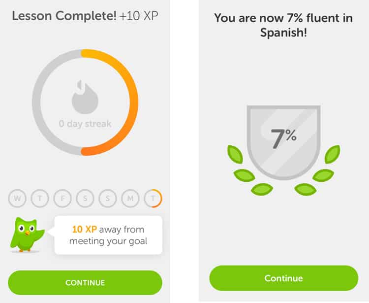 This image shows a classic Duolingo feedback loop. The "Lesson Complete!" screen reinforces progress with XP and streak tracking, while the fluency percentage provides a long-term progress marker. This is a masterclass in using UX to provide immediate positive reinforcement.
B. Data-Driven Design: AI & A/B Testing at Scale
Duolingo’s interface is the result of thousands of experiments. For a UX professional, their process is fascinating. They use data not just to optimize clicks, but to fine-tune motivation and learning.
(Video: 3 minutes)
This is the most important part of the video for you. It reveals the machinery behind the UX, showing how rigorously Duolingo tests everything to maximize engagement and retention.
- Watch from 02:30 to 05:47. Focus on how A/B testing is used for notifications, how the "bandit algorithm" personalizes messaging, and the sheer volume of data used to train their AI models.
This constant optimization serves two purposes:
- Business: It directly increases key metrics like Daily Active Users (DAUs) and retention, which are vital for a freemium model's success. As the video notes, a single "guilt-trip" notification style led to a 3% rise in retention.
- Pedagogy: Their "Birdbrain" AI uses this data to implement spaced repetition, personalizing lesson difficulty to keep learners in the sweet spot between "too hard" and "too easy." This maximizes learning efficacy.
C. The Conversion Funnel: Turning Free Users into Subscribers
The ultimate goal of Duolingo's freemium business model is to convert users. The UX is carefully designed to create "pain points" in the free experience that are solved by subscribing.
As detailed in the article How does Duolingo work & make money: Business Model ..., the key drivers for conversion are:
- Removing Ads: The free experience is interrupted by ads after lessons, creating friction.
- Unlimited "Hearts" (Lives): In the free version, users run out of lives after making too many mistakes, gating their progress for the day. This is arguably the single most powerful motivator to upgrade.
The strategy is simple but effective: provide immense value for free, but introduce carefully chosen limitations that make the premium version a compelling offer.
3. Activity: Visually Mapping Duolingo's Strategy
Now it's your turn to connect the dots. Your task is to fill out the table below, mapping Duolingo's specific UX features to both its freemium business goal and its pedagogical strategy. This exercise will solidify your understanding and directly fulfill the lesson's learning outcome.
Your Task (20 minutes):
Complete the following table. I have filled in the first two rows as an example. Think about how each feature serves both the business and the learner. Use the resources from this lesson to help you. For a high-level overview of the business components, you can also refer to this Business Model Canvas for Duolingo.
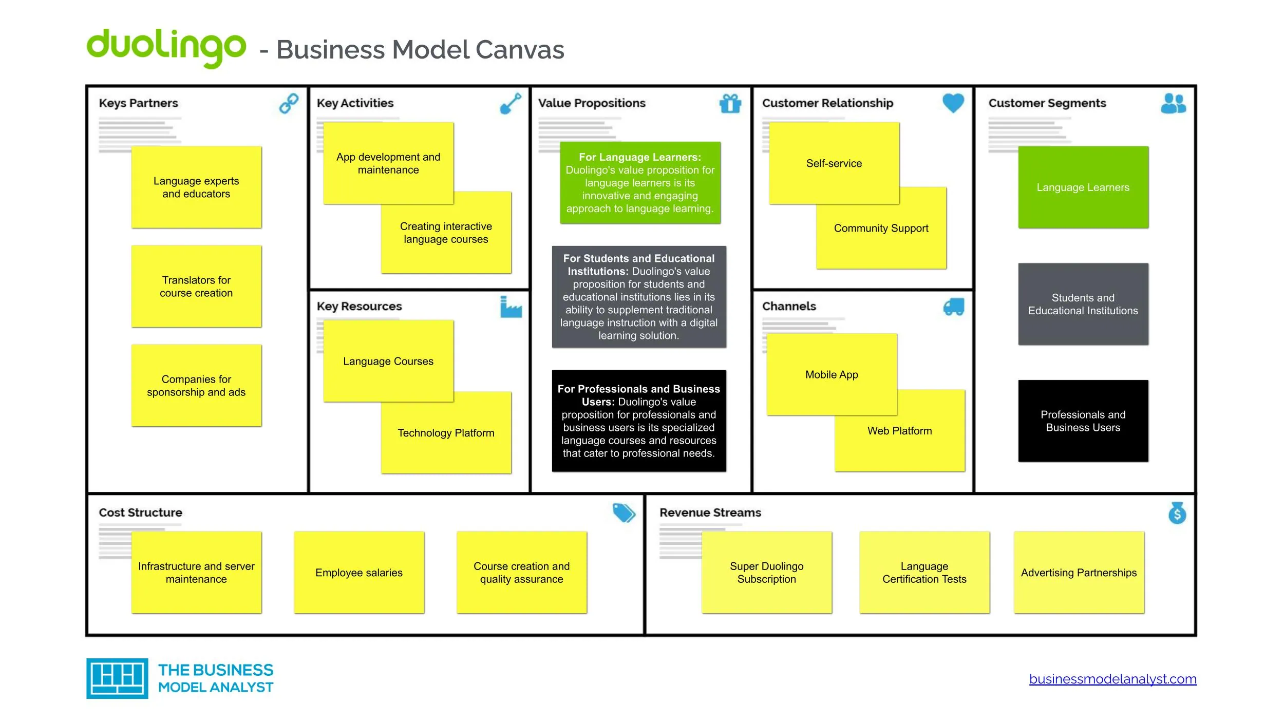 This canvas provides a strategic overview of Duolingo's components, which can help you frame your thinking for the business goal column.
| UX Feature | Link to Freemium Model (Business Goal) | Link to Pedagogical Strategy (Learning Goal) |
|---|---|---|
| Daily Streaks | Increases daily active use (DAU) and long-term retention, creating more opportunities for ad views and subscription conversions. | Encourages habit formation, which is critical for effective long-term language learning. |
| Limited "Hearts" (Lives) | Creates a primary "pain point" that drives subscriptions for "unlimited hearts." A key part of the conversion funnel. | Encourages users to be more careful and thoughtful with their answers to avoid losing a life. |
| Post-Lesson Advertisements | ||
| Leaderboards | ||
| AI-Personalized Lessons (Birdbrain) | ||
| "Duolingo Max" Tier (GPT-4 Features) | ||
| Celebratory Animations & Mascot (Duo) |
Conclusion
Fantastic work! By completing this deconstruction, you've moved beyond simply observing a good user experience to strategically analyzing why it's designed that way. You can now see that in a product like Duolingo, features are rarely one-dimensional; they are sophisticated tools engineered to balance business viability with pedagogical efficacy.
Key Points Summary:
- Duolingo's UX is a masterclass in balancing its freemium business model with its pedagogical strategy.
- Gamification features like streaks and leaderboards are not just for fun; they are core mechanics for driving retention and habit formation.
- Data-driven design, through massive A/B testing and AI, allows Duolingo to optimize its UX for both engagement (business goal) and learning effectiveness (pedagogical goal).
- The conversion funnel is built around creating friction in the free experience (e.g., ads, limited lives) that is elegantly solved by a premium subscription.
Preview of the Next Lesson:
We have now deeply analyzed a B2C freemium product. In our next and final lesson of this module, we will shift our focus entirely. We will tackle the learning outcome: Diagram the user journey for a B2B EdTech platform, identifying key UX touchpoints for demonstrating value to both the administrative buyer and the end-user learner. This will introduce a new layer of complexity, as the person buying the software is often not the person using it every day. Your work today has set a perfect foundation for understanding how to analyze and map user experiences in any context.