Recommended resources
The freely available resources this lesson will direct you to.
Hello Alex! Welcome to your next lesson in our course, "UX Refresher for EdTech Strategy."
Introduction
In our journey to connect UX with EdTech strategy, we've reached a crucial point: translating high-level business goals into measurable design impact. This lesson focuses on making that connection explicit and visible.
Today, we will tackle the following learning outcome: Create a visual hierarchy that links a high-level product OKR for an EdTech product to specific UX-focused KPIs and the user interactions that influence them.
You're already familiar with OKRs and KPIs from your previous studies. We'll build on that knowledge by learning a systematic process to cascade a top-level business objective down to the granular user actions you, as a designer, can directly influence. This skill is vital for demonstrating the strategic value of your UX work and ensuring your design decisions are aligned with business success.
This lesson should take you about 60 minutes to complete.
Let's get started!
1. The Strategic Compass: OKRs in EdTech
Objectives and Key Results (OKRs) are the framework that helps a company define its strategic direction. The Objective is the ambitious, qualitative goal, and the Key Results are the quantitative measures that tell you if you've achieved it.
For a quick refresher on the structure and its relevance to EdTech, please read the following sections from the article "OKR Format & Framework Templates for Teams."
- Reading Time: ~5 minutes
- Focus On:
- The simple definition of an Objective and Key Results in the "Introduction."
- The example OKR provided in the "Crafting Effective OKRs" section. Pay close attention to how the qualitative Objective ("Enhance learner engagement") is paired with quantitative Key Results (like increasing completion rate and NPS).
This structure gives us the top level of our hierarchy. For the rest of this lesson, we'll use the example from the article as our high-level product OKR:
- Objective: Enhance learner engagement on our EdTech platform.
- Key Results:
- Increase course completion rate from 60% to 75%.
- Achieve a learner Net Promoter Score (NPS) of 70+.
This OKR sets the direction. Now, how does a UX team contribute? We need to break these Key Results down into metrics that design can directly impact.
2. From Key Results to UX KPIs: Identifying What to Measure
While a Key Result like "Increase course completion rate" is a great business metric, a UX team needs more specific metrics to guide jejich design work. These are your Key Performance Indicators (KPIs).
UX KPIs fall into two main categories, which should be familiar from your user research experience:
- Behavioral Metrics: What users do. These are quantitative and based on observation (e.g., clicks, time spent, errors).
- Attitudinal Metrics: What users say or feel. These are qualitative but can be quantified through surveys (e.g., satisfaction scores, usability ratings).
To explore these categories and see concrete examples, please read the following sections from "Top 5 UX Metrics Frameworks."
- Reading Time: ~10 minutes
- Focus On:
- The distinction between behavioral and attitudinal metrics.
- The examples of behavioral metrics like Task Success Rate and Error Rate.
- The examples of attitudinal metrics like CSAT and SUS.
To see what these KPIs look like in a real-world context, take a look at this example of an EdTech dashboard.
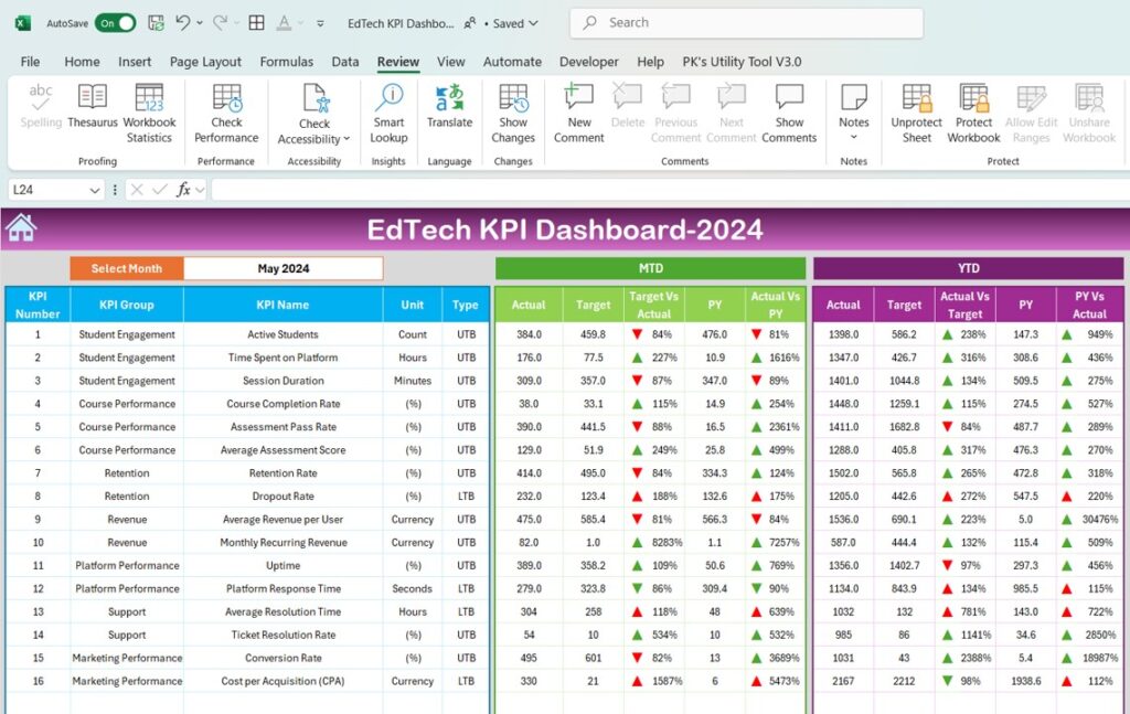
This dashboard shows how an EdTech company tracks various KPIs. Notice how metrics like "Course Completion Rate" and "Student Satisfaction (NPS)" are top-level indicators, while others like "Daily Active Users" or "Avg. Time to Complete Course" provide more granular insight.
You can see how the Key Results from our OKR (Completion Rate, NPS) are present, but they are surrounded by many other metrics that tell a more detailed story about the user experience. The challenge is connecting them in a logical way.
3. Building the Hierarchy: The Goals-Signals-Metrics Process
Now we'll tie everything together. How do we get from a high-level Key Result like "Increase course completion rate" to a specific UX KPI like "Reduce error rate on quiz submission"?
A fantastic tool for this is the Goals-Signals-Metrics process, which was developed at Google as part of their HEART framework. It creates the logical chain we need.
- Goals: A specific user-experience goal that contributes to a Key Result.
- Signals: The user behaviors or interactions that indicate you are (or are not) meeting that goal. This is the critical link between UX and metrics.
- Metrics: The specific KPIs you will track to quantify the signals.
Please read the section below that explains this process.
Top 5 UX Metrics Frameworks to measure your design ... (Goals-Signals-Metrics Process)
- Reading Time: ~5 minutes
- Focus On: Understanding the role of Goals, Signals, and Metrics and how they connect to each other.
Activity: Creating the Visual Hierarchy
Let's apply this process to our example OKR. We will build a visual hierarchy that connects the Objective down to the user interactions.
Objective: Enhance learner engagement on our EdTech platform.
Here is how we can break down each Key Result:
Key Result 1: Increase course completion rate from 60% to 75%.
| Goal (What UX wants to achieve) | Signals (User interactions to observe) | Metrics (KPIs to track) |
|---|---|---|
| Make it easier to progress through a course. |
|
|
| Ensure learning activities are effective, not frustrating. |
|
|
Key Result 2: Achieve a learner Net Promoter Score (NPS) of 70+.
| Goal (What UX wants to achieve) | Signals (User interactions to observe) | Metrics (KPIs to track) |
|---|---|---|
| Create a delightful and trustworthy experience. |
|
|
| Ensure the platform feels easy and intuitive to use. |
|
|
This table is the visual hierarchy your learning outcome requires. It clearly shows how a high-level business objective cascades down to the specific user interactions and the UX KPIs that measure them. As a designer, you can look at a metric like "Error Rate on quiz submission" and know that improving it directly contributes to the company's goal of increasing course completion rates.
Conclusion
Let's summarize what we've covered in this lesson.
Key Takeaways:
- OKRs set the strategy: They define a high-level, qualitative Objective and the quantitative Key Results that measure its success.
- UX KPIs provide the details: Metrics like Task Success Rate, Time on Task, and CSAT measure the quality of the user experience.
- The Goals-Signals-Metrics process connects them: This framework provides a logical bridge, translating a high-level goal into observable user Signals (interactions) and then into trackable Metrics (KPIs).
- Visualizing the hierarchy demonstrates impact: By mapping OKRs to UX KPIs, you can clearly show how your design work—improving interactions and user flows—directly contributes to achieving key business results.
This process is fundamental for any UX professional operating at a strategic level. It moves the conversation from "this design looks better" to "this design improved our Task Success Rate by 15%, which is helping us achieve our company-wide goal of higher course completion."
Preview of the Next Lesson:
Now that you know how to measure the impact of your designs, how do you decide what to design next? In our next lesson, you will use a feature prioritization matrix to evaluate and rank potential new features for an EdTech product based on their impact on learning outcomes and business goals. The hierarchy we built today will be invaluable for informing the "impact" score in that matrix, ensuring your priorities are always aligned with strategy.