Recommended resources
The freely available resources this lesson will direct you to.
Hello. Last time, you built a dashboard that could show how many issues sit in each status. A large “In Review” count is a useful signal, but it does not tell you whether those issues arrived this morning or have been waiting for weeks. This lesson adds three views of time: an issue’s status history, a Control Chart of elapsed time, and a Cumulative Flow Diagram of how work accumulates across stages.
In about 40 minutes, you’ll use them together to distinguish a plausible workflow bottleneck from a misleading chart pattern. The approach applies to both an older Jira Server board and a current Jira Cloud board, although report controls and menu placement may differ.
Start with the evidence inside an issue
An issue’s current status is a snapshot. Its History records changes, including status transitions, so it can show when the issue entered and left a stage. Open an issue and look under Activity > History; on some interfaces, you may need to change the activity view to display history rather than comments.
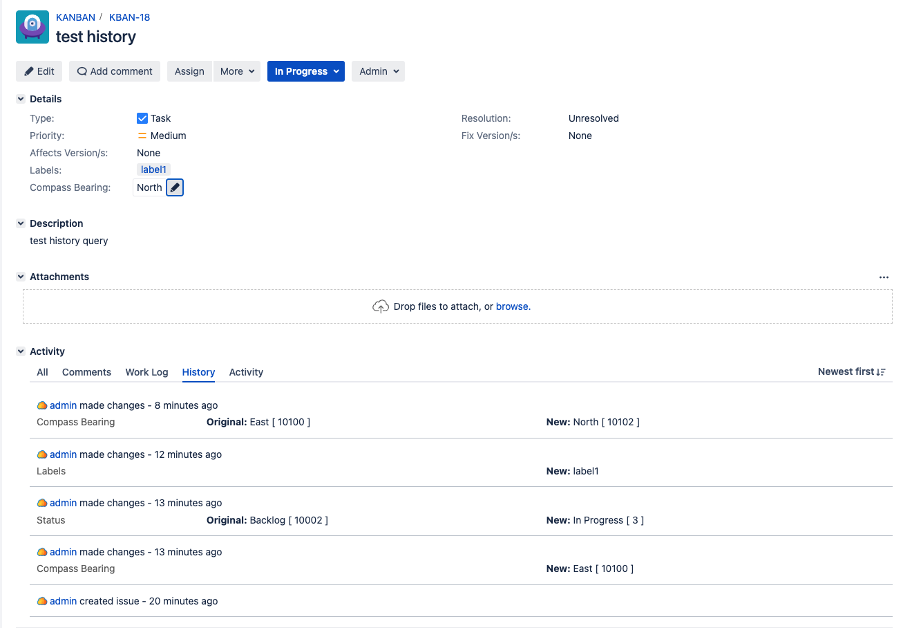
In the example, the status changed from Backlog to In Progress. Other entries record changes to a label and a custom field. Do not treat every activity entry as a workflow transition. To establish time spent in a status, find both the entry into that status and the subsequent exit, using their timestamps. If an issue returned to the same status later, inspect each visit rather than assuming it passed through only once.
This gives you an audit trail for an unusually slow issue. It does not yet tell you whether that issue is typical. Nor does a long interval prove that someone was working on it throughout: it may have been waiting for a review, paused, blocked by another team, or simply left in an inaccurate status. History establishes what Jira recorded; the cause requires investigation.
Measure elapsed time with a Control Chart
From a Jira Software board, look for Reports > Control Chart. The central setup decision is which board columns to include. If you select only an In Progress column, the chart measures time issues spent there. If you select the working columns through review and testing, it measures a broader portion of the delivery cycle.
Cycle time usually means time from starting work to completing it; lead time includes the earlier wait from logging the issue to completion. Jira’s chart calculates elapsed time from the columns you select, so its displayed measure matches either definition only when your selected columns and workflow boundaries match that definition. A “To Do” or backlog column may approximate the beginning of lead time, but check whether issues actually enter it when they are logged.
Watch the selected parts of “Control Chart in Jira” from iZenBridge Consultancy. The demonstration is useful for seeing how column selection changes the question the chart answers.
Watch “Control Chart in Jira” from iZenBridge Consultancy to connect the plotted issues with the board columns used to calculate their elapsed time.
Watch chart basics for the dots, clusters, average, and median. Continue with variation and trends for the rolling average and shaded band. Then watch column selection, focusing on how measuring In Progress alone differs from including the earlier backlog stage.
A dot represents an issue, or a cluster of issues. Its height represents elapsed time in the selected columns. Its horizontal position marks when it left the last selected column—not necessarily when it was completed. The red line is the overall average; the blue rolling-average line helps reveal whether durations are changing across successive issues. A wide shaded band indicates substantial variation. The median supplies another useful reference when a few very long issues pull the average upward.

In this example, the displayed average is 1 week, 1 day, 18 hours, while the median is 3 days, 22 hours. That gap is a reason to inspect the long-running issues; it is not, by itself, proof of a particular bottleneck. Check the issue type, whether the work was paused or reopened, and whether its recorded statuses reflect reality. Also avoid estimating precise durations from visual distances alone: Jira can change the elapsed-time axis scale when long-duration issues are present.
Atlassian’s “Control Chart” documentation for Jira Software Server explains the column-based calculation and an important limit on what appears in the chart.
Control Chart | Atlassian Support | Atlassian Documentation
Read Atlassian’s “Control Chart” documentation to check what the selected columns, dots, and variation actually mean before using the chart to diagnose a team.
Under “Understanding the Control Chart,” start at cycle-time definitions; continue through the paragraphs on configuring columns for cycle time and lead time. In the same section, read chart interpretation, including the questions about the blue shaded area and the dots. Finally, under “Tips and examples,” find “Tip 3: Exclude current work” and read which issues appear, plus the following guidance on viewing completed work only.
That last qualification matters. Depending on the selected columns and filters, a Control Chart can include an issue that has left a measured column but is still moving across the board. If your question is “How long did completed work take?”, use an appropriate completed-work filter and check your workflow’s statuses and resolutions. Keep a separate view of current work: a chart restricted to completed issues cannot expose an issue that is still waiting in review.
Likewise, do not quietly discard every outlier. A paused issue with misleading status data may need to be separated from the comparison, with the reason recorded. A genuine six-week wait is precisely the evidence a process review needs.
See accumulating work in a Cumulative Flow Diagram
The Control Chart describes elapsed time for issues that have crossed a measured boundary. A Cumulative Flow Diagram (CFD) shows how many issues occupy each board column over time. At any date, the vertical thickness of a colored band is the number of issues in that column. If the band for Waiting for QA grows thicker across successive dates, work is entering that stage faster than it is leaving it over that period.
Watch the whiteboard explanation and Jira demonstration in “Cumulative Flow Diagram (CFD) in Jira” from iZenBridge Consultancy. Follow the changing thickness of each band, rather than treating its top edge as the count in that one status.
Cumulative Flow Diagram (CFD) in Jira
Watch “Cumulative Flow Diagram (CFD) in Jira” from iZenBridge Consultancy for a visual construction of the chart before looking for bottlenecks in a real board.
Watch the first bands to see how a board snapshot becomes stacked areas, then work moving as an issue reaches Done. Watch arrivals and departures for the effect of new backlog work. Finally, the Jira report shows where to find the CFD and how its board columns appear on the chart.
A widening band is a candidate bottleneck, not a verdict about its cause. A growing backlog band might reflect a deliberate increase in incoming requests. A growing review band with little corresponding movement into Done more directly suggests that work is accumulating at review. Even then, possibilities include insufficient review capacity, issues arriving in batches, or a policy change about when issues move to Done.
Read Atlassian’s short “Cumulative Flow Diagram” documentation for two safeguards: the report’s scope and its dependence on column mapping.
Cumulative Flow Diagram | Atlassian Support | Atlassian Documentation
Read Atlassian’s “Cumulative Flow Diagram” documentation to ground the visual pattern in the board data that produces it.
At the start of the page, read the diagram definition. Under “Viewing the Cumulative Flow Diagram,” note the route through Board > Reports and the controls for refining the report and timeframe. Under “Understanding the Cumulative Flow Diagram,” read from board scope and mapping; focus on how the board’s saved filter and mapped columns determine what the chart counts.
This is especially important when a QA dashboard and a delivery board appear to disagree. The CFD includes issues matching that board’s filter and groups them according to that board’s column mapping. A filter excluding bugs, or a column that combines several statuses, changes the story the chart can tell. Before comparing periods, keep the board, issue population, column mapping, and date range in view.
Build a defensible bottleneck diagnosis
Suppose a product team’s CFD shows its Ready for Test band growing steadily for two weeks, while the Done boundary rises slowly. Use the reports as a sequence of checks, not as competing answers:
- Verify the scope. Confirm the board includes the relevant stories and bugs and that Ready for Test maps to the column you think it does. Check whether a release-related influx increased arrivals during those two weeks.
- Measure the stage. On the Control Chart, select the test-waiting column to inspect elapsed time for issues that have left it. Compare the median, rolling trend, and spread with an earlier, comparable period. Be explicit if you filter to completed work.
- Inspect actual issues. Open several long-duration issues and several still waiting in that column. Use History to locate their entry and exit timestamps where available, and look for reopens, handoffs, blocked-work notes, or status changes made late.
The resulting finding should separate observation, interpretation, and next check. For example: “The Ready for Test band widened from roughly four to fourteen issues over two weeks; issues leaving that column also show longer and more variable elapsed times. This is consistent with a growing test queue. We should inspect waiting issues and the timing of arrivals before attributing the delay to testing capacity.”
You can perform these checks with ordinary board, report, and issue-view access when those features are available; changing board filters, column mappings, or quick filters may require a board administrator. On an older Server installation, start with the reports your board actually exposes. In Cloud, find the equivalent board reports and verify their controls rather than relying on identical screenshots.
Conclusion
Use History to establish the recorded path of a specific issue, a Control Chart to examine elapsed-time patterns for issues crossing selected columns, and a CFD to see where work is accumulating over time. Before naming a bottleneck, check report scope and column mapping, then inspect both completed outliers and work that is still waiting. The charts identify where to look; issue-level evidence helps explain why.
Next, you’ll extend this flow view beyond one board to track cross-project dependencies and releases using linked issues, versions, boards, filters, and dashboards.