Hello! Welcome to the fifth lesson in our module, Visual Storytelling with AI.
In our previous lessons, we've been working on the internal visuals for your book, focusing on generating consistent comic book panels. We learned how to write detailed scripts and use techniques like reference images and character models to bring your story to life, panel by panel.
Today, we shift our focus from the inside of the book to its single most important marketing tool: the cover. Before a reader sees a single page you've written or a panel you've generated, they will judge your book by its cover. This lesson is dedicated to learning the theory behind what makes a cover successful. We will describe the key principles of effective book cover design, including typography, imagery, and genre conventions.
Mastering these principles is the essential first step before we can effectively command AI to generate compelling cover art. Think of this lesson as learning the rules of the game; in the next lesson, we'll use AI to play.
1. The Purpose of a Book Cover: Your #1 Marketing Asset
Before diving into design specifics, it's crucial to understand the cover's primary job. It is not just a protective wrapping or a piece of art; it is a billboard, a first impression, and a genre signal, all rolled into one. In an online marketplace like Amazon, a potential reader makes a snap judgment in seconds based almost entirely on your cover's thumbnail.
A successful cover accomplishes three main goals:
- Grabs Attention: It stands out in a sea of other thumbnails.
- Signals Genre: It instantly tells the reader what kind of experience to expect (e.g., business guide, psychological thriller, children's story).
- Promises Quality: It looks professional, implying the content inside is also high-quality.
The following resource provides a fantastic introduction to this mindset.
7 Essential Book Cover Design Tips for 2025
Let's start with the article '7 Essential Book Cover Design Tips for 2025' from Barker Books. It frames cover design as a marketing discipline, which aligns perfectly with your goal of selling books.
Please read the introduction of this article, up to the start of section 1. Focus on its argument for why the cover is the 'single most crucial piece of marketing an author has.'
2. The Golden Rule: Follow Genre Conventions
The single most important principle of cover design is that your book must look like it belongs in its genre. While it's tempting to create something completely unique, a cover that is too different will confuse potential readers. A thriller reader looking for a dark, suspenseful story will scroll right past a cover that looks like a lighthearted romance, and vice-versa.
Genres have established visual languages. Understanding this language is key to attracting your target audience.
5 Things to Consider When Designing a Book Cover
The video '5 Things to Consider When Designing a Book Cover' by professional designer Holly Dunn offers a concise and clear explanation of this principle.
Watch the section on 'Appropriateness' from 00:44 to 02:29. Pay close attention to how she explains that different genres have developed specific aesthetics to create reader recognition.
To see these conventions in practice across the various genres you're interested in, the next resource is an excellent visual guide.
Creative Book Cover Design: Balancing Aesthetics and ...
The article 'Creative Book Cover Design: Balancing Aesthetics and Genre Expectations' from The Book Designer breaks down the typical design elements for many popular genres.
Read through the main body of the article, which starts with 'Romance Book Cover Design' and ends just before 'The Key to Creative Book Cover Design'. As you read, pay special attention to the sections relevant to your interests: Self-Help and Business, Young Adult (for children's/comics), and Biography (for mentoring books). Notice the common patterns in color, imagery, and font choices for each.
3. The Design Trinity: Imagery, Typography, and Color
Genre conventions are expressed through three core visual elements. Mastering how to combine these is the art of cover design.
Imagery: The Visual Hook
The image on your cover is what creates the initial emotional connection. Your choice of image—whether it's a photograph, a custom illustration, or a symbolic graphic—is critical. As you know from your interest in using AI for illustrations, the possibilities are vast.
- Photography can signal realism, making it a good choice for biographies, memoirs, or thrillers set in the real world.
- Illustration offers more creative freedom. It’s perfect for fantasy, children's books, and comics, and can range from whimsical to gritty.
- Typographic covers, which use text as the main design element, are common for business, self-help, and some literary fiction. They convey a sense of authority and focus on the message.
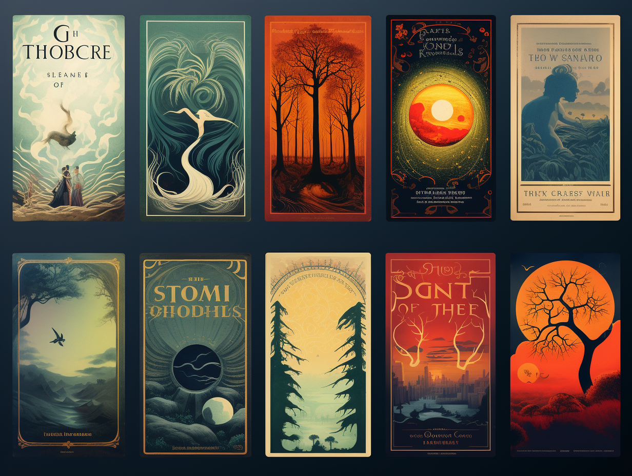
Typography: The Voice of Your Book
The fonts you choose do more than just spell out the title; they convey a personality and reinforce the genre.
- Font Style: Elegant script fonts suggest romance or historical fiction. Bold, clean, sans-serif fonts (like Arial or Helvetica) are common in business and non-fiction. Distressed or sharp-edged fonts can signal a thriller or horror story.
- Readability: The title and author's name must be crystal clear, even when viewed as a tiny thumbnail on a phone. This is non-negotiable.
- Hierarchy: You must create a clear visual order. Typically, the title is the most prominent element, followed by the author's name. A subtitle is usually the smallest. This guides the reader's eye and makes the information easy to process.

Color: The Emotional Shorthand
Color psychology plays a massive role in cover design. Colors instantly communicate a mood and are heavily tied to genre expectations.
- Business/Self-Help: Often use clean white backgrounds with bold, optimistic colors like blue (trust, authority), orange (energy, innovation), or green (growth, wealth).
- Thrillers/Mystery: Dominated by dark palettes—black, deep blues, grays—with a splash of a high-contrast color like red or yellow to create tension.
- Children's Books: Bright, primary colors that feel energetic and fun.
- Psychology: Can vary, but often use more muted, thoughtful color palettes or high-contrast, minimalist designs to convey a sense of intellectual depth.
5 Things to Consider When Designing a Book Cover
Let's return to Holly Dunn's video to review her explanations of these three core elements.
Watch from 02:29 to 07:36. This covers her points on Typography, Imagery, and Color. Notice how she constantly ties these elements back to genre appropriateness and readability.
4. Assembling the Pieces: Contrast, Hierarchy, and Balance
Knowing the individual elements isn't enough; a great cover is about how they all work together.
Contrast and Scalability
Your cover must be legible at a small size. This is achieved through high contrast—the difference between light and dark elements. A light-colored title on a dark background (or vice versa) is crucial for standing out. Always test your design by shrinking it down to the size of a postage stamp. If you can't read the title, the contrast is too low.
Balancing Convention and Uniqueness
The ultimate goal is to create a cover that fits its genre but also has a unique element that makes it stand out. This is the fine line between being derivative and being confusing. You can achieve this by:
- Using a familiar genre layout but with an unexpected color splash.
- Choosing a symbolic image instead of a literal one.
- Employing a unique typographic treatment that still feels genre-appropriate.
How to Design a Book Cover That STANDS OUT
The video 'How to Design a Book Cover That STANDS OUT' offers great advice on this balancing act. The hosts discuss how to draw inspiration and break rules thoughtfully.
Watch from 10:26 to 20:03. The speakers discuss gathering inspiration, playing with mockups in Canva (a free tool), and the idea of 'coloring outside the lines' without confusing the reader. This is a very practical perspective for an author.
Test your understanding!
Imagine you are designing a cover for a non-fiction mentoring book titled: "Code Your Legacy: An IT Professional's Guide to Mentoring Startups".
Based on the principles you've just learned, briefly describe your ideal cover design. Justify your choices for the following elements:
- Genre Conventions: Which genre(s) would you draw from? (e.g., Business, Self-Help).
- Imagery: What kind of image would you use? (e.g., photo, abstract graphic, purely typographic).
- Typography: What style of font would you choose for the title? Why?
- Color Palette: What main colors would you use? Why?
Show answer
Here's one possible approach based on the lesson's principles:
-
Genre Conventions: I would primarily follow the conventions of Business and Self-Help books. These genres signal authority, professionalism, and actionable advice, which is perfect for a mentoring guide.
-
Imagery: I'd opt for a clean, symbolic, or typographic design rather than a literal photo. For example, a minimalist graphic that combines a circuit board pattern with a growing tree, symbolizing the fusion of tech and personal growth. This is more sophisticated than a generic stock photo of people in a meeting.
-
Typography: I would use a bold, clean, modern sans-serif font for the title "Code Your Legacy." This projects confidence, clarity, and a connection to the tech world. The subtitle would be in a smaller, simpler version of the same font for a clear hierarchy.
-
Color Palette: I'd use a professional and trustworthy color palette. A dark blue or charcoal gray background would feel authoritative. For the title and key graphic elements, I'd use a high-contrast accent color like a vibrant cyan or a bright green to signify "go," innovation, and growth. This creates a visually striking cover that feels both serious and energetic.
Conclusion
You now have a solid theoretical understanding of what makes a book cover effective. It's a blend of marketing psychology and design artistry. By focusing on the core principles, you can make informed decisions that will help your book find its audience.
Key Takeaways:
- A book cover is your most important marketing tool; its primary job is to attract the right readers.
- Follow genre conventions. Your cover must speak the visual language of its category to be discovered.
- The design trinity—Imagery, Typography, and Color—are the tools you use to communicate genre, mood, and theme.
- A great design relies on high contrast for thumbnail readability and a clear visual hierarchy to guide the reader's eye.
- The goal is to balance genre expectations with a unique element that makes your cover memorable.
Preview of the Next Lesson:
With this foundational knowledge in place, we're ready for the fun part. In our next lesson, we will apply these principles to generate compelling cover art concepts tailored to specific book genres using AI. You'll learn how to translate your design ideas into effective text-to-image prompts.