Hello! Welcome back.
In our last lesson, we distinguished between CSS transitions and animations, establishing the "when" and "how" of applying motion to web elements. You learned that transitions are for simple state changes, while keyframe animations handle complex, multi-step sequences.
Today, we address a critical follow-up question: if all CSS properties can be animated, which ones should we animate? The answer is fundamental to building professional, high-quality user interfaces. An animation that stutters or "janks" can be worse than no animation at all.
This lesson directly addresses your interest in the "under-the-hood" mechanics of the browser. We'll move beyond syntax to explore the browser's rendering process, which is the key to understanding animation performance. By the end of this lesson, you will be able to implement performant animations by primarily using the transform and opacity properties to avoid triggering layout or paint.
The 16 Millisecond Challenge
For an animation to appear perfectly smooth, it needs to run at 60 frames per second (fps). This is the standard refresh rate for most displays. A simple calculation reveals the tight budget we have for each frame:
If the browser takes longer than 16.7ms to produce a frame, the animation will stutter. This effect is known as jank, and it's what we must avoid.
Web Performance Mini Series: Animations
To start, let's watch a clip from a video by Paul Lewis, a developer advocate from Google, who explains this frame budget and demonstrates the jarring effect of jank.
Watch from 1:20 to 6:32. Focus on the concept of the 16ms 'magic number' and how interrupting the consistent motion of an animation leads to a poor user experience.
The Browser's Rendering Pipeline
To understand how we can meet this 16.7ms budget, we need to understand the sequence of steps the browser takes to turn your HTML and CSS into pixels on the screen. This is known as the rendering pipeline. While the exact implementation differs between browser engines (like Blink in Chrome, Gecko in Firefox, and WebKit in Safari), the conceptual stages are the same.
The main stages relevant to animation are:
- Style: The browser calculates the final CSS styles for each element.
- Layout (or Reflow): The browser calculates the geometry of each element—its size and position on the page. A change to one element's geometry can affect all others, making this a potentially expensive operation.
- Paint: The browser fills in the pixels for each element in memory, drawing out text, colors, images, borders, and shadows. This happens on a set of layers.
- Composite: The browser draws the layers to the screen in their correct order.
A change to a CSS property during an animation can trigger this entire pipeline, or just parts of it. For a performant animation, our goal is to trigger as few stages as possible.
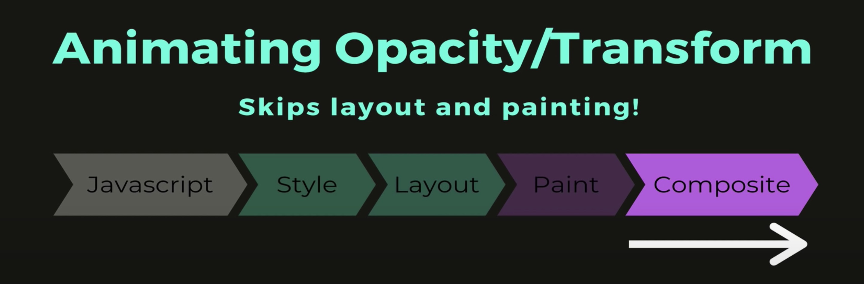
Web Performance Mini Series: Animations
Let's return to Paul Lewis's video, where he breaks down these pipeline stages and clarifies our goal: avoiding Layout and Paint.
Watch from 6:32 to 8:35. Pay attention to his statement: 'performance is the art of avoiding work'. In this context, the work we want to avoid is Layout and Paint.
Why transform and opacity are Special
Most CSS properties describe layout and appearance. Changing width or margin forces the browser to re-run the Layout step because the geometry of the page has changed. Changing background-color doesn't affect layout, but it does require a Paint operation.
The transform and opacity properties are different. Modern browsers are optimized to handle these properties in a special way. Instead of re-calculating layout or repainting pixels on the main thread, the browser can offload the work to the Graphics Processing Unit (GPU).
Here's how it works at a high level:
- Layer Promotion: The browser promotes the element being animated to its own compositor layer. Think of this as giving the element its own sheet of glass, separate from the rest of the page.
- Hardware Acceleration: The GPU can now manipulate this layer as a single texture. Changing
transform(e.g.,translateX,scale) oropacitybecomes a very cheap operation for the GPU, akin to moving or changing the transparency of that entire sheet of glass. - Compositing: The compositor thread, running separately from the browser's main thread, is responsible for assembling these layers into the final image on screen for each frame.
Because this process bypasses Layout and Paint and leverages the GPU, animations remain smooth even if the main thread is busy with other tasks, like running JavaScript.
Inside the Browser Rendering Pipeline
For a deep, conceptual dive into this process, let's read a section from an excellent article by Aleksandar Gjoreski. This will connect all the dots regarding layers, the compositor thread, and the GPU.
Read the section titled '5. Compositing'. This is a detailed explanation that gets to the core of 'why' this works. Focus on: The concept of 'layer promotion' and why transform and opacity are 'strong candidates'. The difference between the 'Main thread' and the 'Compositor thread'. How 'GPU transforms' allow changes to transform and opacity to be cheap.
Sometimes, a browser might not automatically promote an element to a new layer. You can give the browser a hint that you intend to animate an element, encouraging it to create a new layer ahead of time. There are two common ways to do this:
will-change: transform, opacity;This CSS property is the modern, explicit way to tell the browser you plan to animate these properties.transform: translateZ(0);This is a well-known "hack." Applying a minor 3D transform forces the browser to promote the element to a GPU-accelerated layer. The article you just read referenced this as the solution to the author's initial problem.
Seeing the Difference in Practice
Theory is great, but seeing the performance impact is what makes it stick. The Chrome DevTools are invaluable for visualizing the rendering pipeline.
The Only 2 CSS Properties You Should Animate *
This video by Colt Steele provides excellent, clear demonstrations of the performance difference between animating various properties. It's the perfect practical complement to the theory we've just covered.
Watch from 7:16 to 13:32. Observe the following comparisons: Width vs. Transform (scale): Notice how animating width clutters the performance profile with Layout and Paint events. Background-color vs. Opacity: See how background-color still requires Paint, while opacity does not. Margin vs. Transform (translate): This is a dramatic example showing extreme jank when margin is animated on many elements. Top/Left vs. Transform (translate): Another clear demonstration of Layout-inducing properties causing performance issues.
As you saw, animating properties that trigger Layout and Paint is computationally expensive. When animating a single, simple element, you might get away with it on a powerful machine. But as soon as you add complexity—more elements, a larger DOM, or run it on a less powerful mobile device—the cost becomes immediately apparent as jank.
Summary and Best Practices
To ensure your animations are smooth and performant, you should always try to animate transform and opacity first.
- To move an element, use
transform: translate(x, y);instead oftop/left/margin. - To change an element's size, use
transform: scale(x, y);instead ofwidth/height. - To rotate an element, use
transform: rotate(z);. - To fade an element in or out, use
opacityinstead of animatingcolororbackground-colorto transparent.
Understanding Web Animation Performance
For a final summary and some clear, actionable advice, let's review two more resources.
Read the 'Conclusions' section of this article. It reinforces the main takeaway of this lesson.
Inside the Browser Rendering Pipeline
Now, let's go back to the first article we read and review its practical takeaways, which provide a concise checklist.
Read the 'Practical Takeaways' section. Pay special attention to points 1 ('Animate the right properties') and 2 ('Use GPU promotion sparingly'). The second point is an important caveat: while promoting elements to layers is good for animation, creating too many layers can consume significant memory.
Conclusion
You now understand not just what to animate for performance, but why it works. By sticking to transform and opacity, you are telling the browser to take a 'fast path' that leverages the compositor and the GPU, bypassing the most expensive parts of the rendering pipeline. This knowledge moves you from simply writing CSS that looks right to engineering a UI that feels fluid, responsive, and professional.
Key Takeaways:
- Smooth animations require rendering each frame in under 16.7ms to achieve 60fps and avoid jank.
- The browser rendering pipeline consists of Style → Layout → Paint → Composite.
- Animating properties like
widthormargintriggers costly Layout recalculations. Animatingbackground-colortriggers Paint. transformandopacityare special because they can be handled by the compositor thread on the GPU, skipping Layout and Paint.- This is achieved by promoting the animated element to its own compositor layer, a process known as hardware acceleration.
- Use browser DevTools to inspect the performance of your animations and verify that you are not causing unnecessary layout or paint operations.
What's Next?
We've covered how to create fluid motion. In the next lesson, we'll turn our attention to making our layouts adapt to different screen sizes. We will explore responsive design, starting with its core building block: media queries. You will learn how media queries are evaluated by the browser and how the cascade applies to them.