Hello! Welcome back to our module on the Psychology of Packaging and Retail Environments.
In our last lesson, we focused on how color psychology is a powerful tool in packaging, setting emotional tones and communicating product attributes like "healthy" (green) or "luxurious" (black) in an instant. We saw how consumers transfer their feelings about a color directly onto the product itself.
Today, we're going to broaden that lens. Your learning outcome is to describe how packaging creates sensory expectations about a product's taste, feel, or quality before consumption. We'll move beyond just color to explore how shape, texture, weight, and even sound work together to build a detailed 'preview' of the product in the consumer's mind, shaping their perception before they ever open the box.
1. The Package as a Promise: Setting the Stage
Our brains are constantly trying to predict the future to make our lives easier. When we look at a product on a shelf, our brain doesn't wait until we taste or use it to form an opinion. It takes all the sensory information from the packaging—its look, its feel, its weight—and makes an educated guess about the experience to come.
This pre-experience expectation setting is fundamental to marketing. Let's start with a short video that uses the simple ritual of making coffee to illustrate how multiple senses are engaged, creating a rich experience even before the first sip.
The video 'What is Sensory Marketing?' from The Packaging School uses a great example to show how our senses build anticipation and expectation before we even consume a product.
Please watch the first minute of the video (from 00:02 to 01:06). Notice how the smell, the sounds, and the sights of the coffee-making process create a powerful sense of enjoyment and expectation.
This coffee example shows how our senses work together to build a complete picture. Packaging aims to do the same thing on a store shelf. It's the first promise the product makes to the consumer. The neuroscience behind this phenomenon is fascinating.
2. The Science of Sensory Crossover: Cross-Modal Correspondences
The brain doesn't keep the senses in separate boxes. It constantly makes automatic, unconscious connections between them. This is known as cross-modal correspondence. It’s the brain's tendency to associate a certain shape with a certain taste, or a texture with a certain level of quality.
To understand this core principle, let's explore an article that explains it clearly.
Beyond the Taste Buds: How Packaging Shapes Our Perception
The article 'Beyond the Taste Buds' from Newneuromarketing provides a great explanation of cross-modal correspondences and how they apply to packaging.
Please read the section titled 'When senses collide'. This will introduce you to the concept and provide the classic 'Bouba-Kiki effect' example, which is a perfect illustration of the principle.
The Bouba-Kiki effect shows that we naturally link a rounded shape ("Bouba") with a soft sound and a spiky shape ("Kiki") with a sharp sound. This isn't something we are taught; it's a built-in association. Marketers leverage these same intuitive links to shape how we perceive products.
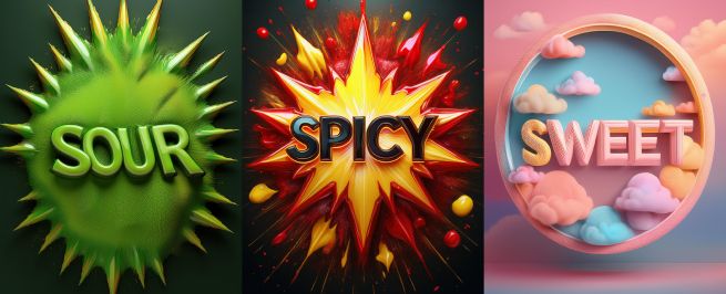
3. "Tasting with Your Eyes": How Visual Cues Shape Flavor
As we learned in the previous lesson, color is a primary visual cue. But shape and imagery are just as important in setting taste expectations.
Shape Psychology
Building on the Bouba-Kiki effect, research shows a strong link between shape and perceived taste:
- Rounded shapes are typically associated with sweetness.
- Angular or sharp shapes are associated with sourness, bitterness, or saltiness.
Beyond the Taste Buds: How Packaging Shapes Our Perception
Let's return to the 'Beyond the Taste Buds' article to see how shape psychology is applied in practice.
Please read the section 'Shaping perception'. It gives concrete examples of how the shape of yogurt or cheese packaging can change our expectation of its taste, even if the product inside is identical.
When Visuals Set You Up for a Fall
The expectations set by visuals are so powerful that they can completely alter our actual taste experience. Professor Charles Spence, a leading expert in this field, provides a brilliant example.
The Perfect Meal | Professor Charles Spence | Talks at Google
In this talk from Google, Professor Charles Spence tells the story of a savory ice cream. It's a fantastic real-world case study on how disconfirmed visual expectations can ruin an experience.
Please watch from 07:22 to 09:08. Listen for how the visual appearance of the dish (it looks like a sweet strawberry ice cream) created such a strong expectation that when people tasted it, they perceived it as 'too salty'—even though it was perfectly seasoned.
This example is perfect for when you need to explain this concept to others. It clearly demonstrates that what we see can dominate what we taste. The brain expected sweet, got savory, and registered the conflict as a negative experience.
4. "Feeling the Quality": The Power of Touch and Sound
Beyond sight, the physical feel—or haptics—of a package is a critical driver of perceived quality. Our brains use simple heuristics: heavier often means more substantial and higher quality, and a unique texture signals a premium or special product.
Weight and Texture
The weight and texture of packaging can make us believe a product is more reliable, luxurious, or even more filling.
Let's revisit the 'What is Sensory Marketing?' video, which has an excellent segment on the power of touch in packaging.
Please watch from 01:06 to 02:22. The video explains how the weight of an Apple product's box or the sturdiness of food packaging subconsciously affects our perception of the product's quality.
Marketers intentionally design packaging with tactile elements to create these associations.
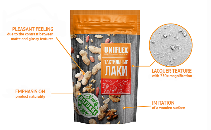
The article "Multi-Sensory Packaging, Haptics, and Neuroscience" further explains that tactile elements like embossing (raised patterns) or soft-touch coatings not only signal luxury but also invite consumers to touch the product. This interaction increases a feeling of "psychological ownership," making a purchase more likely.
Auditory Cues
Even the sound a package makes can be a cue. Think about:
- The satisfying "snap" of a quality jar of pickles.
- The crisp "crinkle" of a fresh bag of chips.
- The solid "thump" of a high-end cosmetic jar placed on a counter.
According to the article "Multi-Sensory Packaging...", studies have shown that drinks from a can with a more satisfying opening "pop" were rated as higher in quality and carbonation. This sound becomes a signal of freshness and a quality experience.
Test your understanding!
A coffee company is launching two new products:
- Product A: An intense, bitter, high-caffeine "espresso blast" coffee blend.
- Product B: A smooth, creamy, sweet-noted "vanilla latte" blend.
For each product, describe one visual packaging choice (shape/imagery) and one haptic packaging choice (texture/material) that would help set the correct sensory expectations. Justify each choice using a principle from this lesson.
Show answer
Product A (Intense Espresso Blast):
- Visual Choice: The packaging should be an angular, rectangular box with sharp lines and dark colors (like black or deep brown). This angularity corresponds with the expected bitter, sharp taste profile.
- Haptic Choice: The packaging could have a coarse, slightly rough texture, perhaps like unfinished paper or a grainy finish. This tactile roughness signals an unrefined, powerful, and intense product experience.
Product B (Smooth Vanilla Latte):
- Visual Choice: The packaging should be a rounded, curved bag or canister. This roundness creates an expectation of sweetness and a smooth, mellow flavor, consistent with a vanilla latte.
- Haptic Choice: The packaging should have a soft-touch matte finish. This velvety, smooth feel directly transfers to the expectation of a creamy, smooth-tasting coffee.
Conclusion
Today we've seen that packaging is far more than a simple container; it is a multi-sensory messenger that primes our brain for the product experience. By understanding how consumers instinctively connect what they see and feel with what they expect to taste and value, marketers can design packaging that tells the right story from the very first glance.
Key Takeaways:
- Packaging creates sensory expectations about a product through cross-modal correspondences, the brain's automatic linking of different senses.
- Visual cues like shape are critical: rounded shapes suggest sweetness, while angular shapes suggest sharpness or bitterness.
- Haptic (touch) cues like weight, texture, and material are powerful shortcuts for perceived quality. A heavier, more textured package often feels more premium.
- Auditory cues, like the sound of opening a package, can reinforce perceptions of freshness and quality.
- Effective packaging ensures sensory congruence, where all cues (color, shape, texture, sound) align to tell a single, coherent story about the product.
Preview of the Next Lesson:
We have now thoroughly examined the package itself. In our next lesson, we will zoom out to look at the environment where the package lives. Our focus will be on analyzing how the layout and sensory elements of a retail space (e.g., lighting, music, traffic flow) influence shopping behavior.