Hello! Welcome to the first lesson of our new module: Psychology of Packaging and Retail Environments.
In our last module, we explored how brands build an emotional personality and connect with consumers on an identity level. Today, we bring those big ideas to the most critical, tangible point of contact: the product package on a shelf. In the split second a consumer scans an aisle, the package must do all the work—grab attention, communicate what the product is, and convey a key benefit or brand value.
Your learning outcome for this lesson is to be able to apply visual hierarchy principles to package design to guide consumer attention to key information. We'll explore how designers use fundamental visual cues to create a "pathway" for the consumer's eye, ensuring the most important messages are seen first. This is a core skill in translating psychological principles into effective marketing execution.
1. The Science of First Impressions: Visual Hierarchy
Before a consumer consciously decides to read a label, their brain has already performed a rapid, subconscious scan of the environment. It's a survival mechanism leftover from our evolutionary past: our brains are wired to prioritize information and quickly spot what's different or important without us even trying. This is the foundation of visual hierarchy.
Visual hierarchy is the intentional arrangement of design elements to signal importance and guide the viewer's eye. To understand the "why" behind this, let's touch on the neuroscience.
Unpacking 'good design' through Visual Hierarchy
The article 'Unpacking 'good design' through Visual Hierarchy' from Dragonfly AI gives a concise explanation of the science at play. It introduces the idea of the 'pre-cognitive stage' of viewing, which is crucial for your interest in the neurophysiological side of marketing.
Please read the section titled 'The Science Behind Visual Hierarchy'. Focus on the list of visual cues and the concept of how our brains prioritize information before our conscious mind kicks in.
As the article explained, our brains are automatically drawn to certain visual cues like color, contrast, and scale. Marketers don't fight this innate programming; they leverage it. By understanding these pre-cognitive triggers, a designer can create a package that "talks" to the brain's attention system, making sure the right message lands first.
2. The Designer's Toolkit for Guiding Attention
Now that we know why visual hierarchy works, let's look at what tools designers use to create it. These are the fundamental building blocks for directing a consumer's gaze.
The following video provides an excellent overview of the primary techniques designers use to establish a clear hierarchy.
The ONLY Video On Visual Hierarchy ANY Graphic Designer Needs
This video, 'The ONLY Video On Visual Hierarchy ANY Graphic Designer Needs' by Satori Graphics, breaks down the core principles in a clear, practical way. It will give you the vocabulary to deconstruct almost any design.
Please watch the following segments: 01:34 - 03:20: Focus on the explanation of Size and Color as tools for hierarchy. 12:47 - 14:14: Pay attention to the role of Typography and, crucially, Whitespace (the space between elements). 15:36 - 16:49: This is a quick-fire summary of all the key hierarchy techniques. It's a great final recap.
From the video, you've now seen the main tools at your disposal:
- Size: Larger elements are perceived as more important.
- Color: Bright, contrasting colors capture attention.
- Contrast: High contrast between an element and its background makes it pop.
- Typography: The style, weight (boldness), and size of fonts create a hierarchy of information.
- Whitespace: The empty space around elements gives them "room to breathe" and makes them more prominent.
These are not just abstract design rules; they are the levers we pull to direct a consumer's brain to see the Brand Name, then the Product Type, then the Key Benefit, in exactly that order.
3. Applying Hierarchy to Packaging
Let's now take these principles and apply them directly to our focus area: package design. A grocery store aisle is one of the most cluttered visual environments imaginable, and hierarchy is what allows a product to win the "shelf-war."
The following article is purpose-built for our topic, showing how each principle is used on real-world labels.
Visual Hierarchy on Labels and Packaging
The article 'Visual Hierarchy on Labels and Packaging' from Label Media Solutions is a fantastic resource that connects each principle directly to package design with clear examples.
Read the article from the beginning down to the end of the 'SPACING' section. As you read, notice how each example uses a combination of principles (e.g., size and contrast) to achieve its effect.
This article provides a practical masterclass in applying the principles:
- Size tells the consumer what to read first. Is it the brand name ('Canyon Coffee') or a product feature? The choice depends entirely on strategy.
- Color helps a product stand out and can be used to differentiate variants in a product line, like different flavors of soda or cider.
- Contrast is key for readability. White text on a dark background or a transparent label showing the colorful product inside are effective ways to draw the eye.
- Spacing (or whitespace) prevents a design from feeling cluttered and overwhelming. By grouping related information and separating it from other groups, you make the package easy to scan.
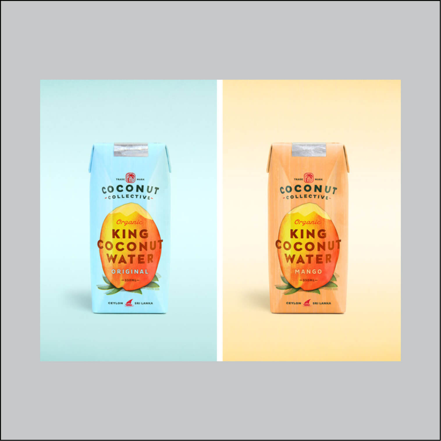
4. Creating a Visual Roadmap: F-Patterns and Z-Patterns
Beyond individual elements, visual hierarchy is also about the overall layout. How do you arrange information on a package to align with how people naturally scan content? Two of the most common scanning patterns in the Western world are the F-pattern and the Z-pattern.
- Z-Pattern: The eye scans from top-left to top-right, then diagonally down to the bottom-left, and finally across to the bottom-right. This is great for designs with minimal text where you want to lead the viewer from a logo to a key image, then to a final call-to-action.
- F-Pattern: The eye scans the top of the page, then moves down and scans another horizontal line (like the crossbars of an 'F'), and finally scans vertically down the left side. This is common for more text-heavy designs, like websites or the back of a cereal box.
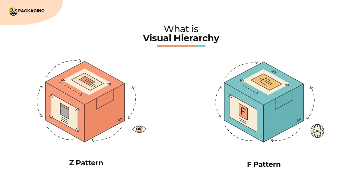
By understanding these natural tendencies, you can place your most important information (e.g., brand name, primary benefit) where the eye is most likely to land. The Satori Graphics video referred to this as the "hook, secondary detail, and finisher" model—a simple but powerful way to structure the consumer's visual journey.
Test your understanding!
Imagine you are designing the front of a package for a new brand of high-protein, organic chocolate bar called "Verve". The target audience is health-conscious but busy.
Using the principles of visual hierarchy (size, color, contrast, spacing, and a scanning pattern like the Z-pattern), decide the hierarchy for these three key pieces of information:
- Brand Name: "Verve"
- Key Benefit: "20g Protein"
- Product Descriptor: "Organic Dark Chocolate"
Describe the position and design attributes (e.g., "largest font," "brightest color") you would assign to each piece of information to guide a consumer's attention.
Show answer
There can be multiple correct answers, but here is one effective strategy based on a Z-pattern:
- Top-Left (Hook): The brand name "Verve" would be placed here. It would be in the largest font to establish brand identity first. This is the first stop in a Z-pattern.
- Center/Slightly Below: The key benefit "20g Protein" would be the main visual anchor. It would use a bold font and a high-contrast color (e.g., a bright circle behind the text) to make it pop. This is the element that grabs the busy, health-conscious consumer.
- Bottom-Right (Finisher): The product descriptor "Organic Dark Chocolate" would be placed in the bottom right corner. The font would be smaller than the brand name and benefit, but still clear and legible. This provides the final piece of information as the eye completes the Z-scan, confirming what the product is.
Spacing would be used to ensure these three elements are distinct and don't crowd each other, making the package feel clean and premium.
Conclusion
Well done! You have now learned how to deconstruct the visual language of packaging. This isn't just about aesthetics; it's a direct application of cognitive psychology to influence consumer attention and choice in a matter of seconds.
Key Takeaways:
- Visual hierarchy leverages the brain's pre-cognitive ability to prioritize information based on cues like size, color, and contrast.
- The primary tools for creating hierarchy are size, color, contrast, spacing, and typography.
- In package design, these tools are used to guide the consumer's eye to the most critical information first (e.g., brand, benefit).
- Layouts often follow natural scanning paths like the F-pattern or Z-pattern to create a predictable visual journey for the consumer.
Preview of the Next Lesson:
Today we focused on the 2D design on the package. In our next lesson, we'll explore the package itself. We will learn how package shape and structural design can influence product perception and usage experience. We'll move from what the consumer sees to what they hold and feel.