Welcome back. In our last lesson, you transformed the static ProfileCard into a dynamic and reusable component by learning how to pass data using Svelte 5's $props rune. Your main page now displays multiple, unique cards, but their layout is still quite basic. If you shrink your browser window, you'll notice the cards simply wrap onto new lines, which is functional but not always ideal for a polished user experience on mobile devices.
Today, we will address this by diving into responsive design with TailwindCSS. You'll learn how to make your components look great on any screen, from a small phone to a large desktop monitor. We'll focus on Tailwind's mobile-first philosophy and its powerful breakpoint prefixes, which allow you to apply different styles at different screen sizes. Since you have experience with web development in the MERN stack and Next.js, you're already familiar with the importance of responsive layouts; this lesson will show you Tailwind's elegant, utility-first approach to achieving them.
By the end of this lesson, you will have a ProfileCard component and a main page layout that are fully responsive, adapting seamlessly to different devices.
The Core of Responsive Design in Tailwind
Tailwind's approach to responsive design is built on a simple but powerful idea: mobile-first. This means that any utility class you apply without a prefix (e.g., text-center, bg-slate-100) applies to all screen sizes, starting from the smallest mobile view. To make changes for larger screens, you add a special prefix.
This GIF perfectly illustrates the result: a layout that starts as a single column on a narrow screen and dynamically rearranges into multiple columns as the screen gets wider.

Tailwind provides a set of default breakpoints, which are essentially predefined minimum screen widths. The most common ones are:
sm:(small) for screens 640px wide and upmd:(medium) for screens 768px wide and uplg:(large) for screens 1024px wide and upxl:(extra large) for screens 1280px wide and up2xl:(double extra large) for screens 1536px wide and up
A key concept to grasp is that these are min-width breakpoints. A class with an md: prefix will apply to medium screens and also to lg, xl, and 2xl screens, because they are all wider than 768px.
The following video provides a concise and clear explanation of these breakpoints and the min-width concept.
How to Create Responsive Websites (TailwindCSS)
Watch this short segment from Austin Davis's video "How to Create Responsive Websites (TailwindCSS)". It clearly explains the five standard breakpoints and the crucial concept that they represent minimum widths.
Pay close attention to the explanation from the introduction. The table he shows is a great reference for the default breakpoint sizes.
Applying Responsive Prefixes: A Practical Example
Let's put this theory into practice by refactoring your project. Our goal is to make the layout of the ProfileCard itself more adaptive and to organize the cards on the main page into a responsive grid.
Step 1: Making the ProfileCard Layout Responsive
Currently, your ProfileCard has a fixed width of w-80. This looks fine on a desktop, but on a narrow mobile screen, it might not leave enough horizontal space. Let's change it to be full-width on mobile and revert to the fixed width on larger screens.
- Open
src/lib/components/ProfileCard.svelte. - Find the main
divelement for the card. - Change its
classattribute fromw-80tow-full md:w-80.
// src/lib/components/ProfileCard.svelte

// ... script tag ...

<div class="w-full md:w-80 rounded-lg bg-white p-6 shadow-lg">
  <!-- ... rest of the card content ... -->
</div>
With this change, the card will take up the full width of its container by default (on mobile). Once the screen width hits 768px (md:), the width will be constrained to w-80 (20rem).
Now, let's go a step further. The content inside the card (image, text, button) is stacked vertically. This is great for mobile, but on a wider screen, we might prefer to have the image on the left and the text content on the right. This is a classic responsive pattern.
- Inside
ProfileCard.svelte, find thedivthat contains the image and wrap it, along with the subsequentdivcontaining the text and thedivcontaining the follow button, in a new parentdiv. - Apply flexbox classes to this new parent
divto control the layout.
Here’s how you can modify the markup:
// src/lib/components/ProfileCard.svelte

// ... script tag ...

<div class="w-full md:w-80 rounded-lg bg-white p-6 shadow-lg">
  <div class="flex flex-col items-center md:flex-row md:items-start md:gap-6">
    <!-- Image -->
    <img
      class="h-24 w-24 flex-shrink-0 rounded-full md:h-20 md:w-20"
      src={avatarUrl}
      alt="Profile of {name}"
    />

    <!-- Text content and Button grouped together -->
    <div class="flex flex-grow flex-col items-center md:items-start">
      <div class="mt-4 text-center md:mt-0 md:text-left">
        <h2 class="text-xl font-semibold text-slate-800">{name}</h2>
        <p class="mt-1 text-sm text-slate-600">{bio}</p>
      </div>

      <!-- Follow Button -->
      <div class="mt-4 w-full">
        <button class="w-full rounded-lg bg-blue-600 px-4 py-2 text-sm font-semibold text-white hover:bg-blue-700">
          Follow
        </button>
      </div>
    </div>
  </div>
</div>
Let's break down these class changes:
flex flex-col items-center: This is our mobile-first default. It creates a vertical flex column and centers everything, just like it was before.md:flex-row md:items-start md:gap-6: This is where the magic happens. On medium screens and up, the layout switches to a horizontal row (flex-row), aligns items to the top (items-start), and adds a gap between the image and the text content (gap-6).flex-shrink-0: We add this to theimgto prevent it from shrinking if the container gets crowded.md:h-20 md:w-20: We slightly reduce the image size on medium screens to better fit the horizontal layout.flex-grow: We add this to the text/button container so it takes up the remaining available space.md:text-left: We change the text alignment from centered to left-aligned on medium screens.
This pattern of switching from flex-col to flex-row is extremely common. The next video demonstrates this exact technique.
The BEST Way to Create Responsive Design with Tailwind CSS (2025)
This segment from Lukas's video "The BEST Way to Create Responsive Design with Tailwind CSS" provides a great walkthrough of converting a stacked mobile layout into a side-by-side desktop layout.
Watch from this point to see how he uses md:grid-cols-2 and md:text-left to adapt the layout, which is very similar to what we just did. Notice his clear explanation that every utility needs its own prefix.
Step 2: Creating a Responsive Grid on the Main Page
Now that the individual card is responsive, let's improve the layout of the page that holds all the cards. Instead of letting them wrap unpredictably with flex-wrap, we can use Tailwind's grid system to create a structured, responsive grid.
- Open
src/routes/+page.svelte. - Find the main container
divthat wraps all the<ProfileCard>components. - Replace the flexbox classes with grid classes.
Modify the div like this:
// src/routes/+page.svelte

// ... script tag ...

<main class="min-h-screen bg-slate-100 p-8">
  <div class="mx-auto grid max-w-6xl grid-cols-1 gap-8 md:grid-cols-2 lg:grid-cols-3">
    <!-- ProfileCard components go here -->
    <ProfileCard {name} {bio} {avatarUrl} />
    <ProfileCard
      name={jane.name}
      bio={jane.bio}
      avatarUrl={jane.avatarUrl}
    />
    <ProfileCard
      name={sam.name}
      bio={sam.bio}
      avatarUrl={sam.avatarUrl}
    />
  </div>
</main>
Let's analyze the new classes on the container div:
grid: This establishes a grid container.grid-cols-1: This is our mobile-first default. It creates a single-column grid, stacking the cards vertically.gap-8: This creates space between the grid items.md:grid-cols-2: On medium screens (≥768px), the layout switches to a two-column grid.lg:grid-cols-3: On large screens (≥1024px), it expands to a three-column grid.max-w-6xl mx-auto: We've added these to constrain the maximum width of the grid on very large screens and center it horizontally.
Now, resize your browser window. You should see the layout smoothly transition from one, to two, and then to three columns. You've just built a fully responsive component layout!
For a more detailed read on these concepts, the following article provides excellent examples and explanations.
Zero-to-hero Tailwind CSS tutorial: Build modern websites like a pro
This article provides a thorough guide to responsive design in Tailwind. It reinforces the concepts we've just practiced.
Focus on the section Learn responsive design. Pay special attention to the subsections on "Breakpoints" and "Building Stacked-to-Grid Layouts," as they directly correspond to the changes you just made.
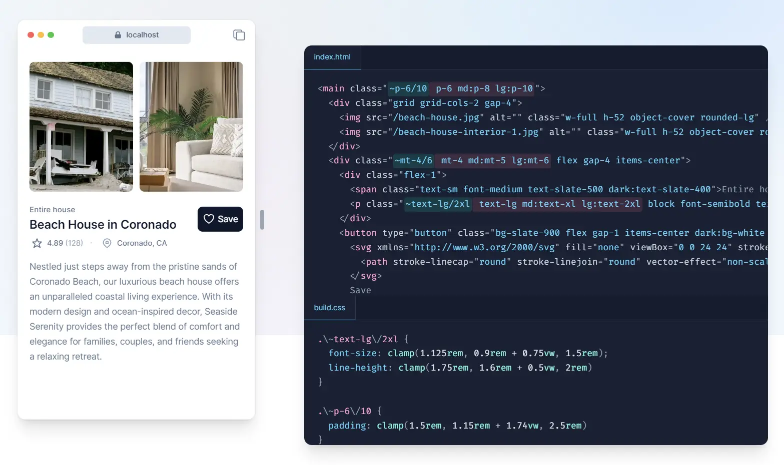
The image below, similar to the one in the article, shows the kind of professional, responsive component you can build using these techniques.
Conclusion
In this lesson, you've taken a huge step forward in building modern web interfaces. You've learned how to harness Tailwind's mobile-first design philosophy and its breakpoint prefixes to create layouts that are not just functional, but also polished and adaptive across all devices.
Key Takeaways:
- Mobile-First by Default: Unprefixed Tailwind classes apply to all screen sizes, establishing your base mobile layout.
- Breakpoint Prefixes for Larger Screens: Use prefixes like
md:andlg:to override or add styles for specific minimum screen widths. - Common Responsive Patterns: You practiced two fundamental patterns:
- Switching a component's layout from vertical (
flex-col) to horizontal (flex-row). - Arranging items in a responsive grid that changes the number of columns (
grid-cols-1,md:grid-cols-2, etc.).
- Switching a component's layout from vertical (
- One Prefix per Utility: Remember that each utility class that needs to be responsive must have its own prefix (e.g.,
md:flex-row md:items-start, notmd:flex-row items-start).
Your ProfileCard component is now well-styled, accepts dynamic data, and displays beautifully on any screen. You've completed the foundational UI work for this component. In our next module, we'll shift our focus from styling and structure to behavior and interactivity, starting with how to conditionally render elements using Svelte's {#if} blocks.