Welcome back! In our last session, we demystified JSX, learning how it serves as a descriptive syntax for what our UI should look like and how it gets converted into regular JavaScript. Now, we'll put that knowledge to work by creating the fundamental building blocks of every React application: components.
Your goal is to build a web component library, and this lesson is your first concrete step in that direction. A component library is, at its core, a collection of well-crafted, reusable UI pieces. Today, you will learn how to define these pieces as functional components—JavaScript functions that return JSX—which will form the foundation of everything you build in this course.
What Are Components?
In React, we don't build monolithic pages. Instead, we break down the user interface into small, self-contained, and reusable parts called components. Think of them like custom HTML tags you invent for your application. A button, a user profile card, a search bar—each of these can be a component.
Your experience with traditional web development involved creating structured HTML documents. React takes this a step further by allowing you to encapsulate that structure, along with its associated styles and logic, into a single, reusable JavaScript function. This modular approach is what makes building complex applications manageable and is the essence of creating a component library like Material UI or Chakra UI.
The official React documentation provides an excellent introduction to this core concept.
This reading from the React team introduces the idea of components as UI building blocks and summarizes their key characteristics.
Please read the introduction under Components: UI building blocks and the final Recap section. This will solidify the what and why of components before we dive into the how.
Defining a Functional Component
At its heart, a React functional component is a JavaScript function with two simple rules:
- Its name must start with a capital letter (e.g.,
MyComponent, notmyComponent). This convention is crucial because it allows the JSX transpiler to distinguish between your custom components and standard HTML tags (likedivorp). - It must return a block of JSX that describes the UI it should render.
Let's look at the anatomy of a basic component.
This section of the documentation provides a clear, step-by-step guide to defining your first component.
Read the entire section Defining a component. Pay close attention to the three steps: exporting, defining the function, and adding the markup. The "Pitfall" notes about capitalization and using parentheses for multi-line JSX are particularly important.
The process looks like this: you write a JavaScript function that returns some JSX, and React takes care of rendering that JSX into actual DOM elements in the browser.
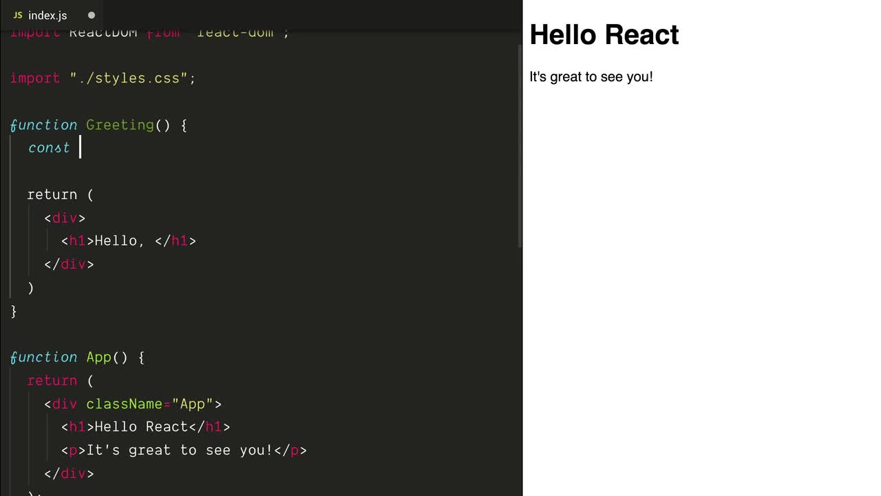
A Practical Walkthrough
Theory is great, but seeing it in action makes it click. The following video demonstrates how to create a functional component in a separate file, import it into the main application, and render it. It also introduces the common convention of using ES6 arrow functions.
ReactJS Tutorial - 5 - Functional Components
This tutorial from Codevolution, "Functional Components," provides a concise and practical demonstration of creating and using components.
Please watch the following segments: The definition of a functional component. The process of creating a component file (greet.js), defining the function, returning JSX, exporting it, and then importing and using it in App.js. The switch to the more modern ES6 arrow function syntax, which is standard in today's React code. Finally, watch from the explanation of default versus named exports. Your background in JavaScript and Node.js will make this concept familiar, and it's crucial for managing imports in a larger project.
Let's Code: Your First Component
Now it's your turn to apply what you've learned in your own project.
-
Open the Vite project you created in our first lesson.
-
Inside the
srcfolder, create a new folder namedcomponents. This is a standard convention for organizing reusable components. -
Inside
src/components, create a new file namedWelcome.jsx. -
In
Welcome.jsx, write your first component using the arrow function syntax:const Welcome = () => { return ( <div> <h2>Welcome to Your Component Library!</h2> <p>This is the first reusable piece of our project.</p> </div> ); }; export default Welcome; -
Now, open
src/App.jsx. Remove the boilerplate content inside thereturnstatement. -
Import your new
Welcomecomponent at the top of the file:import Welcome from './components/Welcome'; -
Finally, render your component inside the
Appcomponent's JSX, just like a custom HTML tag:function App() { return ( <> <h1>My App</h1> <Welcome /> </> ); } export default App;
Run your development server (npm run dev) and you should see your new component rendered on the page! Try rendering the <Welcome /> component multiple times to see reusability in action.
Component Composition and Key Rules
As you just saw, you can use components inside other components. This is called composition, and it's one of React's most powerful features. The App component is the "parent," and each <Welcome /> instance is a "child."
This part of the React docs explains how components are nested and organized.
Read the section Using a component. The key takeaway here is understanding the parent-child relationship and the critical rule: you must never define a component function inside another component function. Always define them at the top level of your file.
While writing your component, you also followed a key JSX rule: returning a single root element. Your h2 and p tags were wrapped in a div. What if you don't want to add an extra div to the DOM? React provides a special syntax called a Fragment.
Returning JSX from Component Functions
This resource clearly explains the "single root element" rule and introduces its solution, Fragments.
Read the "Key Concepts" section, focusing on the two parts: JSX Must Be Wrapped and Returning JSX Without a Wrapper. The shorthand <>...</> is what you'll see in most modern codebases, including the App.jsx example above.
Finally, the real power of components comes from making them dynamic. You can embed JavaScript variables and expressions directly into your JSX using curly braces {}.
React For Beginners #3 - Components and JSX
This video from Tech With Tim provides a quick and clear example of using JavaScript inside JSX.
Watch the segment from the demonstration of JSX. This shows how to define a variable within a component and render its value within the return statement using curly braces.
Try it yourself! In your Welcome.jsx component, add a variable and display it:
const Welcome = () => {
  const learnerName = "your name here"; // Change this!
  return (
    <div>
      <h2>Welcome to Your Component Library, {learnerName}!</h2>
      <p>The current year is {new Date().getFullYear()}.</p>
    </div>
  );
};

export default Welcome;
Conclusion
You've made significant progress today, moving from the theory of JSX to the practical application of building components. This is the core workflow of a React developer and the first step toward building your component library.
Here are your key takeaways:
- Components are reusable UI building blocks, defined as JavaScript functions.
- A component's name must begin with a capital letter.
- A component must return a single root JSX element, using a wrapper
divor a Fragment (<>...</>). - Components are composed by nesting them within each other, like HTML tags.
- You can use curly braces
{}to embed dynamic JavaScript expressions directly in your JSX. - Using ES6 arrow functions and default exports is the modern convention for defining components.
In our next lesson, we'll explore how to make our components even more powerful and reusable by passing data to them from a parent component using a mechanism called props.