Welcome back. In our last lesson, we explored the complex relationship between text and image, deciding what your book will say and how it will say it. You've now established the complete internal content of your project—the sequence of images and the accompanying words. Now, we shift our focus from the content within the book to the book itself as a physical, tangible object.
Your background in sculpture and fine arts gives you a unique sensitivity to form and material. We will leverage that today. A photo book is not just a container for images; it is a sculptural object with its own presence, weight, and texture. This lesson is about making deliberate choices for its physical form—the paper, the binding, the cover materials—to ensure the final object feels as intentional as the photographs within it. Our goal is to select material qualities that enhance your book's conceptual and tactile experience.
The Book as a Complete Object
Before we can make informed choices, we need a shared vocabulary for the physical components of a book. While some of these terms may be familiar from your graphic design work, seeing them demonstrated in the context of a photo book will clarify their specific roles and expressive potential.
The video "The Anatomy of the Photobook" by Sebastian Siadecki provides an excellent and clear visual introduction to the physical parts of a hardcover book. It methodically breaks down the terminology we will be using throughout this lesson.
Please watch the section from 02:20 to 05:16. As you watch, pay close attention to the terms used to describe the cover (board, spine, bookcloth, joint), the edges (head, tail, fore-edge), and the pages (endpapers, leaf, recto/verso, gutter). This will form the foundation for our discussion.
Understanding these parts allows us to see the book not as a generic package, but as a system of interconnected components, each offering an opportunity for creative expression.
The Heart of the Experience: Paper
The paper you choose is arguably the most significant material decision you will make. It directly impacts the viewer's tactile experience, the visual reproduction of your photographs, and even the pacing of the book. As noted in the article "Performing the Photobook," the texture and weight of the paper can affect the speed at which a viewer turns the pages, subtly influencing the narrative rhythm you established during sequencing.
The two primary characteristics of paper are its weight and its finish.
Paper Weight (GSM)
Paper weight is typically measured in grams per square meter (GSM). A standard office paper might be 80 GSM, while the pages of a high-quality photo book can range from 115 GSM to 200 GSM or more.
- Lighter paper (e.g., < 120 GSM) feels more delicate, like a magazine or a novel. It allows for more pages in a thinner book but can feel less substantial.
- Heavier paper (e.g., > 150 GSM) provides a sense of luxury and permanence. The pages are stiffer and more opaque, giving each image more individual presence.
Paper Finish
The finish of the paper determines its texture and sheen, which radically alters how your images look and feel. The main distinction is between coated and uncoated stock.
- Coated papers have a surface sealant (often clay-based) that restricts ink absorption. This results in sharper details, deeper blacks, and a smoother surface. Finishes range from high gloss to a semi-gloss "silk" or "lustre."
- Uncoated papers are more porous and have a natural, matte texture. Ink sinks into the paper fibers, which can result in a softer, lower-contrast look. They feel more organic and are completely non-reflective.
Let's return to "The Anatomy of the Photobook" for a powerful demonstration of how paper choice affects an image. The presenter compares two editions of the same book by Robert Adams, one printed on coated paper and the other on uncoated.
Watch the segment from 23:05 to 27:11. Observe the difference in reflectivity, contrast, and overall mood between the coated and uncoated examples. Also, note the discussion of paper weight (GSM) and the use of different paper stocks within a single book to differentiate content.
To deepen your understanding of the nuances within these categories, the next resource breaks down the most common finishes.
Gloss, Lustre or Matt? All About Paper Types for Your Photo Books
The video "Gloss, Lustre or Matt?" by Photo Book Guru offers a clear, comparative look at the five most common paper finishes you'll encounter.
Watch the section on finishes from 05:45 to 11:37. Pay attention to the descriptions of silk, glossy, lustre, matte, and uncoated paper. The visual examples will help you connect the terminology to the actual look and feel of the paper. Also, note the important mention of acid-free paper, which is essential for archival quality.
The Structure and Flow: Binding
Binding determines how a book is held together and, crucially, how it opens and lies on a surface. This choice has major implications for your layout, especially for images that cross the center gutter.
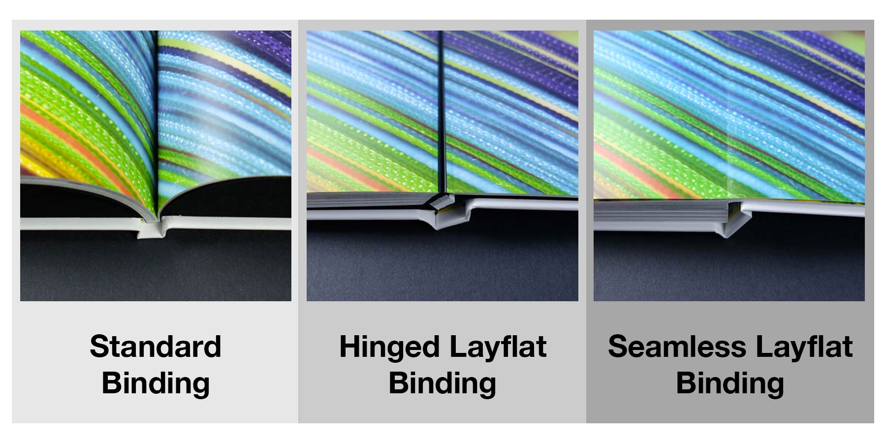
The "Anatomy of the Photobook" video provides the most comprehensive visual survey of the binding options available to you, from common commercial methods to more handmade, artistic approaches.
This extended segment from "The Anatomy of the Photobook" explains how books are constructed from folded "signatures" and then demonstrates a wide variety of binding techniques.
Watch the segment from 05:16 to 18:58. Focus on understanding the difference between the two most common types: Perfect bound: Signatures are glued at the spine. Inexpensive, but doesn't lay flat and can be less durable. Smyth sewn (or Section sewn): Signatures are sewn together with thread. The gold standard for durability; allows the book to open more freely. Then, observe the other creative options presented, such as saddle stitch, Japanese side stab, Swiss binding, and accordion fold (leporello). Think about which of these might align with the concept of your project.
The First Touch: Cover Materials
The cover is the viewer's first physical interaction with your book. Its material signals the nature of the work inside. Think of this as choosing the material for a sculpture—is it raw and textured, or smooth and refined?
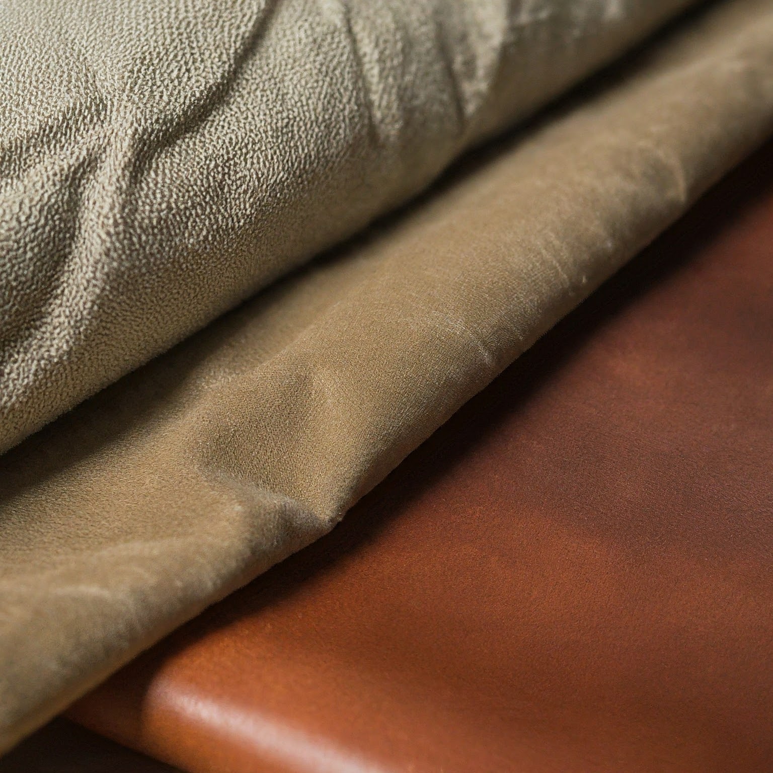
Common choices include:
- Bookcloth: A durable, woven fabric (often linen or cotton) that comes in many colors and textures. It feels classic and substantial.
- Paper-wrapped hardcovers: An image or design is printed on paper that is then laminated and wrapped around the boards. This allows for full-color printed covers.
- Softcovers: A heavier weight of the interior paper stock or a dedicated cover stock is used. This feels more informal and zine-like.
- Experimental Materials: Your fine art background might draw you to less conventional materials like raw bookboard, wood, or acrylic.
The "Covers" section of "The Anatomy of the Photobook" video showcases several common decorative and material choices for hardcovers.
Watch the segment from 18:58 to 23:05. Note the explanations of bookcloth, foil stamping, tipped-on images, and quarter binding. These are all techniques for adding layers of texture and refinement to your cover.
Synthesis: Materiality as Meaning
Individual material choices are important, but their true power comes from how they work together to support your book's core concept. The most successful photo books are those where the physical form is inseparable from the photographic content.
The following article presents several artists who have masterfully integrated material choices into their book's meaning.
An Incomplete Guide To Photobook-Making - PhMuseum
This article from PhMuseum features artists discussing their photobook-making process. Their reflections provide perfect examples of how materiality can serve a book's narrative and conceptual goals.
First, read about Max Pinckers's book, Margins of Excess. Pay close attention to how he used different paper stocks to represent different "truths": his paper choices. Also, note his conceptual use of binding: glued in, not bound. Next, read about Ngadi Smart's Wata Na Life. Notice how the book's physical structure was designed to mirror her artistic process: the structure mirrored her process. Finally, read Allan Salas's reflection on his book Thorns. His closing statement perfectly summarizes our goal for this lesson: creating a tactile experience.
These examples demonstrate that materiality is not an afterthought but a fundamental part of the artistic statement. Your task is to think like these artists, translating your project's themes into physical, tactile sensations.
Exercise: Defining Your Book's Physical Form (Approx. 40 minutes)
This exercise asks you to make concrete material decisions for your own project and, most importantly, to justify them conceptually.
Part 1: Material & Textural Research (15 minutes)
Gather samples—either physical or digital—that align with the mood of your project.
- Physical (Ideal): If you have access to them, find scraps of paper with different weights and finishes, textured fabrics, or pieces of cardboard. Feel them. Hold them to the light.
- Digital: If you're working digitally, create a small "material mood board." Find high-resolution images of paper textures (e.g., "matte uncoated paper texture," "lustre photo paper sheen"), bookcloth, and binding styles (e.g., "exposed Smyth sewn spine," "Japanese stab binding").
Part 2: The Specification Sheet (25 minutes)
Create a document and outline the physical specifications for your book. For each of the three categories below, make a specific choice and then write a 2-3 sentence justification explaining why this choice supports your project's concept.
-
Paper:
- Choice: Specify a finish (e.g., uncoated matte, silk coated, high gloss) and an approximate weight (e.g., "heavy," ~170 GSM; "light," ~115 GSM).
- Justification: How does this paper's look and feel enhance your images and the book's theme? Does it create a sense of nostalgia, clinical precision, raw energy, or quiet luxury?
-
Binding:
- Choice: Select a binding method (e.g., Smyth sewn hardcover, perfect bound softcover, saddle stitch, Japanese stab).
- Justification: How does this binding contribute to the experience? Does your project need to lay perfectly flat? Should it feel like a precious object, a functional document, or a handmade zine?
-
Cover:
- Choice: Describe the cover material and any special features (e.g., navy blue linen bookcloth with a debossed title, raw bookboard with a tipped-on image, full-color laminated softcover).
- Justification: What is the first impression you want to create? What does the tactile sensation of the cover communicate about the work inside?
This exercise will produce a blueprint for the physical object you intend to create, ensuring that its form is as considered as its content.
Conclusion
Today we have deconstructed the photo book as a physical object and explored how its material components are powerful expressive tools. You have moved beyond just thinking about the images on the page to considering the page itself, the way it's bound, and the cover that encloses it.
Key Takeaways:
- The book is a sculpture: Every element, from the endpapers to the fore-edge, contributes to the book's identity as a three-dimensional object.
- Materiality is conceptual: Paper choice affects the perception of your images; binding dictates the flow and structure; cover materials set the initial tone. These are not merely technical decisions but core artistic ones.
- Holistic design: The most resonant photo books are those in which the physical form and the conceptual content are seamlessly integrated, creating a singular, immersive experience for the viewer.
You have now considered all the interior and exterior elements of your book object. In our next lesson, we will focus specifically on the final piece of the design puzzle: the cover. Building on your choice of materials, we will explore how to use typography and imagery to design a cover that acts as a compelling and conceptually sound entry point to your entire project.