Hello! Let's continue building your high-converting cover.
In our last lesson, we focused on the foundational principles of good design: visual hierarchy, contrast, and readability. You performed a critical audit of your existing cover using the squint, grayscale, and thumbnail tests to diagnose its weak points. This gave you the "why" behind what makes a cover succeed or fail.
Today, we move from principle to practice. Our goal is to select appropriate fonts, colors, and imagery that align with your niche. You'll learn how to choose the specific building blocks of your cover to communicate your book's theme instantly and professionally. These choices are what turn a generic cover into one that speaks directly to your target customer and convinces them to click.
1. Mastering Typography: More Than Just Words
Fonts are one of the most powerful—and often overlooked—tools in cover design. The right font choice signals your genre and audience in a split second. The wrong choice can make your cover look amateurish and confusing, killing sales before a customer even reads the title.
To start, let's understand the basic types of fonts you'll encounter.
Do Fonts Matter? - 5 Tips to KDP Success
In this short clip, KDP publisher Paul Marles provides a clear, concise overview of the four basic font categories. This will give you the vocabulary to identify different font styles.
Watch from 01:53 to 03:30. Pay attention to the visual differences between Serif, Sans-Serif, Script, and Display fonts.
The Golden Rule: Match the Font to the Niche
The single most important rule of typography is to choose a font that is appropriate for your specific niche and target audience. A playful, bubbly font works for a children's coloring book, but would look ridiculous on a serious accounting ledger.
Do Fonts Matter? - 5 Tips to KDP Success
Let's watch another clip from Paul Marles. He uses a perfect example to show how a mismatched font can instantly destroy a cover's credibility.
Watch from 06:17 to 07:29. Notice how the 'comic' font on the ledger feels wrong. This is the exact mistake you want to avoid. The key takeaway is to look at the bestsellers in your niche for clues about what customers expect.
So, what fonts are appropriate for coloring books? The answer depends on your audience.
Coloring book cover design: How to create the perfect book exterior ...
The article 'Coloring book cover design' from BookBolt breaks down the typical font choices for children's vs. adult coloring books based on analysis of bestsellers.
Please read the two short subsections 'Fonts' and 'Large, simple font for children, cursive fonts for adults'. This will give you a clear, simple rule of thumb for your own book.
Key Font Guidelines for Coloring Books:
- For Children/Toddlers: Use large, simple, bold, and blocky fonts. They should be easy to read and have a fun, friendly feel.
- For Adults: You have more flexibility. Cursive or script fonts can signal elegance or a female audience. Strong, uppercase block letters can work for more general or "sweary" adult coloring books.
Going the Extra Mile with Custom Fonts
Using the default fonts in a program like Canva is easy, but it can also make your book look generic. To truly stand out, you can use custom fonts that perfectly match your book's theme.
Full Guide To Creating Amazon KDP Book Covers (2025)
This video from Samazonkdp provides an excellent practical tutorial on how to find, import, and use custom fonts to create a professional-looking cover.
First, watch from 03:12 to 03:49, where he explains why custom, themed fonts are so powerful. Then, watch from 08:27 to 10:20 to see the step-by-step process of downloading a font and applying effects in design software to make the title pop. This is a very practical skill you can apply immediately.
Note: Websites like Creative Fabrica, DaFont, and Google Fonts are popular sources for finding fonts. Always check the license to ensure it allows for commercial use!
2. Strategic Color Selection
Color is a powerful emotional trigger. It works with your font to tell the customer what kind of experience your book offers.
Color Psychology and Genre Conventions
Different colors evoke different feelings and are associated with specific genres. Understanding this "color language" helps you attract the right readers.
Book Cover Design Principles: The Complete Guide (2025) - KDPEasy
For a deeper dive into how professionals use color, let's look at the 'Book Cover Design Principles' guide from KDPEasy. This resource provides a fantastic overview of color psychology and common color palettes for different book genres.
Read the section 'Color Psychology for Book Covers'. Pay special attention to the 'Color Meanings and Genre Associations' and the 'Genre-Specific Color Palettes' tables. You don't need to memorize them, but get a feel for how different colors are used to target different readers. The short FAQ section 'How do I choose the right colors for my book cover?' also provides a great summary.
As with fonts, the best color choices for coloring books vary significantly by audience.
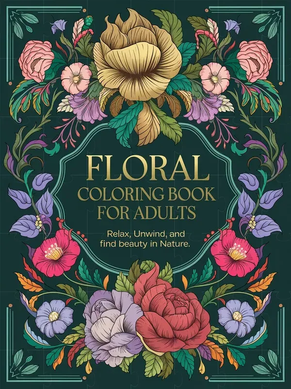
For coloring books, a simple rule often applies:
- For Children: Bright, primary colors (red, yellow, blue) and a clean white background are common. This creates a fun, energetic, and non-overwhelming look.
- For Adults: Darker backgrounds (black, deep blue, dark gray) are often used to create a more serious, premium, or mysterious feel. Color palettes are often more complex and nuanced.
3. Compelling and Relevant Imagery
The images on your cover are the most direct preview of what's inside. They must be high-quality, relevant to your theme, and appropriate for your target audience's skill level.
Matching Image Complexity to Your Audience
The complexity of the cover illustrations should reflect the complexity of the interior pages.
Coloring book cover design: How to create the perfect book exterior ...
Let's return to the BookBolt article, which has excellent advice on matching your imagery to your audience.
Read the sections 'Distinguish between the complexity of coloring objects' and 'Round, simple objects for children, intricate, raunchy objects for adults'. This clearly explains the different approaches needed for different age groups.
- For Children: Use simple, round shapes and clearly defined objects (e.g., a single large dinosaur, a smiling sun).
- For Adults: Use more intricate and detailed designs (e.g., complex mandalas, detailed floral patterns, elaborate fantasy scenes).

Creating and Integrating Your Imagery
You don't need to be a professional artist to create compelling cover images. Modern design tools offer powerful features to help you.
Full Guide To Creating Amazon KDP Book Covers (2025)
The Samazonkdp video demonstrates a fantastic modern workflow for generating and adding niche-specific images to a cover.
Watch from 10:20 to 11:59. He shows how to use an AI image generator to create custom 'Kawaii' style animals, remove the background, and place them on the cover. This is a powerful technique for creating unique imagery that perfectly matches your book's theme.
Your Design Checklist
As you begin to redesign your cover, use this checklist to guide your selection of fonts, colors, and imagery. For each point, refer back to the analysis of bestsellers in your niche that you completed in the previous module. Your goal is to align with customer expectations while still creating something unique.
- Fonts:
- Does my font style match my target audience (e.g., playful for kids, elegant for adults)?
- Is my main title font bold and readable at a thumbnail size?
- Have I limited myself to 2-3 fonts at most?
- Colors:
- Does my color palette align with my niche (e.g., bright primaries for toddlers, dark/sophisticated for adults)?
- Is there enough contrast between my text color and my background color? (Check with the grayscale test!)
- Imagery:
- Do my cover images accurately represent the style and complexity of my interior pages?
- Are the images high-quality and relevant to my book's theme and keywords?
- Do the images help the cover stand out, or do they make it look cluttered?
Conclusion
You now have a framework for making deliberate, informed decisions about the three core visual elements of your cover. You're no longer just guessing; you're using established genre conventions and design principles to build a cover that works.
Key Takeaways:
- Choose Fonts for Your Audience: Select fonts that signal the correct genre and age group—playful and blocky for kids, more complex or elegant for adults. Prioritize readability above all else.
- Use Color Strategically: Employ color psychology and niche conventions to evoke the right emotion. Use bright palettes for children's books and often darker, more complex palettes for adult books. Always ensure high contrast for text.
- Select Relevant and Appropriate Imagery: Your cover images must be a true sample of what's inside, matching the theme and complexity to avoid disappointing customers.
Preview of the Next Lesson:
We've now covered the visual style of your title. In the next lesson, we will focus on the words themselves. You will learn how to write a compelling title and subtitle that includes primary keywords and entices clicks, combining persuasive copywriting with the SEO power needed to get discovered on Amazon.