Hello! Welcome back to our module on "Crafting Language."
In our last lesson, we explored how metaphors and similes create vivid meaning through direct comparison, like describing a project management app as an "air traffic controller for your projects." Today, we shift from direct comparison to the more subtle art of indirect association.
This lesson is dedicated to the learning outcome: Explain the role of symbolism in embedding deeper meaning into a brand's identity. We'll investigate how brands use objects, colors, and shapes to communicate their core story and values without explicitly stating them. For someone with your background in literature and branding, this is where the two fields beautifully intersect, allowing you to build rich, layered brand narratives.
1. From Metaphor to Symbol: A Shift in Meaning
While related, metaphors and symbols work in distinct ways. A metaphor asserts that one thing is another to transfer qualities. Symbolism is quieter; it suggests that an object or image represents a bigger idea or value through shared cultural understanding and repeated association.
Let's start with a foundational definition.
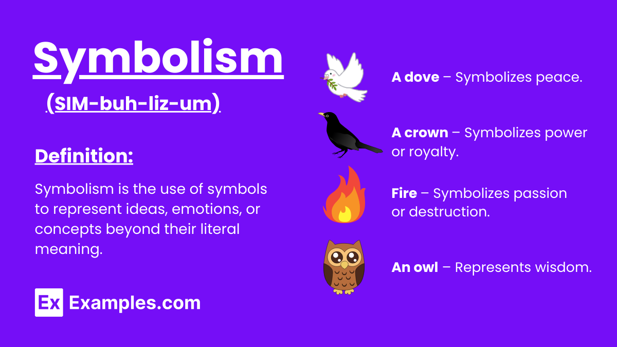
As the image shows, symbols are a kind of visual shorthand. However, their meaning can be context-dependent.
Symbolism in Branding and Logos
The article 'Symbolism in Branding and Logos' offers a great introduction to this idea, noting that while symbols are powerful, their interpretation isn't always universal.
Please read the first three paragraphs of the article, starting from 'Symbolism is the process...' and ending with '...bad luck and betrayal.' Focus on the distinction between an image's natural aesthetic and its deeper, symbolic meaning, as well as the example of the snake symbol.
The key takeaway is that a symbol's power comes from a collectively understood meaning. A snake can mean healing (the Rod of Asclepius in medicine) or danger. For a brand, the goal is to consistently associate a symbol with a specific, positive meaning to build a strong identity.
2. The "Empty Vessel": How Brand Symbols Are Made
This leads to a crucial question: how does a simple logo or shape acquire such deep meaning? A common misconception is that great symbols are inherently brilliant. The truth is, they start as "empty vessels."
This short clip from a Vox documentary on logo design perfectly illustrates the concept of a symbol as an 'empty vessel.'
Please watch the two short segments at 01:53-02:07 and 03:43-03:51. The speaker explains that meaning is not inherent in a symbol's shape but is actively 'poured into them' over time.
Brands "pour" meaning into their symbols through storytelling, advertising, customer experience, and consistent association. Over time, the Nike "swoosh" stopped being just a checkmark and became a symbol of athletic achievement, perseverance, and the "Just Do It" ethos.
This next video elaborates on how brands deliberately create and manage this meaning.
How Brands Use Design & Marketing to Control Your Mind
The video 'How Brands Use Design & Marketing to Control Your Mind' explains that what successful companies sell isn't just a product, but the meaning attached to it.
Watch from 31:41 to 33:05. Pay close attention to the idea that objects are 'repositories of meaning' and how a simple descriptive word, like 'Mountain water' for Liquid Death, begins the process of embedding a story and legacy into a product.
This process transforms a product from a simple object into a symbol of a larger story or identity—an autographed dollar bill is worth more than a dollar because of the story it represents.
3. The Anatomy of Brand Symbolism
Symbols in branding come in many forms. Let's explore the most common ones.
A. Logos with Hidden Meanings
The most obvious brand symbol is the logo. Many famous logos are designed with clever symbolic layers that reinforce the brand's promise.
Symbolism in Branding and Logos
The same article we looked at earlier, 'Symbolism in Branding and Logos,' provides excellent examples of this technique.
Read through the examples in the article, such as the FedEx arrow (symbolizing speed and direction), the Amazon smile (customer satisfaction and A-to-Z selection), and the Tostitos logo (shared experience). Notice how these symbols visually communicate a core benefit or value.
These "Easter eggs" are more than just clever tricks. When a customer discovers the hidden arrow in the FedEx logo, it creates a small "aha!" moment that reinforces the brand's message of efficiency in a memorable way.
B. The Symbolism of Color
Color is one of the most powerful and immediate symbolic tools in a brand's arsenal. Different colors evoke distinct psychological and emotional responses, a fact that brands leverage to shape perception.
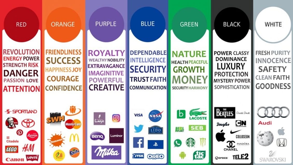
Think about the financial industry's reliance on blue, the health food industry's use of green, or the luxury market's preference for black. These are deliberate symbolic choices designed to communicate values like trust, nature, and sophistication at a glance.
C. Shapes, Forms, and Beyond the Logo
Powerful symbolism can extend beyond the logo to other distinctive assets.
Make Your Brand Iconic: The Power of Symbols in Branding
The article 'Make Your Brand Iconic' provides a fantastic case study of how a physical object—the Coca-Cola bottle—was deliberately designed to become a powerful brand symbol.
First, read the section 'Pack Meaning into your Brand,' focusing on the story of the Coca-Cola bottle. Note the design challenge: to be 'recognizable by feel in the dark.' Then, read the section 'A Visual Shorthand in Brand Storytelling' to understand how symbols like the McDonald's Golden Arches function as a quick, meaningful signal to customers.
Coca-Cola's leadership understood that to build an enduring brand, they needed more than a logo; they needed a symbol that was uniquely theirs. The iconic bottle shape became a tangible piece of the brand's identity, packed with over a century of meaning related to happiness, tradition, and refreshment. It's a "visual shorthand" that communicates the entire brand story instantly.
Test your understanding!
Think of the Apple brand. Its primary logo is the bitten apple.
What are some other symbols the brand uses across its products, marketing, and retail experiences to embed meaning? What ideas or values do these symbols represent?
Show answer
Here are a few examples:
- Minimalist Design: The clean lines, white space, and lack of clutter in Apple's products and stores symbolize simplicity, elegance, and ease-of-use.
- The "i" Prefix (iPhone, iMac): Originally standing for "internet," it has evolved to symbolize individuality ("I"), innovation, and an entire ecosystem of interconnected products.
- The Sound of a Mac Starting Up: This distinct chime acts as an auditory symbol, representing the start of a creative and seamless user experience.
- The Packaging Experience: The carefully designed, satisfying process of unboxing an Apple product symbolizes quality, attention to detail, and a premium experience from the very first touch.
Each of these elements reinforces the core brand identity of creativity, simplicity, and premium quality.
4. The Strategic Value: Why Symbolism Builds Brand Equity
Ultimately, using symbolism is not just an artistic exercise; it's a core business strategy. In a crowded market, products are often similar. Symbolism allows a brand to differentiate itself on a deeper, more emotional level.
Make Your Brand Iconic: The Power of Symbols in Branding
Let's conclude with the business case for symbolism, explained in the final part of the 'Make Your Brand Iconic' article.
Please read the final section, 'Symbols Build Brand Equity.' Focus on how symbols help create awareness, associations, and feelings that directly impact customer loyalty and perceived quality.
As the author David Aaker is quoted, a symbol can be "the central element of brand equity." It's an emotive communication device that forges a connection that logic and feature lists alone cannot achieve. It makes a brand not just recognizable, but meaningful.
Conclusion
Today we've explored the subtle but powerful role of symbolism in brand storytelling. By moving beyond literal descriptions, brands can embed their identity into every aspect of their presentation, creating a rich and resonant narrative.
Key Takeaways:
- Symbolism embeds meaning through indirect association, suggesting that an object, color, or shape represents a larger idea.
- Brand symbols are often "empty vessels" that are intentionally filled with meaning over time through consistent storytelling and customer experiences.
- Symbols can take many forms, including logos with hidden meanings, evocative colors, and iconic shapes like the Coca-Cola bottle.
- Ultimately, symbolism is a strategic tool that builds brand equity by creating an emotional shorthand that fosters loyalty and differentiates a brand in the marketplace.
Preview of the Next Lesson:
Just as symbols subtly communicate a brand's present identity, another literary device, foreshadowing, can be used to subtly hint at what's to come. In our next lesson, we will explore how brands apply foreshadowing to build anticipation and excitement for product launches and campaigns.