Hello! Welcome back to our course on building a professional accounting website with Astro.
In our previous lesson, you created your first Astro pages with HTML and learned how Astro's scoped CSS helps keep your styling organized and conflict-free. You probably noticed that you were duplicating the entire <html>, <head>, and <body> structure on each page. This isn't sustainable for a real project.
This lesson directly addresses that issue. Our goal is to build reusable UI elements using Astro's component syntax. We will explore one of Astro's most fundamental concepts: breaking your UI into small, manageable, and reusable pieces. This practice, known as component-based architecture, is the key to achieving the clean, scalable, and maintainable site you're aiming for.
By the end of this lesson, you'll be able to refactor duplicated code into components, pass data into them, and compose them together to build complex UIs efficiently.
1. The Power of Reusable Components
In modern web development, we think of user interfaces as a collection of independent, reusable pieces. A button, a navigation bar, a card, or even an entire page layout can be a "component."

This approach has several benefits that are crucial for your goal of building a production-ready website:
- DRY (Don't Repeat Yourself): Write the code for an element once and reuse it everywhere.
- Maintainability: Need to change your site's header? You only need to edit one file, not every single page.
- Consistency: Every button or card on your site will look and behave the same way, creating a cohesive user experience.
To start, let's get a firm grasp of what Astro components are by reading the official documentation.
This documentation page introduces the core concepts of Astro components, their structure, and why they are fundamental to any Astro project.
Please read the introduction and the sections "Component Structure" and "Component-based design." This will reinforce what you already know about the .astro file structure and formally introduce the concept of composing components.
2. Creating Your First Component: A Site Header
Let's put theory into practice by refactoring some of your page into a reusable component. A site header is a perfect candidate.
Following the best practices from the Astro documentation, we'll create a dedicated folder for our reusable components.
- In your project's
src/directory, create a new folder namedcomponents. - Inside
src/components/, create a new file namedHeader.astro. - Copy the following code into
src/components/Header.astro. This is a simple header that will contain our site title and main navigation.
---
// src/components/Header.astro
---
<header>
  <div class="logo">
    <a href="/">Apex Financials</a>
  </div>
  <nav>
    <a href="/">Home</a>
    <a href="/about/">About</a>
    <a href="/services/">Services</a>
    <a href="/blog/">Blog</a>
  </nav>
</header>

<style>
  header {
    display: flex;
    justify-content: space-between;
    align-items: center;
    padding: 1rem 2rem;
    background-color: #ffffff;
    border-bottom: 1px solid #e2e8f0;
  }
  .logo a {
    font-weight: 700;
    font-size: 1.25rem;
    color: #1a2b48;
    text-decoration: none;
  }
  nav a {
    margin-left: 1.5rem;
    color: #5c677d;
    text-decoration: none;
  }
  nav a:hover {
    color: #1a2b48;
  }
</style>
Now, let's use this new component on our homepage. Open src/pages/index.astro and replace its content with the following:
---
// src/pages/index.astro
import '../styles/global.css';
import Header from '../components/Header.astro';

const pageTitle = "Apex Financials";
const tagline = "Your trusted partner in financial clarity and growth.";
---
<html lang="en">
  <head>
    <meta charset="utf-8" />
    <meta name="viewport" content="width=device-width" />
    <title>{pageTitle}</title>
  </head>
  <body>
    <Header />
    <main>
      <h1>{tagline}</h1>
    </main>
  </body>
</html>

<style>
  main {
    display: flex;
    flex-direction: column;
    justify-content: center;
    align-items: center;
    min-height: 80vh;
    text-align: center;
  }
  h1 {
    font-size: 3rem;
    font-weight: 800;
  }
</style>
Notice three key changes:
- We imported the
Headercomponent in the script fence. - We used it in the template like a custom HTML tag:
<Header />. - We've started to structure our page with semantic HTML (
<main>).
Your browser preview should now show the new header at the top of the page. This process of improving existing code without changing its external behavior is called refactoring. It's a vital skill for maintaining a clean codebase.
3. Making Components Dynamic
Our Header is reusable, but it's static. What if we want to pass data to a component to change how it renders? This is done using props. And what if we want to wrap content within a component? For that, we use slots.
Props: Passing Data to Components
Props (short for properties) are how you pass data from a parent to a child component. This should feel very familiar from your work with React. In Astro, props are accessed via the Astro.props object in the component script.
Slots: Rendering Child Content
A <slot /> element is a placeholder for external HTML content. It allows you to inject children into your component's template. This is the core mechanism behind layout components.
Let's combine these concepts to create a BaseLayout.astro component to handle all our HTML boilerplate.
- Create a new file:
src/layouts/BaseLayout.astro. (Using alayoutsfolder is a common convention). - Add the following code. This layout accepts a
pageTitleprop and uses a<slot />to render the page's main content.
---
// src/layouts/BaseLayout.astro
import '../styles/global.css';
import Header from '../components/Header.astro';

// Define the props the component accepts using a TypeScript interface
interface Props {
  pageTitle: string;
}

// Destructure the props from Astro.props
const { pageTitle } = Astro.props;
---
<html lang="en">
  <head>
    <meta charset="utf-8" />
    <meta name="viewport" content="width=device-width" />
    <title>{pageTitle} | Apex Financials</title>
  </head>
  <body>
    <Header />
    <main>
      <slot /> <!-- Page content will be injected here -->
    </main>
    <!-- We can add a Footer component here later -->
  </body>
</html>

<style>
  main {
    padding: 2rem;
  }
</style>
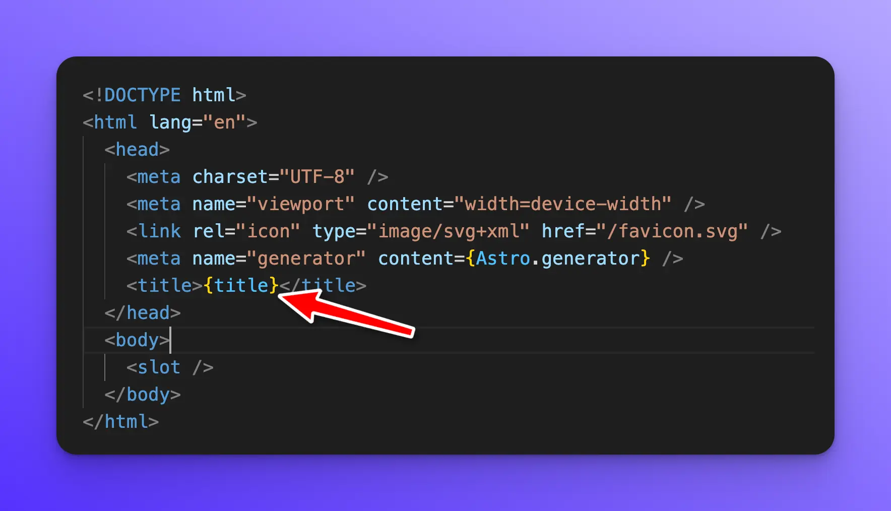
Now, refactor src/pages/index.astro to use this new layout:
---
// src/pages/index.astro
import BaseLayout from '../layouts/BaseLayout.astro';
const tagline = "Your trusted partner in financial clarity and growth.";
---
<BaseLayout pageTitle="Home">
  <h1>{tagline}</h1>
  <p>We provide expert accounting services to help your business thrive.</p>
</BaseLayout>
Look at how much cleaner our page file is!
- We wrap our content in
<BaseLayout>. - We pass the
pageTitleas a prop (attribute). - Everything between the opening and closing
<BaseLayout>tags is passed into the<slot />insideBaseLayout.astro.
4. Building an Advanced, Configurable Component
You're a fast learner with a background in UI engineering, so let's build something more complex that showcases the power and flexibility of Astro components. We'll create a highly reusable Link component that can be styled in multiple ways.
The following video demonstrates creating three components, but we'll focus on the third and most advanced one: the Link component.
Astro Blog Course #5 - Astro Components
This video from the "Astro Blog Course" series by Coding in Public builds three components of increasing complexity. Pay close attention to the final Link component, as it demonstrates several powerful features for creating flexible, reusable UI elements.
Watch the segment from 09:32 to 19:13. You don't need to code along just yet, but focus on these key concepts he implements: Using a TypeScript interface to define the component's Props. Setting default values for props (isFilled = true). Using the class:list directive to conditionally apply CSS classes. Conditionally rendering an icon based on a prop. Using the ...rest operator to pass through any extra HTML attributes.
The component created in the video is a fantastic example of professional component design. It's configurable, type-safe, and flexible. This is exactly the kind of reusable element you'll want to build for your accounting site's UI kit (e.g., for buttons, calls-to-action, etc.). The use of the class:list directive is particularly powerful for managing complex styling logic cleanly.
Test your understanding!
Let's apply these concepts to create another common UI element: a Card component.
- Create a new file at
src/components/Card.astro. - This component should accept two props:
title: Astringfor the card's heading.bgColor: An optionalstringthat can be'white'or'lightgray'. It should default to'white'.
- The component should have a
<slot />to render the body content of the card. - Use scoped
<style>and theclass:listdirective to apply a different background color based on thebgColorprop.
Use this new component on your index.astro page like this:
<Card title="Our Services">
  <p>Discover how we can help your business grow.</p>
</Card>

<Card title="Client Testimonials" bgColor="lightgray">
  <p>See what our clients have to say about us.</p>
</Card>
Show answer
Your src/components/Card.astro file should look something like this:
---
interface Props {
  title: string;
  bgColor?: 'white' | 'lightgray';
}

const { title, bgColor = 'white' } = Astro.props;
---
<div class:list={["card", bgColor]}>
  <h2>{title}</h2>
  <div class="content">
    <slot />
  </div>
</div>

<style>
  .card {
    border: 1px solid #e2e8f0;
    border-radius: 8px;
    padding: 1.5rem;
    box-shadow: 0 1px 3px 0 rgb(0 0 0 / 0.1);
  }

  /* Apply background color based on the class passed by class:list */
  .card.white {
    background-color: #ffffff;
  }

  .card.lightgray {
    background-color: #f7fafc;
  }

  .card h2 {
    font-size: 1.5rem;
    font-weight: 600;
    margin-bottom: 1rem;
    color: #1a2b48;
  }
</style>
When you use this component on a page, Astro's class:list directive will combine the static "card" class with the dynamic bgColor prop value, resulting in class="card white" or class="card lightgray".
Conclusion
Fantastic work! You have now mastered the fundamental building block of any Astro application. Moving from single-page files to a component-based architecture is a huge leap towards building a professional, scalable website.
Here are your key takeaways:
- Astro Components are reusable units of UI defined in
.astrofiles, typically stored insrc/components/. - You can make components dynamic and configurable by passing them props, which are accessed via
Astro.props. - The
<slot />element acts as a placeholder, allowing you to inject child HTML content into a component, which is the basis for layouts. - Advanced directives like
class:listallow for clean, declarative handling of dynamic CSS classes.
Up Next: So far, all our components are static HTML and CSS. They contain zero client-side JavaScript by default, which is why Astro sites are so fast. In the next lesson, we will explore Astro's zero-JS-by-default philosophy and the 'islands architecture'. You'll learn how to "hydrate" components, adding client-side interactivity only where you need it, which is the secret behind Astro's excellent performance.