Hello! Welcome to the next lesson in your journey to build a professional accounting website with Astro.
In the previous lesson, you successfully created dynamic pages for your services using Astro's Content Collections and dynamic routing. This was a critical step in building the content-driven architecture for your site. Now, we need a way to present summaries of your content—like services, case studies, or testimonials—in an engaging way on your main pages.
Today, we'll dive into one of the most fundamental patterns in modern web development: reusable components. You will design and build reusable card components for testimonials and case study summaries. This lesson will merge principles of component architecture, accessibility, and your goal for a minimal, trustworthy design.
1. The Anatomy of a Reusable Card
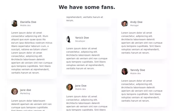
Before we write any code, let's think about the design. A "card" is a self-contained unit of UI that groups related information. For your accounting website, you'll need cards for testimonials, case studies, and perhaps even blog posts. While the specific content will differ, the underlying structure is often very similar.
Your goal is a "premium, minimal, and trustworthy" aesthetic. A clean card design is central to achieving this.
When designing components, especially interactive ones like cards that link to other pages, accessibility is paramount.
Accessible card UI component patterns
To build a truly professional and WCAG-compliant website, we need to consider how users with different abilities will interact with our components. This article from UC Berkeley's Digital Accessibility Program provides excellent guidance on accessible card patterns.
Please read the sections 'What is a card?', 'What are some considerations for cards?', and 'Three accessible card options'. Pay close attention to the three different patterns for making cards clickable and the pros and cons of each.
Based on that reading, we have a few patterns to choose from. For maximum usability, especially on mobile, making the entire card a single, large clickable target (Pattern #1) is often a great choice. It avoids redundant links and provides a generous touch area. We will implement this pattern.
Our card component will therefore need:
- An outer element that is a link (
<a>). - A semantic heading element (
<h2>,<h3>, etc.) for the title. - Space for a summary or description.
- Clear hover and focus states to indicate interactivity.
2. Building a Reusable Card Component
With the design principles in mind, let's start building. Since this component will be used for various types of content, we'll create a generic Card.astro component.
Your experience with React components will be very helpful here. The concepts of passing data via props and creating a reusable UI element are identical in Astro. The key difference is that this Astro component will render to plain HTML and CSS at build time, with zero client-side JavaScript by default.
Action: Create the Card Component File
- In your
src/components/directory, create a new file namedCard.astro. - Paste the following code into the file. This sets up the basic structure.
---
// src/components/Card.astro

interface Props {
  href: string;
  title: string;
  body: string;
}

const { href, title, body } = Astro.props;
---
<article class="card">
  <a href={href}>
    <div class="card-content">
      <h2>{title}</h2>
      <p>{body}</p>
    </div>
  </a>
</article>

<style>
  .card {
    background-color: #f9fafb; /* A light grey background */
    border: 1px solid #e5e7eb;
    border-radius: 0.5rem;
    overflow: hidden;
    transition: transform 0.2s ease-in-out, box-shadow 0.2s ease-in-out;
  }

  /* Style the link to cover the card and remove default styling */
  .card a {
    display: block;
    color: inherit;
    text-decoration: none;
    height: 100%;
  }

  .card-content {
    padding: 1.5rem;
  }

  .card h2 {
    font-size: 1.25rem;
    font-weight: 600;
    margin-bottom: 0.5rem;
  }

  /* Hover and Focus states for accessibility */
  .card:hover,
  .card:focus-within {
    transform: translateY(-4px);
    box-shadow: 0 4px 6px -1px rgb(0 0 0 / 0.1), 0 2px 4px -2px rgb(0 0 0 / 0.1);
  }
</style>
This code establishes a solid, accessible base:
- Props: We define a TypeScript
interfacefor our props (href,title,body), giving us type-safety and autocompletion. - Structure: An
<article>provides a semantic container. The<a>tag wraps the content, making the entire card clickable. - Scoped Styles: The
<style>tag styles are scoped to this component only, preventing CSS conflicts. We've added a subtle hover/focus effect as recommended for good usability. The:focus-withinpseudo-class ensures the styles apply when the link inside the card is focused via keyboard navigation.
3. Making the Component Truly Reusable
Our current card is good, but the <h2> for the title is hardcoded. On your homepage, a case study summary might be an <h2>, but in a sidebar of related posts, it should probably be an <h3> to maintain a correct document outline.
We can make our component more flexible by allowing the heading tag to be passed as a prop.
Astro Blog Course #8 - Card component
The following video demonstrates this exact technique for a blog post card. The presenter shows how to accept a prop to dynamically set the heading level, a powerful pattern for creating reusable and semantically correct components.
Watch from 06:04 to 08:44. Focus on how a tagType prop is defined, passed to the component, and then used to render a dynamic HTML tag (e.g., <Tag />).
Let's apply this concept to our Card.astro component.
Action: Add a Dynamic Heading Tag
Update src/components/Card.astro with the following changes:
---
// src/components/Card.astro

// Define the type for heading levels
type HeadingTag = 'h2' | 'h3' | 'h4';

interface Props {
  href: string;
  title: string;
  body: string;
  tagType?: HeadingTag; // Make it optional
}

const { href, title, body, tagType = 'h2' } = Astro.props;

// Capitalize the variable name to use it as a component tag
const Tag = tagType;
---
<article class="card">
  <a href={href}>
    <div class="card-content">
      <Tag>{title}</Tag> <!-- Use the dynamic tag here -->
      <p>{body}</p>
    </div>
  </a>
</article>

<style>
  /* ... same styles as before ... */

  .card-content {
    padding: 1.5rem;
  }

  /* Target the dynamic tag instead of h2 directly */
  .card-content :is(h2, h3, h4) {
    font-size: 1.25rem;
    font-weight: 600;
    margin-bottom: 0.5rem;
    /* Reset margin that might be inherited from browser styles */
    margin-top: 0;
  }
</style>
Key changes:
- We added an optional
tagTypeprop, defaulting to'h2'. - We created a capitalized variable
const Tag = tagType;. In JSX-like syntax, a capitalized variable can be used as a component or tag. - We replaced
<h2>with<Tag>. - We updated our CSS selector to
.card-content :is(h2, h3, h4)to apply the title styling regardless of the heading level used.
Our Card component is now significantly more reusable and semantically flexible.
Test your understanding!
Imagine you need to add an optional author's name to the card, which should appear below the body text. How would you modify the Card.astro component (both the script and the template) to accept and display an author prop?
Show answer
- Update the
Propsinterface to include the optionalauthorstring:interface Props { href: string; title: string; body: string; tagType?: HeadingTag; author?: string; // Add the new prop } - Destructure the
authorprop fromAstro.props:const { href, title, body, tagType = 'h2', author } = Astro.props; - Conditionally render the author in the template using a short-circuit expression. This ensures nothing is rendered if the
authorprop isn't provided.
You would then add styling for the<div class="card-content"> <Tag>{title}</Tag> <p>{body}</p> {author && <p class="author-name">{author}</p>} </div>.author-nameclass in the<style>block.
4. Using the Card Component
Now, let's put our new component to work. We'll add a "Case Studies" section to the homepage. We don't have a case-studies content collection yet (we'll cover that later), so for now, we'll use some mock data directly in our page's frontmatter.
Action: Add Cards to the Homepage
Open your src/pages/index.astro file and modify it as follows:
---
// src/pages/index.astro

import Layout from '../layouts/Layout.astro';
import Card from '../components/Card.astro'; // Import our new component

// Mock data for case studies
const caseStudies = [
  {
    href: '/services/tax-advisory', // Link to an existing service page for now
    title: 'Startup Reduces Tax Liability by 20%',
    body: 'Discover how our strategic tax planning helped a growing tech startup optimize their finances for sustainable growth.'
  },
  {
    href: '/services/bookkeeping',
    title: 'E-commerce Store Streamlines Bookkeeping',
    body: 'A case study on how we implemented a full-cycle bookkeeping system that saved our client 10+ hours per week.'
  }
];
---
<Layout title="Welcome to Premier Accounting">
  <!-- ... Your existing hero section or other homepage content ... -->

  <section class="p-8">
    <div class="container mx-auto">
      <h2 class="text-3xl font-bold text-center mb-8">Our Success Stories</h2>
      <div class="grid grid-cols-1 md:grid-cols-2 gap-8">
        {caseStudies.map(study => (
          <Card
            href={study.href}
            title={study.title}
            body={study.body}
            tagType="h3"
          />
        ))}
      </div>
    </div>
  </section>

</Layout>
Here's what's happening:
- We import our shiny new
Cardcomponent. - We create a
caseStudiesarray to simulate fetching data. - In a new "Success Stories" section, we use
caseStudies.map()to loop through our data. - For each item, we render a
<Card />, passing the data as props. - Crucially, we set
tagType="h3". Since the section heading "Our Success Stories" is anh2, the card titles should beh3s to maintain a correct heading hierarchy.
Now, check your homepage. You should see two beautifully rendered, fully interactive cards!
Conclusion
Congratulations! You have successfully designed and built a flexible, reusable, and accessible card component in Astro. This is a massive step towards your goal of a maintainable, component-driven website.
Key Takeaways:
- Design First: Good components start with a clear design plan that includes accessibility.
- Props for Data: You used props to pass dynamic content into your component, making it a reusable template.
- Props for Structure: You elevated your component's reusability by using a prop (
tagType) to change its HTML structure, ensuring semantic correctness across different contexts. - Scoped Styling: You applied styles that are safely contained within the component, preventing unintended side effects.
- Component Instantiation: You instantiated your component on a page by mapping over a data array, a pattern you'll use constantly when fetching data from Content Collections.
Up Next:
As you build more components like Header and Card, your src/components directory will start to grow. To keep your project organized and scalable—a key part of your goal for a clean architecture—we need a strategy. In the next lesson, you will learn how to structure your project with a scalable component directory, using conventions like atomic design to keep your codebase tidy and maintainable.