Introduction
In our last lesson, we learned to use the B.I.A.S. framework to systematically audit a user experience and identify behavioral gaps. Today, we'll zoom in on a crucial principle that falls squarely under the "Behavioral" lens: Hick's Law. This psychological concept directly addresses why users can feel overwhelmed by too many options and how we, as designers, can prevent it.
Your background in finance has trained you to organize complex information into clear, logical structures. Hick's Law provides a psychological basis for applying that same discipline to user interfaces. You'll learn that simplifying choices isn't about removing functionality, but about presenting it more intelligently.
By the end of this lesson, you'll be able to apply Hick's Law to simplify UI navigation menus, reducing user decision time and creating a more efficient, less frustrating experience.
What is Hick's Law? The Cost of Choice
At its core, Hick's Law (or the Hick-Hyman Law) is a simple but powerful principle: the more choices a person has, the longer it will take them to make a decision. When the number of options becomes overwhelming, users may experience "choice paralysis" and abandon the task altogether.
To get a formal definition and see the underlying formula, let's start with a foundational reading.
Using Hick's Law to help users make decisions - LogRocket Blog
This article from the LogRocket Blog provides a clear and concise introduction to Hick's Law and its relevance in UX design.
Please read the first two main sections: "What is Hick’s Law, and how does it apply to decision making?" Pay attention to the definition and the formula. You don't need to perform calculations, but notice how reaction time increases with the number of choices. "Applying Hick’s law to UX" and the following section "Reducing the number of choices...". This part connects the theory to practice and introduces the concept of analysis paralysis.
The mathematical formula for Hick's Law is:
Where:
- is the reaction time.
- is the number of choices.
- and are constants that depend on the context.
The key takeaway from the formula is that the relationship is logarithmic, not linear. This means that while adding a choice to a small set has a noticeable impact, the effect diminishes as the number of choices grows. However, the core principle remains: more choices lead to more cognitive load.
How to Apply Hick's Law in Navigation Design
Knowing the law is one thing; applying it is another. Let's explore three powerful strategies for simplifying menus and guiding users effectively.
1. Grouping and Categorization
Instead of presenting a long, flat list of options, group related items into logical categories. This is the most common and effective application of Hick's Law. It reduces the initial number of choices a user has to consider.
2. Prioritizing Key Actions
Not all navigation items are equally important. Identify the most frequent or critical tasks your users need to perform and give them visual prominence. Relegate less-used options (like "Legal" or "Help") to a secondary menu or a footer.
3. Using Progressive Disclosure
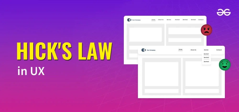
Progressive disclosure is the technique of showing only the necessary information upfront and revealing more complex or advanced options on demand. A dropdown or "mega menu" is a perfect example of this. The user first chooses a broad category, and only then are the specific sub-options revealed.
The article you just read provides excellent real-world examples of these strategies.
Using Hick's Law to help users make decisions - LogRocket Blog
This part of the LogRocket article demonstrates how major companies like Zappos, Amazon, and Netflix apply these simplification strategies.
Now, read the sections: "Reducing the number of choices..." (focus on the three sub-points: Create categories, Prioritize the most important options, and Break down complex tasks). "Using progressive disclosure to reveal options gradually". Pay close attention to how e-commerce sites like Zappos and Amazon manage vast inventories by categorizing and prioritizing, and how Apple uses clean top-level navigation that expands on click.
To see these principles applied in a complete redesign, the following case study is a great practical walkthrough.
Optimizing Menu Navigation with Hick's Law — A UX Case Study
This Medium article by Amarish AT is a concise case study showing the 'before' and 'after' of a website menu redesign guided by Hick's Law.
Read the article from the beginning down to the "Conclusion". Focus on: How the author identifies the problem with the old menu. The specific changes made in the redesign (grouping, progressive disclosure). The UX principles that explain why the new design works better.
The "before and after" image from the case study powerfully illustrates the impact of applying these strategies.

Applying Hick's Law to Mobile Navigation
The constraints of a small screen make Hick's Law even more critical. A common pattern is the bottom tab bar. Trying to cram too many options here quickly leads to tiny, hard-to-tap targets and a cluttered feel.
This video provides a clear, actionable rule of thumb for mobile navigation.
Top UI/UX Design Tips - How to Design a Great Bottom Mobile Navigation Bar
The presenter from uxpeak gives a specific, evidence-based guideline for how many items to include in a mobile bottom navigation bar.
Watch the section from Limit the number of tabs. The key takeaway here is the "sweet spot" for the number of tabs to avoid choice paralysis.
As the video states, the golden rule is to aim for three to five tabs. This provides quick access to core features without overwhelming the user, perfectly aligning with Hick's Law.
An Important Nuance: When Are Long Menus Okay?
It's tempting to think "fewer choices are always better," but that's an oversimplification. Hick's Law primarily applies when users are trying to decide between unfamiliar or uncategorized options. There's a key exception.
Watch this short video from the Nielsen Norman Group to understand the nuance.
Hick's Law: Designing Long Menu Lists
This video from the respected NNgroup explains the two conditions under which long menus can still be highly efficient.
Watch the video from the beginning to the end. Focus on the two criteria that make a long list acceptable: The list is ordered (e.g., alphabetically). The items in the list are known to the user.
Think of a dropdown menu for selecting your country. You already know the name of your country, and you know the list is alphabetical. You don't decide which country to pick; you locate a known item. In this scenario, you can scan the long list very quickly.
Your Turn: Audit and Redesign a Menu
Now it's time to apply what you've learned. This hands-on exercise will prepare you for a common task in freelance projects: analyzing an existing interface and proposing improvements.
Your Task (25-30 minutes):
- Select a Subject: Go to a large e-commerce website with a complex navigation system (e.g., Amazon, Etsy, or a large department store site).
- Capture the "Before": Navigate to the website's main "mega menu" (e.g., hover over "Shop by Department" or a similar primary category). Take a screenshot of the full, expanded menu.
- Analyze in Figma:
- Create a new file in Figma and paste your screenshot.
- Next to the screenshot, add annotations critiquing the menu based on Hick's Law. Ask yourself:
- How many choices are presented at once?
- Is it overwhelming? Why or why not?
- Does it use grouping, prioritization, or progressive disclosure effectively?
- Are there any long lists that meet the "ordered and known" criteria?
- Sketch a "Quick Redesign":
- You don't need to create a pixel-perfect design. Using simple shapes and text boxes, create a wireframe of how you would redesign the menu to better apply Hick's Law.
- Focus on structure. Would you group certain items differently? Would you create new sub-categories to reduce the initial number of choices? Would you use more white space?
- Justify Your Changes: Add a few text notes to your redesigned wireframe explaining why you made the changes, explicitly referencing the principles from this lesson (e.g., "I grouped these 8 links into a 'Home Goods' sub-category to reduce the primary choice count from 20 to 13.").
This exercise will solidify your understanding and give you a tangible example of applying psychological principles to solve a real-world design problem.
Conclusion
Today we've unpacked Hick's Law, a cornerstone principle of interaction design. You've moved beyond the simple idea of "less is more" to a more nuanced understanding of how to manage choice and complexity for the user.
Key Takeaways:
- Hick's Law: The time it takes to make a decision increases with the number of choices available. Ignoring this leads to cognitive load and choice paralysis.
- Core Strategies: You can simplify navigation by grouping related items, prioritizing essential actions, and using progressive disclosure to hide complexity.
- The Exception: Long lists are perfectly fine if the items are known to the user and presented in a logical order (like a list of countries), as this changes the task from deciding to locating.
- Mobile Matters: On mobile, limiting primary navigation like tab bars to 3-5 items is a direct and effective application of Hick's Law.
Preview of the Next Lesson:
We've just learned how to reduce the cognitive effort of choosing an action. In the next lesson, we'll focus on reducing the physical effort of executing that action. We'll explore Fitts's Law, which provides a model for designing clickable targets (like buttons and menu items) that are fast and easy to hit.