Introduction
In our last lesson, we explored Fitts's Law and saw how designing larger, closer targets can make interfaces feel effortless. We learned that these principles of UX psychology are powerful tools for guiding user behavior in a positive way. However, this same power can be used unethically to trick users into actions they didn't intend to take.
Today, we delve into the "dark side" of UX design. This lesson is about dark patterns: deceptive interface designs crafted to benefit a business at the user's expense. Your background in finance and audit has trained you to scrutinize details and understand the line between acceptable business practice and unethical conduct. This lesson applies that same critical lens to design, helping you recognize manipulative tactics and understand their profound ethical and commercial implications.
By the end of this lesson, you will be able to identify common dark patterns in real-world products and articulate why they are harmful to both users and the businesses that employ them.
What Are Dark Patterns?
A dark pattern is not a mistake or a bad design; it's an intentional choice. It's a user interface that has been carefully crafted to trick users into doing things, such as buying insurance they didn't want, signing up for recurring subscriptions they can't easily cancel, or giving away their personal data.
These patterns exploit predictable human psychological tendencies and cognitive biases—the very principles we've been studying—to achieve a business goal while disrespecting the user's autonomy.
To start, let's watch a brief TEDx talk that introduces the concept and walks through a few common examples.
Dark Patterns: How design seeks to control us | Sally Woellner | TEDxSydney
This talk by Sally Woellner provides an excellent high-level introduction to dark patterns and their manipulative nature.
Watch from the beginning to the third pattern. Pay close attention to the definitions and the real-world examples provided for Confirmshaming and Misdirection.
As you can see, these aren't subtle suggestions; they are deliberate designs intended to confuse or pressure you. The use of a sad, crying owl in Duolingo is a classic example of Confirmshaming, using emotional manipulation to prevent a user from canceling. Hiding fees until the last moment, as shown in the StubHub example, is a form of Misdirection.
A Field Guide to Common Dark Patterns
Dark patterns come in many forms. Being able to name and categorize them is the first step to identifying them in the wild. Let's explore a few more of the most notorious types.
One of the most well-known is the Roach Motel. This pattern makes it very easy to get into a situation, but then frustratingly difficult to get out of. The video below provides a perfect, step-by-step deconstruction of a classic Roach Motel.
How Dark Patterns Trick You Online
This video from Nerdwriter1 gives a clear, practical demonstration of how a company can intentionally create a poor user experience for its own benefit.
Watch the first section on the Roach Motel pattern, from the Amazon example. Notice how many steps and confusing paths are required to perform a simple action like deleting an account.
This laborious process for account deletion is a textbook example. It stands in stark contrast to the simple, one-click process for creating an account.
To build your recognition skills, here is a list of common dark patterns you will encounter.
Dark Patterns in UX - Nascenia
This article from Nascenia provides a concise but comprehensive catalog of the most common dark patterns, with clear definitions and examples.
Read the section titled "The 12 Types of Dark Patterns in UX Design." As you read, focus on creating a mental checklist of these patterns. You don't need to memorize them all, but try to understand the core trick behind each one (e.g., hidden costs, tricky language, creating false urgency).
Here are a few key patterns from that list, which you will see frequently:
- Sneak into Basket: Automatically adding items to a user's cart, hoping they won't notice at checkout.
- Hidden Costs (or Drip Pricing): Revealing unexpected charges like taxes or delivery fees only at the final step of the checkout process, after the user has already invested time and effort.
- Forced Continuity: Automatically charging a user's credit card after a free trial ends, often without a clear warning or an easy way to cancel.
- Confirmshaming: Using guilt-inducing language to make users opt into something. The image below is a classic example.

The Ethical Line: Persuasion vs. Manipulation
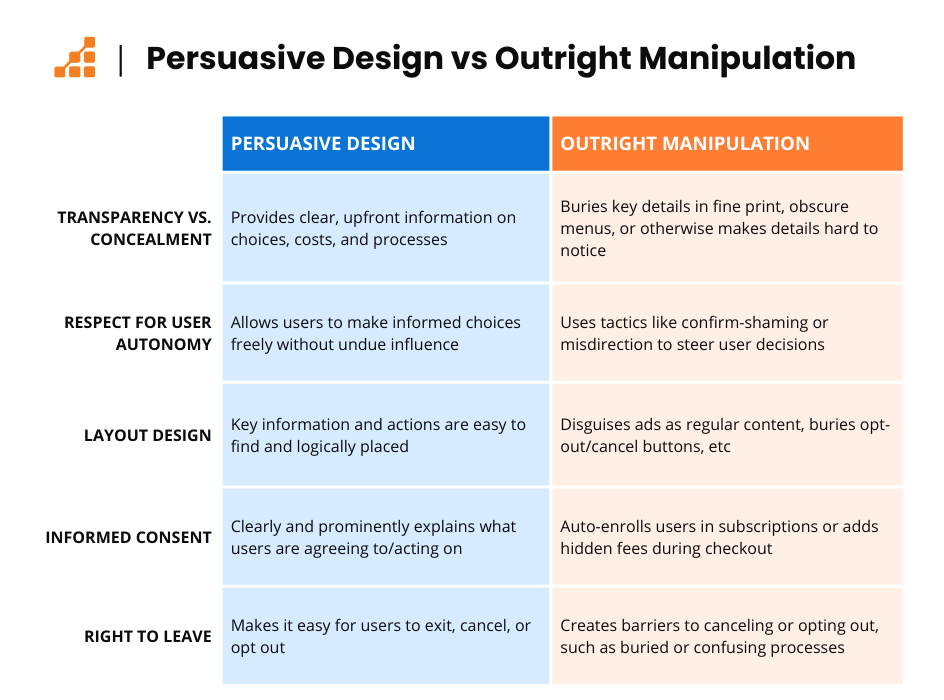
As a designer, your goal is often to persuade users to take an action—to sign up, to buy a product, to complete a form. This is a normal part of commercial design. However, there is a clear ethical line between persuasion and manipulation.
- Persuasion is transparent. It respects the user's intelligence and autonomy, presenting information clearly so they can make an informed choice that benefits them.
- Manipulation (using dark patterns) is deceptive. It conceals information, creates confusion, and exploits psychological weaknesses to trick the user into an action that primarily benefits the business.
This distinction is crucial for building long-term trust and a sustainable business.
Why Dark Patterns Are Bad for Business
Your background in commerce and audit has taught you that short-term gains at the expense of trust and compliance are a recipe for long-term failure. The same is true in UX design.
While a dark pattern might increase a specific metric in the short term (e.g., more newsletter sign-ups), the long-term consequences are severe:
- Erosion of Trust and Brand Damage: Users who feel tricked lose trust in your brand. They are less likely to return and more likely to share their negative experiences, damaging your reputation.
- Poor Customer Retention: A business built on tricks will have high churn. Users will cancel their "roach motel" subscriptions as soon as they figure out how, and they won't come back.
- Legal and Regulatory Risk: Governments are cracking down on dark patterns. The GDPR in Europe, the CCPA in California, and even new regulations in India (as mentioned in the UX Tigers article) explicitly outlaw many of these practices. Companies like LinkedIn and Honda have faced multi-million dollar settlements for using them.
Ultimately, ethical design that respects the user is not just good karma; it's good business strategy.
Your Turn: Dark Pattern Audit
It's time to put on your auditor's hat. Your task is to analyze a real-world website and identify any dark patterns. This exercise will train your eye to spot these tactics in the wild.
Your Task (20 minutes):
- Select a Target: Choose a large e-commerce or travel booking website that you use (e.g., Amazon, Booking.com, or even a competitor in the events/gifting space).
- Go Through a Key Flow: Navigate through a primary user flow, such as:
- The process of purchasing a product.
- The process of signing up for a newsletter or a free trial.
- The process of trying to cancel a service or find privacy settings.
- Set Up Your Figma File:
- Create a new Figma file for your audit.
- As you go through the flow, take screenshots of any interface elements that seem suspicious or manipulative. Paste these into your Figma file.
- Annotate Your Findings: Use the text tool in Figma to annotate your screenshots. For each potential dark pattern you find, identify:
- The Pattern Name: What type of dark pattern is it? (e.g., "Confirmshaming," "Hidden Costs," "Roach Motel").
- The Evidence: Briefly describe why it fits the pattern. (e.g., "The site adds a 'charity donation' to the cart by default," or "The unsubscribe button uses a tiny, low-contrast font.").
- The Ethical Implication: Articulate why it's a problem. (e.g., "This misleads the user and erodes trust," or "This creates a frustrating experience designed to prevent users from leaving.").
This structured audit mirrors how you would analyze a client's product for ethical and usability issues, turning your observations into actionable insights.
Conclusion
Today, we've navigated the murky waters of dark patterns. You've learned what they are, how to spot them, and most importantly, why they represent a fundamental breach of trust between a business and its users.
Key Takeaways:
- Dark patterns are intentional tricks, not accidents. They exploit human psychology for business gain.
- Common patterns include the Roach Motel, Hidden Costs, Confirmshaming, and Sneak into Basket. Being able to name them is key to recognizing them.
- There is a clear line between ethical persuasion and unethical manipulation. Ethical design is transparent and respects user autonomy.
- Dark patterns are bad for business. They destroy user trust, harm brand reputation, and create significant legal risks. As a designer, you are a user advocate, and your primary responsibility is to create honest, clear, and trustworthy experiences.
Preview of the Next Lesson:
Now that we've confronted the unethical application of UX psychology, we will return to the "light side." In our next lesson, you will learn how to take the principles we've discussed—like cognitive load, Fitts's law, and bias—and use them ethically to propose design improvements that solve user problems and achieve business goals without resorting to deception.