Welcome to the first lesson of our new module, "UX Psychology and Behavioral Design." In the previous modules, you did a fantastic job mastering the how of design—learning Figma, applying visual principles, and building a complete, interactive landing page prototype. We are now shifting our focus to the why. Understanding the psychological principles behind user behavior is what separates a good designer from a great one, and it's a skill that will be invaluable in your freelance career.
Today's lesson addresses a foundational concept in user experience: cognitive load. We will explore what it is and learn how to identify its primary sources in a user interface. Your background in finance and audit has trained you to find clarity in complexity; this lesson applies that same analytical lens to design, helping you spot where a UI might be overwhelming a user's mental capacity.
By the end of this lesson, you will be able to identify the two main culprits of high cognitive load: visual clutter and excessive choice.
1. What is Cognitive Load?
Think of a user's brain like a computer's processor. It has a finite amount of working memory and processing power. Cognitive load is the total amount of mental effort a user needs to expend to complete a task in an interface. When a design forces them to think too much about irrelevant things, their mental "processor" gets overwhelmed, leading to frustration, errors, and task abandonment.
To get a clear and concise definition, let's start with a short video from the Nielsen Norman Group, a leading voice in UX research.
Watch this clip from "What Is Cognitive Load?" by the NNgroup.
Focus on these two key parts: The core definition of cognitive load and the computer analogy. Intrinsic vs. Extraneous Load. Pay close attention to this distinction.
As the video explained, there are two main types of cognitive load:
- Intrinsic Load: The inherent difficulty of the task itself. Filling out a complex tax form is intrinsically more demanding than sending a simple text message. We can't eliminate this, but we can avoid making it worse.
- Extraneous Load: This is the unnecessary mental effort caused by poor design—confusing layouts, inconsistent buttons, unclear instructions. This is the type of load that we, as designers, have a direct responsibility to minimize.
To see how this applies directly to UI design, let's review a short article.
Cognitive Load Theory in UI Design
This section from an Aufait UX article, "The Psychology Behind Good UI," provides a great summary and lists the common causes of cognitive load in an interface.
Read the section titled "Now, What Is Cognitive Load and Why It Matters in UI Design?". As you read, focus on the bulleted list of what causes high cognitive load. These are the red flags you'll learn to spot.
Now that we have a solid definition, let's explore the two most common sources you'll encounter.
2. Source #1: Visual Clutter
Visual clutter is anything in the UI that is not directly helping the user complete their task. It's the digital equivalent of a messy desk. This includes irrelevant images, unnecessary text, inconsistent styles, and poorly organized layouts. Clutter distracts the user and forces their brain to work harder to find what's important.
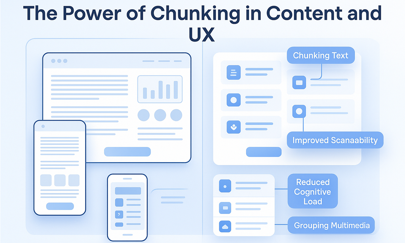
One of the most effective ways to combat visual clutter is through chunking. Just as an accountant groups related items on a balance sheet (e.g., current assets, long-term liabilities), a designer should group related information and controls in the UI.
Let's see a practical example of how simplifying a cluttered interface can dramatically improve the user experience.
This Video Will Take You From Junior to Senior UX/UI Designer
The video "This Video Will Take You From Junior to Senior UX/UI Designer" by uxpeak offers excellent before-and-after examples. We'll look at two that deal with clutter and layout.
Watch these two short segments: Simplifying the transfer screen. Notice how the "senior" design removes redundant buttons and uses space more efficiently by showing recent recipients. This reduces the number of decisions and clicks. Focusing on the primary task. Observe how the improved design makes the most important action (entering the amount) prominent and de-emphasizes the secondary action (selecting currency). This creates a clear visual hierarchy.
These examples show that reducing clutter isn't just about deleting things; it's about thoughtful prioritization and organization to guide the user's attention.
3. Source #2: Excessive Choice
The second major source of cognitive load is forcing the user to make too many decisions. This is directly related to several psychological principles you'll find useful. In fact, Growth.Design, a resource you're interested in, lists them clearly.
106 Cognitive Biases & Principles That Affect Your UX
Take a quick look at this list from Growth.Design. You don't need to read the details of each, just familiarize yourself with these three related concepts.
Find the following principles on the page: Hick's Law: More options lead to harder decisions. Decision Fatigue: Making a lot of decisions lowers users' ability to make rational ones. Miller’s Law: Users can only keep about 7 (plus or minus 2) items in their working memory.
When an interface presents too many options, it can lead to "analysis paralysis," where the user becomes overwhelmed and simply gives up.
Let's look at another practical example of how to manage choice effectively.
This Video Will Take You From Junior to Senior UX/UI Designer
Let's return to the uxpeak video to see how a designer can simplify choices.
Watch these two clips: The initial sleep app design. This "junior" design presents a functional but uninspired list of radio buttons. It forces the user to read and weigh five separate options. Offering selection over manual input. Notice how providing a pre-defined list of job titles is much easier for the user than typing it in a blank text field. It reduces physical effort and the mental effort of "what should I type here?"
The key takeaway is that reducing choices—or presenting them in a more manageable way—lowers the mental barrier to taking action.
4. Your Turn: Spotting Cognitive Load
It's time to put this into practice. Your experience running a bespoke gifting business gives you a unique advantage—you have a real-world context to analyze.
Your Task (10 minutes):
- Open the website for your own business or a direct competitor in the gifting/events space.
- Analyze the homepage or a key product page.
- Identify and describe two specific sources of cognitive load:
- One example of visual clutter: Is the layout confusing? Are there inconsistent button styles? Is there too much text that isn't grouped logically?
- One example of excessive choice: Does the main navigation have too many options? Is the user presented with too many product choices at once without filtering? Is a form asking too many questions?
Write down your findings. For each one, briefly explain why it increases cognitive load. For example: "The navigation bar has 15 different links, which violates Hick's Law and forces me to read every option to find what I need."
This exercise will begin training your eye to see interfaces not just for their aesthetics, but for their mental efficiency.
Conclusion
In this lesson, you've taken your first step into the world of UX psychology. You now have a framework for understanding and identifying one of the most significant barriers to a good user experience: cognitive load.
Key Takeaways:
- Cognitive Load is the mental effort required to use an interface. Our primary goal as designers is to minimize extraneous load—the effort caused by poor design.
- Visual Clutter is a key source of cognitive load. It can be caused by disorganized layouts, irrelevant information, and inconsistent design elements. Strategies like chunking help fight it.
- Excessive Choice is the second major source, leading to decision fatigue and analysis paralysis. Applying principles like Hick's Law by limiting options is crucial.
- Learning to spot these issues is the first step toward creating interfaces that feel intuitive, efficient, and effortless.
Preview of the Next Lesson:
Now that you can identify the sources of cognitive load, our next lesson will focus on the solutions. We will explore specific, actionable design strategies like progressive disclosure and visual hierarchy that you can use to actively reduce cognitive load and create cleaner, more user-friendly designs.