Introduction
In our last lesson, you successfully analyzed mock usability test findings for your gift ordering form, translating raw observations into a prioritized list of issues and recommendations. This analytical step is where you transform user feedback into a strategic action plan. But a plan is only as good as its execution.
Today, we will take that action plan and put it into practice. This lesson focuses on the core design loop of iteration: taking usability feedback and using it to refine your Figma prototype. You'll not only implement the design changes but also learn how to document your decisions professionally. This skill is vital for communicating your rationale to clients and for building compelling case studies, turning your analytical work from your CA background into a powerful design asset.
Part 1: The Iteration Cycle: From Analysis to Action
Iteration isn't about admitting failure; it's the engine of improvement. Great user experiences are rarely built on the first try. They emerge from a cycle of testing, learning, and refining. The analysis you did in the previous lesson is the input for this cycle. The output should be a clear, professional report that guides your design changes.
Let's look at how a professional UX audit translates findings into an actionable iteration plan.
UI UX Audit & Analysis Tutorial | GYMSHARK Case Study Included | 2022
The final part of the Gymshark UX audit video by Ari Pxl shows how to consolidate findings into a structured recommendations report. This is the bridge between analysis and iteration.
Watch the segment from the recommendations page. Pay close attention to the structure of the report. Notice how each identified issue is: Named (e.g., "Location detection"). Rated for severity and implementation effort. Given a high-level suggestion for a fix. Assigned a priority based on its impact on the user and business. This report becomes your to-do list for the iteration phase, ensuring you focus on what matters most.
Part 2: The Art of Documenting Your Design Decisions
Once you have your prioritized list of changes, it's crucial to document the iteration process. Think of this as maintaining a clear audit trail for your design work—a practice that should feel familiar from your finance and audit background. This documentation serves three key purposes:
- For Clients/Stakeholders: It clearly explains why a design changed, linking it directly to user feedback and business goals.
- For Developers: It provides context for the changes they need to implement.
- For Your Portfolio: It forms the backbone of a powerful case study, demonstrating your ability to solve problems based on evidence.
Let's explore two effective methods for documenting your iterations.
1. The Decision Log
A decision log is a simple table or text block, often kept directly within your Figma file, that tracks changes over time. It provides a concise history of the project's evolution.
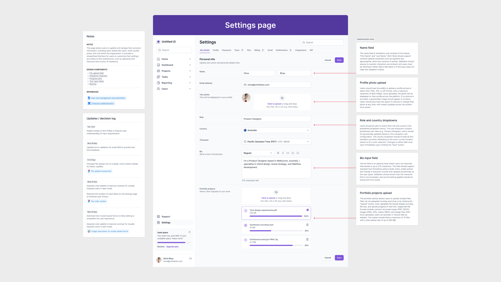
A simple and effective structure for your log includes:
- Issue: The problem identified from user feedback.
- Change Made: A description of the design change you implemented.
- Rationale: The reason for the change, linking back to the user feedback.
2. Before & After Screens
A "Before & After" comparison is a highly visual and persuasive way to showcase the impact of your iterations. It's especially powerful in a portfolio case study.

Part 3: Practical Iteration: Making Changes Efficiently in Figma
Implementing feedback across a multi-screen prototype can become tedious. If you need to change a navigation bar or a button that appears on ten different screens, updating it ten times is inefficient and prone to error.
This is where leveraging Figma's components for prototyping becomes a superpower. By turning recurring elements into components, you can make a change once in the main component, and it will automatically update everywhere it's used.
The CORRECT (and lazy) way to prototype | Figma Tutorial
Mizko's tutorial, "The CORRECT (and lazy) way to prototype," brilliantly demonstrates how to avoid this repetitive work when iterating on your designs.
Watch from the lazy way. Focus on two key moments that showcase this efficiency: Creating the Component: The presenter turns the sidebar into a main component and adds the prototype links to it just once. The Magic of Iteration: He then changes a link in the main component, and it automatically updates across all screen instances. This is the exact technique you should use to make your iteration process fast and consistent.
Activity: Iterate and Document Your Gift Form Prototype
It's time to apply these concepts. In the last lesson, you analyzed feedback for your custom gift ordering form and identified three key issues. Let's assume your recommendations were:
- Issue (Serious): Confusing selection model for materials.
- Recommendation: Change the material selection from separate "click to select" and "click to add" actions to a single-action radio button group.
- Issue (Critical): Lack of cost transparency on the summary screen.
- Recommendation: Replace the single total price with a line-item breakdown showing the base price, material cost, and gift-wrapping fee.
- Issue (Minor): No way to edit previous steps from the summary screen.
- Recommendation: Add an "Edit" link next to each section on the summary screen that links back to the relevant step in the form.
Your Task:
Open your multi-step form prototype in Figma and perform the following actions:
-
Implement the Fixes:
- Modify your UI to implement the three recommendations listed above.
- For the "Edit" links on the summary screen, try using the component technique from the Mizko video to make them efficient to manage.
-
Document Your Changes:
- Create a new page in your Figma file named "Documentation" or create a text block next to your artboards.
- Create a Decision Log with the headers:
Issue,Change Made, andRationale. - Fill out the log for each of the three changes you implemented. Be specific in your rationale, referencing the user feedback (e.g., "To address user confusion, as one user stated they 'didn't know why the price jumped up.'").
This activity combines the strategic thinking of a UX analyst with the practical execution of a UI designer, solidifying the full feedback loop.
Conclusion
You have now completed the entire design feedback loop: you've planned and simulated a usability test, analyzed the findings to create prioritized recommendations, and finally, iterated on your prototype while documenting your decisions. This process of evidence-based refinement is what separates professional designers from amateurs and is a skill that will serve you immensely in your freelance career.
Key Takeaways:
- Iteration is a cycle: It's a structured process of testing, learning, and refining, guided by an actionable recommendations report.
- Document your 'why': Recording the rationale behind your design changes is crucial for client communication, developer collaboration, and building strong portfolio case studies.
- Work smart, not hard: Use Figma features like components in your prototypes to make iteration fast, efficient, and consistent.
Preview of the Next Lesson:
Having mastered the universal process of building, testing, and iterating on prototypes, you are now ready to apply these skills to specific platforms. In our next module, we will dive into mobile app design. The first lesson will be "Analyze the core principles of Apple's Human Interface Guidelines (HIG) for iOS design," where you'll learn the fundamental rules that govern the look and feel of apps on iPhones and iPads.