Welcome back! In our last lesson, we focused on the 'macro' organization of your work—structuring your Figma files with pages, frames, and clear naming conventions. This is the professional foundation for every project, much like setting up a well-organized chart of accounts before any financial records are made.
Today, we shift from the file cabinet to the document itself. We will focus on the 'micro' organization: how to arrange elements on your canvas with absolute precision. You'll learn to use Figma's alignment, distribution, and spacing tools to create layouts that are clean, balanced, and professional. For someone with your background in audit, the importance of precision and consistency is self-evident. In design, this same meticulousness transforms a messy draft into a polished, trustworthy interface that users and clients will love.
By the end of this lesson, you will be able to arrange any set of elements on your canvas with pixel-perfect accuracy.
1. The Visual Impact of Precision
Before we dive into the tools, let's look at why this matters. A well-aligned design isn't just about aesthetics; it communicates order, intention, and quality. It makes information easier to scan and understand, which directly impacts the user's experience.
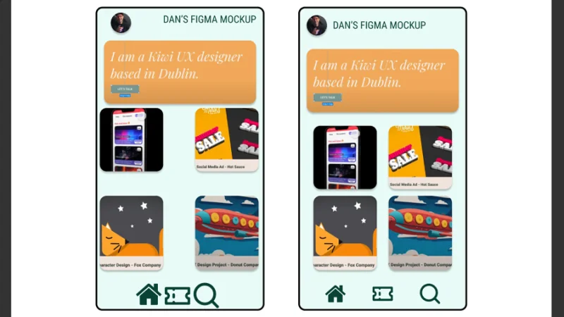
This difference is what separates a DIY look from a professional design that clients will pay for. Your eye for detail, honed in your finance career, will be your greatest asset here.
2. The Core Toolkit: Alignment and Distribution
Figma's primary arrangement tools are located in the right-hand properties panel and become active when you select two or more objects.
There are two main sets of tools:
- Alignment Tools (the first six icons): These tools align objects to each other or to their parent frame. They control how objects line up along a specific axis (e.g., all tops aligned, all centered horizontally).
- Distribution Tools (the last two icons): These tools control the space between objects, ensuring they are evenly distributed either horizontally or vertically.
This official video from Figma provides a quick, clear demonstration of these fundamental tools.
Figma Tutorial: Alignment & Distribution
This short tutorial, "Figma Tutorial: Alignment & Distribution," will introduce you to the main tools and how they behave.
Watch the video from the beginning until the end. Pay close attention to these key points: How selecting a single object aligns it to the frame. How selecting multiple objects aligns them relative to each other. How the distribution tools affect the inner objects while keeping the outer ones in place.
3. Smart Tools and Spacing Systems
Beyond the basic buttons, Figma provides smarter ways to manage spacing and alignment that will dramatically speed up your workflow.
Key Smart Tools:
- Smart Guides: As you drag objects, red lines appear to help you snap them into alignment with other objects or the center of the frame.
- Measuring Distances: Select one object, then hold
Alt(on Windows) orOption(on Mac) and hover over another object. Figma will show you the exact pixel distance between them. This is essential for maintaining consistent spacing. - Tidy Up: This is a powerful feature for arranging a messy selection of objects into a neat grid. It automatically aligns them and creates uniform spacing that you can then adjust.
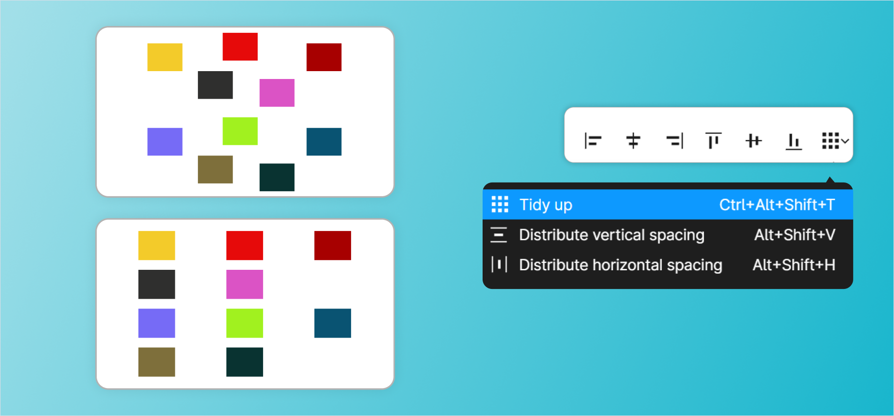
The following video provides an excellent, hands-on walkthrough of these smart tools and introduces a critical professional concept: the spacing system.
Figma Alignment UIUX Tutorial for Beginners
The video "Figma Alignment UIUX Tutorial for Beginners" by Aliena Cai goes beyond the basics to show you how to work like a professional.
First, watch from the beginning to the keyboard shortcuts. This section introduces Smart Guides, measuring with the Option/Alt key, and the keyboard shortcuts for alignment, which are huge time-savers. Next, watch from the 'Tidy up' feature. This demonstrates how to align multiple elements and introduces the magic of the 'Tidy up' tool for creating perfectly ordered grids.
A crucial takeaway from the video is the concept of designing on a 4pt or 8pt grid system. This means that all spacing and sizing of elements should be in multiples of 4 or 8 pixels (e.g., 8px, 16px, 24px, 32px). This systematic approach, much like double-entry bookkeeping, ensures consistency and harmony throughout your design. It's a simple rule that has a massive impact on the quality of your work.
4. Guided Practice: Aligning Real-World UIs
Now it's time to put this into practice. The best way to learn is by doing. The rest of Aliena Cai's video consists of two challenges where you'll fix the alignment of real-world app screens.
Open your practice Figma file, create a new frame, and follow along with the video. Pause frequently to complete the steps yourself.
Figma Alignment UIUX Tutorial for Beginners
Follow along with these two challenges to solidify your understanding of alignment and spacing.
Challenge 1 (Apple Vision Pro Notification): This is a great warm-up. Focus on how she uses a top-down approach and implements the 4pt system to define margins and padding between elements. Notice the logic behind the spacing choices—small gaps for related items, larger gaps for distinct sections. Challenge 2 (Microsoft Fluent Design Screen): This is a more complex layout. The key lessons here are: Establishing Margins: Setting a consistent 16px margin on the sides to give the content breathing room. Breaking Down Complexity: Tackling the screen section by section (header, tabs, files). Using Groups: Grouping related elements (like an icon and its text) before aligning them with other elements. This is a critical technique for managing complex layouts.
Completing these exercises will give you the practical muscle memory you need to apply these principles to your own freelance projects.
Conclusion
In this lesson, you've moved from simply placing elements to arranging them with the precision of a seasoned professional. You now have the tools and, more importantly, the systematic thinking required to create clean, organized, and visually appealing user interfaces.
Key Takeaways:
- The Toolkit: You can now use Figma's alignment, distribution, and Tidy up tools to arrange elements.
- Measure, Don't Guess: Use the
Alt/Optionkey to measure distances and ensure your spacing is intentional and consistent. - System Over Ad-Hoc: Applying a spacing system (like the 8-point grid) brings mathematical order and harmony to your designs, making them look more professional.
- Structure is Key: For complex layouts, break the problem down into sections and use groups to manage alignment hierarchically.
Preview of the Next Lesson:
Now that you can structure a layout with precision, the next step is to infuse it with brand identity and visual hierarchy. In our next lesson, we will focus on how to define and apply color styles and text styles for design consistency. This will allow you to quickly apply and update colors and fonts across your entire project, ensuring brand consistency and dramatically speeding up your workflow.