Welcome back! In our last lesson, you mastered components, learning how to create reusable UI elements that ensure consistency. You saw how a change to a single "main component" could update dozens of "instances" across your design, a concept that mirrors the efficiency of master templates in finance.
However, what if you need several distinct but related versions of a button—a primary one, a secondary outline style, a smaller version for mobile, or one with an icon? Creating a separate main component for each would quickly become unmanageable. This lesson tackles that exact problem.
Today, we'll explore Variants and Component Properties. These powerful Figma features allow you to group all related versions of a component into a single, highly-organized set. This is the key to building truly scalable and professional design systems, a skill that directly translates to faster turnarounds and higher value for your future freelance clients.
1. The Problem: Component Sprawl
Imagine designing for your gifting business. You might have:
- A "Buy Now" button (solid color)
- An "Add to Wishlist" button (outline style)
- A "Buy Now" button with a gift icon
- A "Buy Now" button in a hover state (slightly darker)
If each of these was a separate main component, your Assets panel would become cluttered and confusing. It would be difficult to manage and update them consistently.
Variants are the solution. They let you combine all these related components into a single "component set," organized by their properties, like Type (Solid, Outline) or State (Default, Hover).
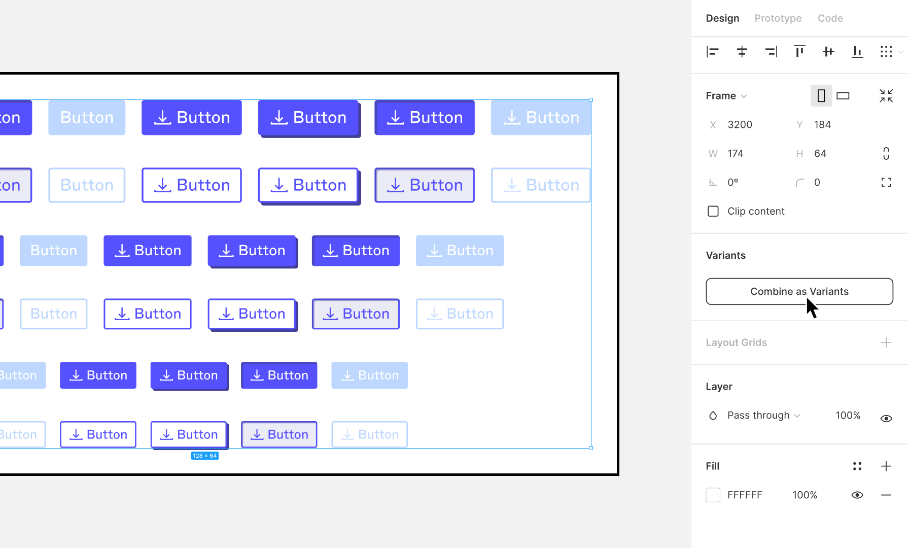
The image below shows how multiple separate button components are selected and then combined into one variant set.
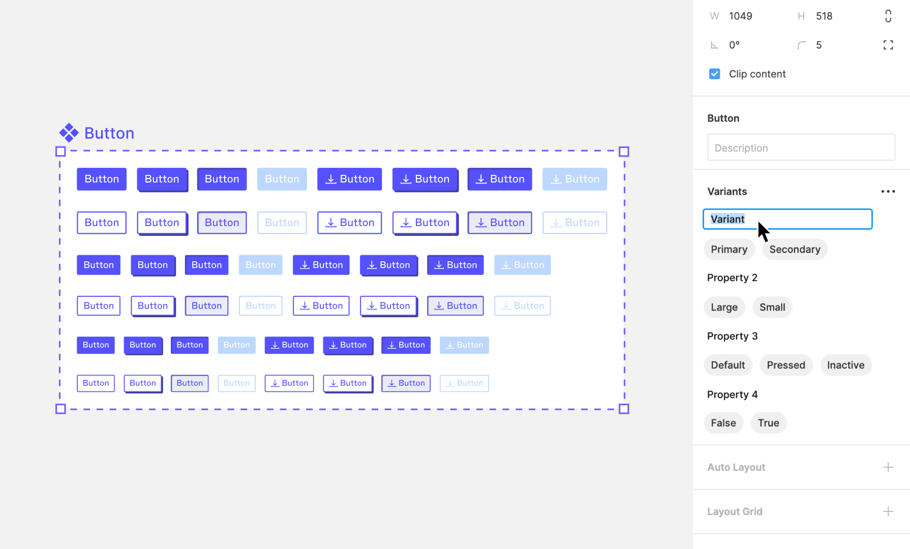
Once combined, you can manage them with properties, as shown in the next image. Notice how Variant and Property 2 are now configurable options in the right-hand panel.
2. Component Properties: The Keys to Customization
While variants group components, Component Properties are what make them truly dynamic and efficient. They allow you to control aspects of a component instance directly from the properties panel, drastically reducing the number of variants you need to create.
There are four main types of component properties. Let's watch a quick overview.
Figma Component Properties made SIMPLE (Variants, Boolean, Text, Instance)
The video "Figma Component Properties made SIMPLE" by Tim Gabe provides a fantastic, direct explanation of the four property types.
Watch the introduction from the beginning to the overview. The presenter gives a clear, high-level summary of each property: Variants: The different versions or states of a component (e.g., size, color). Instance Swap: Lets you swap a nested component, like an icon. Text: Lets you change a text layer's content. Boolean: An on/off switch to show or hide a layer (e.g., an icon).
Understanding these four properties is the key to unlocking an efficient workflow. Instead of making a separate variant for "with icon" and "without icon", you can use a single Boolean property. This is the kind of system thinking that you've honed in your CA work, applied now to design.
3. Practical Build: A "Smart" Button Component
Now, let's put it all together by building a flexible button component from scratch. We'll follow along with the same video, which does an excellent job of demonstrating the process step-by-step.
Figma Component Properties made SIMPLE (Variants, Boolean, Text, Instance)
This video will guide you through building a complete, flexible button component using all the properties we just discussed.
Watch from the full build. Follow along as the presenter applies each property. Pay close attention to these stages: Base Component: Creating the initial button with Auto Layout and converting it into a component. Variant Property: Creating size variants (large, medium, small). Notice how the property is named and how the values are assigned to each button. Instance Swap Property: Adding the ability to swap the icon directly from the properties panel. Text Property: Making the button's label editable. Boolean Properties: Creating toggles to show or hide the text and the icon independently. At the end, you'll see how all four properties work together on a single instance of the button, giving you complete control from the right sidebar.
4. Your Turn: Practice Exercise
Now it's time for hands-on practice in your own Figma file. Let's create a versatile button for your bespoke gifting business website.
-
Create Two Base Buttons:
- Create a "Primary" button: A rectangle with a solid fill color (e.g., your brand's main color) and white text that says "Order Now". Use Auto Layout for padding.
- Create a "Secondary" button: A rectangle with a stroke (outline) and no fill. The text should be the same color as the stroke. It can also say "Order Now".
-
Combine as Variants:
- Select both buttons.
- In the Design panel on the right, click "Combine as Variants". You'll see a purple dashed line appear around them.
-
Name Your Variant Property:
- With the variant set selected, look at the Properties section in the right sidebar. You'll see Figma created
Property 1. - Click on
Property 1and rename it toStyle. - Select your primary button variant. In the
Current variantsection, ensure itsStylevalue isPrimary. - Select your secondary button variant and change its value to
Secondary.
- With the variant set selected, look at the Properties section in the right sidebar. You'll see Figma created
-
Add an Icon and a Boolean Property:
- Add a small icon (you can use a plugin like "Iconify" or just draw a simple shape for now) inside both button variants. Place it to the left of the text.
- Select the icon layer inside both variants.
- In the Layer section of the Design panel (look for the eye icon), click the diamond-shaped
Create propertyicon on the far right. - Select Create boolean property. Name it
Show Iconand leave the value asTrue. ClickCreate property.
-
Test Your Component:
- Go to the Assets panel in the left sidebar.
- Drag an instance of your new button component onto the canvas.
- In the right sidebar, you should now see your custom properties. Try changing the
StylefromPrimarytoSecondary. - Click the
Show Icontoggle on and off.
You've just created a component that can be either primary or secondary, and can show or hide its icon, all from one master component set!
Conclusion
You've now moved beyond basic components and into building powerful, scalable systems. By mastering variants and properties, you can create a single, well-organized component that handles dozens of potential use cases. This is not just a Figma trick; it's a professional workflow that demonstrates efficiency and systematic thinking—qualities that are highly valuable in a freelance designer.
Key Takeaways:
- Variants Organize Components: They group related components (e.g., buttons of different styles and states) into a single, manageable component set.
- Properties Add Dynamic Control:
- Variant Properties define the main categories (e.g.,
Style,Size). - Boolean Properties provide on/off toggles (e.g., show/hide an icon).
- Text Properties allow for easy content changes.
- Instance Swap Properties let you switch out nested elements like icons.
- Variant Properties define the main categories (e.g.,
Preview of the Next Lesson:
You have now completed the foundational skills of Figma mastery. It's time to put them to work on a real, marketable asset. In the next lesson, we will begin Module 2 by designing a reusable Instagram post template. You will directly apply your knowledge of Auto Layout, components, and variants to create a high-demand digital asset that you can offer as a freelance service.