Introduction
In our last lesson, you laid the organizational groundwork for your website by structuring your Figma file with pages, frames, and simple layout blocks. You now have a static blueprint of your Home, About, and Products pages. However, modern web design needs to be dynamic and responsive—it must adapt seamlessly to different screen sizes and content changes.

Today, we'll dive into the single most important feature for achieving this in Figma: Auto Layout. This lesson directly addresses the learning outcome: Apply Auto Layout to create responsive and flexible design components. You'll learn how to transform your static frames into intelligent containers that automatically adjust their size and spacing. This is a fundamental, rule-based system that is essential for the professional "Figma to Framer" workflow.
1. Understanding Auto Layout: The Core Properties
At its heart, Auto Layout allows you to create frames that control the arrangement of the elements inside them. Instead of manually positioning every element, you define rules for direction, spacing, and alignment, and Figma does the rest. This mirrors concepts like CSS Flexbox, which you may encounter in your computer science studies, where a parent container manages the layout of its children.
To get a quick but comprehensive overview of the main controls, let's watch a tutorial.
Figma Auto Layout Tutorial for Beginners
The video 'Figma Auto Layout Tutorial for Beginners' by Aliena Cai provides a fast-paced tour of the Auto Layout panel. It's an excellent way to familiarize yourself with the key properties we'll be using.
Watch from the beginning to 01:41 and from 04:18 to 04:52. Focus on these core concepts: Adding Auto Layout (0:00 - 0:51): How to apply Auto Layout to a selection using Shift + A. Direction (1:12 - 1:41): Understanding the difference between Vertical and Horizontal layouts. Spacing and Padding (4:18 - 4:52): How to control the gap between items and the padding inside the frame.
To summarize the key controls you just saw, here is a helpful diagram.
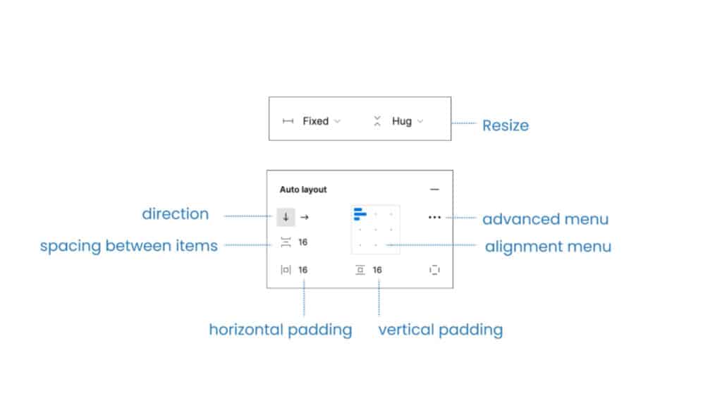
The essential properties to remember are:
- Direction: Arranges items horizontally or vertically. A
Wrapoption is also available for horizontal layouts to push overflow items to the next line. - Gap: The space between items within the Auto Layout frame.
- Padding: The space between the items and the edge of the Auto Layout frame itself.
- Alignment: Controls where the items are positioned within the frame (e.g., top-left, center, bottom-right).
For a detailed reference you can return to, Figma's official guide provides clear definitions of these properties.
Figma's 'Guide to auto layout' is the official documentation. It's a great resource to have on hand for precise definitions.
Quickly scan the sections titled 'Add auto layout', 'Choose an auto layout flow', and 'Adjust spacing properties'. You don't need to memorize it; just familiarize yourself with where to find the definitions for Direction, Padding, and Gap.
2. The Power of Resizing: Hug, Fill, and Fixed
The true magic of Auto Layout lies in its resizing properties. These rules determine how an element behaves when its content or its parent container changes size. This is what makes a design truly responsive.
There are three primary resizing behaviors:
- Hug contents: The frame resizes to be just big enough to "hug" the content inside it, plus any padding. This is perfect for components like buttons, where the background should grow or shrink with the text label.
- Fill container: The item stretches to fill all available space within its parent Auto Layout frame. This is essential for creating layouts where columns or elements need to adapt to the screen width.
- Fixed width/height: The item's dimensions are locked and will not change automatically.
The relationship is key: Hug relates to an object's children, while Fill relates to its parent.
The next video explains this parent-child resizing dynamic very clearly.
Auto Layout for Beginners (crash course)
The video 'Auto Layout for Beginners (crash course)' from Flux Academy has an excellent segment that demystifies the different resizing options.
Watch from 04:55 to 08:07. Pay close attention to the visual demonstration of: Hug contents (how the frame shrinks and grows with its contents). Fixed width (how the frame size is independent). Fill container (how a nested frame expands to fill its parent).
3. Practical Application: Building a Flexible Button Component
Let's apply these concepts by building a simple, flexible button. This is a classic use case for Auto Layout and something you will build countless times.
Activity (~20 minutes):
- Navigate to your
💎 Designspage in the Figma file from our last lesson. - Create the Text: Use the Text tool (
T) and type "Get Started" somewhere on the canvas (not inside a frame yet). - Add Auto Layout: With the text layer selected, press
Shift + A. You've just created a new frame with Auto Layout applied around your text. - Style the Button:
- In the right sidebar, find the Fill section and click
+to add a background color. Choose one of your primary brand colors. - Change the text color to be legible against the background (e.g., white).
- In the right sidebar, find the Fill section and click
- Adjust Padding:
- In the Auto Layout panel, find the padding settings. Set the horizontal padding to
32and the vertical padding to16.
- In the Auto Layout panel, find the padding settings. Set the horizontal padding to
- Set Resizing to
Hug:- Observe the resizing settings for the frame. They should already be set to
Hugfor both width and height by default.
- Observe the resizing settings for the frame. They should already be set to
- Test the Flexibility: Double-click the text and change it to something longer, like "Learn More About Our Products". Notice how the button's background automatically resizes to accommodate the new text while maintaining the padding. This is the power of
Hug contents.
You've just created a fully responsive button component!
4. Nesting Auto Layouts for Complex Designs
Simple components are great, but real-world layouts are more complex. The true power of Auto Layout is unlocked when you nest Auto Layout frames inside each other. For example, you can have a vertical Auto Layout frame for a page section, which contains a horizontal Auto Layout frame for a row of cards.
Let's revisit the static blocks you made in the last lesson.
Activity (~10 minutes):
- Select the rectangle you created for your "Hero Section" in the
Homeframe. - Delete the rectangle. Now select the
Homeframe itself. In the right sidebar, click the+next to Auto Layout. - Set its direction to Vertical and add
64pxof top and bottom padding. - Now, drag the flexible button you just created inside the
Homeframe. You'll see it snap into place. - Add two text layers above the button: one large for a "Headline" and one smaller for a "Sub-headline".
- Notice how all three items—headline, sub-headline, and button—stack vertically because their parent (
Homeframe) has a vertical Auto Layout. Adjust theGapbetween them to24px.
You have now converted a static design into a simple, dynamic section. To see how this concept of nesting can be scaled to build highly complex and fully responsive layouts, the following segment is highly recommended.
Auto Layout for Beginners (crash course)
Returning to the Flux Academy video, this segment provides a masterclass in using nested Auto Layouts to build a complex, responsive data table. This shows the ultimate potential of the skills you're learning.
Watch from 10:34 to 20:54. You don't need to follow along and build the table yourself, but focus on the strategy: How individual elements (text, icons) are put into their own Fixed width Auto Layout frames. How those frames are combined into a horizontal Auto Layout Row component. How multiple Row components are stacked in a final vertical Auto Layout frame. How changing the parent frame's width and setting the rows to Fill container makes the whole table responsive.
Conclusion
Today you've made a significant leap from static to dynamic design. You have mastered the fundamentals of Auto Layout, a skill that is non-negotiable for modern UI/UX designers. By understanding and applying these rule-based systems, you're building a strong foundation for creating efficient, scalable, and professional-grade designs.
Key Takeaways:
- Auto Layout automates the arrangement of elements using Direction, Gap, Padding, and Alignment.
- The resizing properties—Hug contents, Fill container, and Fixed—are what make your components truly responsive.
- Nesting Auto Layout frames is the technique used to build complex, multi-dimensional layouts like page sections, cards, and navigation bars.
- Always build components like buttons with Auto Layout to ensure they adapt to their content.
Preview of the Next Lesson:
You now have the technical skill to create flexible containers. In the next lesson, "Design the hero section of a landing page with a clear value proposition and call-to-action," you will apply what you've learned to build the most critical part of your homepage. We'll focus on combining typography, your new Auto Layout skills, and persuasive messaging to create an engaging and effective hero section.