Introduction
Welcome back! In our last lesson, you established your "homebase"—the project management system in either Notion or Obsidian that will serve as the command center for your entire journey into creating digital products. You now have a dedicated space to track projects, capture ideas, and, starting today, document your learning.
This lesson marks our shift from organizational systems to design fundamentals. Our learning outcome is to identify the core principles of minimalist design: whitespace, visual hierarchy, and simplicity.
Mastering these principles is non-negotiable for creating the clean, aesthetic, and fast-loading digital experiences you're aiming for. You've mentioned you prefer systematic, rule-based frameworks for design, and that's exactly what this lesson provides. We will break down minimalist design into three core, actionable components that you can apply methodically, rather than relying on abstract creative sparks.
Let's begin building your visual design vocabulary.
1. Whitespace: The Active Element of Design
The first, and arguably most important, principle to understand is that empty space is not empty. In design, we call it whitespace or negative space, and it's an active element that brings order and focus to your layout. New designers often feel the need to fill every pixel, but learning to use whitespace deliberately is what separates amateur work from professional design.
This video from the Satori Graphics channel provides an excellent, structured breakdown of how to think about and use whitespace.
Graphic Design Principles Master-Class! (Ep 1 White Space)
In 'Graphic Design Principles Master-Class! (Ep 1 White Space)', you'll learn why whitespace is crucial for preventing visual clutter and how it can be used to group elements and guide the viewer's attention.
Please watch the following segments: The Foundation (0:22 - 1:29): Focus on the concept of whitespace as 'breathing room' that brings balance and calm to a design. Grouping & Proximity (1:29 - 2:33): Pay attention to how spacing alone can group related items together, a key concept from Gestalt psychology. Directing Focus & Scale (2:47 - 5:06): This is a critical section. Understand the difference between micro whitespace (between letters and lines) and macro whitespace (between larger sections) and how a consistent spacing system creates rhythm.
As the video explains, effective use of whitespace achieves three main goals:
- It reduces cognitive load: A clean layout is easier to understand.
- It creates relationships: Elements placed close together are perceived as a group.
- It establishes focus: Generous space around an element makes it stand out.
A systematic way to apply this, which fits your coding background, is to use a spacing scale (e.g., 4px, 8px, 16px, 32px, 64px) for all margins and padding. This creates a predictable and harmonious rhythm throughout your design.
2. Visual Hierarchy: Guiding the User's Journey
If whitespace provides the canvas and structure, visual hierarchy is the set of directions you give the viewer. It's the art of arranging elements to show their order of importance, telling the user exactly where to look first, second, and third. Without a clear hierarchy, users don't know what's important and can quickly become overwhelmed.
The following video, also from Satori Graphics, offers a fantastic, rule-based approach to establishing hierarchy.
🔸 Master ADVANCED Hierarchy In Under 7 Minutes! (Important)
In 'Master ADVANCED Hierarchy In Under 7 Minutes!', you'll learn practical techniques for controlling where a user looks and in what order they process information.
Watch these key parts of the video: The Three-Flow Rule (0:10 - 1:17): Internalize this simple model of a viewer's journey: a starting point, a secondary point, and a final destination. F & Z Patterns (1:17 - 2:41): Understand these natural eye-scanning patterns, which are especially relevant for web pages. Size & Scale (2:41 - 4:20): This is the most direct way to create hierarchy. Notice the 'hook, secondary detail, finisher' model. Hierarchy's Best Friend (5:39 - 6:16): This section explicitly connects hierarchy back to whitespace, reinforcing that one cannot exist without the other.
To summarize, you can control hierarchy using several tools:
- Size: Larger elements grab more attention.
- Color & Contrast: Bright or high-contrast elements stand out.
- Position: Elements at the top of the page are seen as more important.
- Spacing: As we just learned, more whitespace around an element gives it prominence.
Combining these allows you to create a clear path through your content, from the main heading (the hook) to the body text (the detail) and finally to the call-to-action button (the finisher).
3. Simplicity: Maximizing Signal, Minimizing Noise
Whitespace and hierarchy are the tools you use to achieve the overarching goal of simplicity. In the context of minimalist design, simplicity isn't about a stark, empty look. It's about a relentless focus on purpose. Every single element on the page must have a job. If it doesn't, it's "noise" that distracts from the "signal"—the core message or function.
This concept is central to usability, and the Nielsen Norman Group, a leading voice in user experience research, defines it perfectly.
Aesthetic and Minimalist Design (Usability Heuristic #8)
This article, 'Aesthetic and Minimalist Design', provides a functional, no-nonsense definition of minimalism that aligns perfectly with creating effective digital products.
Please read the following two short sections: Start at the heading 'Minimalist Design, Maximum Utility'. This section clarifies that minimalism, in a usability context, is about simplifying interfaces by removing unnecessary elements to support user tasks. Continue to 'Limit the amount of “noise” in your design'. This introduces the powerful concept of the 'signal-to-noise ratio', a useful mental model for evaluating any design element.
The key idea is to think of your design's information content like a data transmission.
- Signal: The essential information the user needs. This includes clear labels, readable text, and functional images.
- Noise: Extraneous elements that compete for attention without adding value. This includes decorative graphics, irrelevant information, and confusing visual cues.
Your goal as a minimalist designer is to maximize the signal-to-noise ratio. Before adding any element, ask yourself: "Does this help the user achieve their goal, or does it just add clutter?"
Synthesis and Action
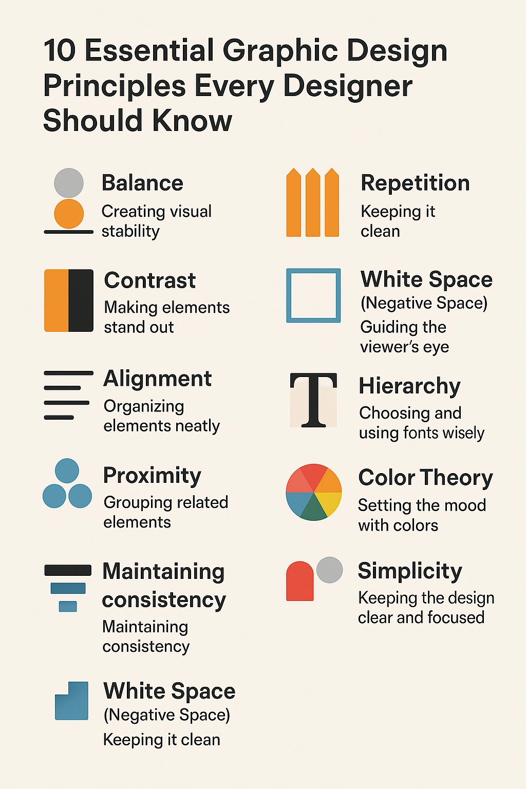
These three principles—Whitespace, Hierarchy, and Simplicity—are not separate ideas but a deeply interconnected system. Simplicity is the philosophy, and you use whitespace and visual hierarchy as your primary tools to implement it.
These infographics provide a great visual summary of how these concepts fit into the broader world of design principles.

Your Task:
Now, let's put this knowledge into practice.
- Open the "homebase" you set up in the previous lesson (Notion or Obsidian).
- Navigate to your
Course Learning Journal. - Create a new note or page titled
Core Design Principles. - In your own words, write a one-paragraph summary for each of the three principles we covered:
- Whitespace: What is it, and what are its primary functions?
- Visual Hierarchy: What is its purpose, and what are two methods to create it?
- Simplicity: How would you explain the "signal vs. noise" concept?
- Finally, write one concluding sentence that explains how these three principles work together.
This exercise will solidify your understanding and give you a reference sheet you can return to throughout this course.
Conclusion
In this lesson, you've established the theoretical foundation for the minimalist design style you want to master. You now have a systematic framework for analyzing and creating clean, effective designs.
Here are the key takeaways:
- Whitespace is an active design element that creates structure, relationships, and focus.
- Visual Hierarchy guides the user's eye and communicates importance through tools like size, contrast, and spacing.
- Simplicity is the discipline of removing every non-essential element ("noise") to amplify the core message and function ("signal").
In our next lesson, we will move from theory to practice. We will deconstruct the visual aesthetics and product ecosystems of successful creators like Oliur and Bog, analyzing how they use these very principles to build their brands and sell their products. You'll start to see these rules in action everywhere.