Hello again! It's great to connect for our next lesson.
In our last session, we successfully built an embedded app page that could fetch product data from the Shopify API and even allow merchants to select products using the ResourcePicker. This was a huge step in building a full-stack slice of an app.
Today, we'll focus on polishing the user experience. A great app doesn't just perform tasks; it communicates clearly with the user. We'll explore how to provide feedback and create interactive dialogs using native Shopify UI elements. Your background in full-stack development will be helpful here, as this is analogous to creating front-end components that trigger server-side-styled UI responses, but with Shopify's specific toolset.
By the end of this lesson, you will be able to use App Bridge actions to trigger native Shopify UI elements like modals and toast messages.
Why Not Just Use alert() or a React Modal Library?
Your "first principles" approach to learning makes this a perfect place to start. Why do we need App Bridge for something as simple as a pop-up message? Why not use a standard library like react-modal or a simple alert()?
The answer lies in creating a seamless, native experience. Your app runs inside an <iframe> within the Shopify Admin.
- A standard
alert()is jarring and doesn't match the Shopify look and feel. - A modal from a generic React library would be trapped inside your app's
<iframe>. It would be centered within your app's content area, not the entire Shopify Admin page, and the rest of the admin (like the main navigation) would remain active.
App Bridge solves this by acting as a "bridge" between your app and its host, the Shopify Admin. Your app sends a message (an "action") across this bridge, and the Shopify Admin itself renders the UI element.
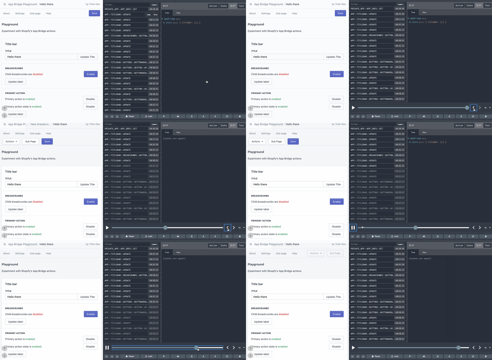
To understand the benefits of this approach, please read the following section from the Shopify documentation.
The article 'Using modals in your app' explains the core reasons for using App Bridge for UI elements. It directly addresses the 'why' behind this pattern.
Please read the section titled 'Why App Bridge Modals instead of Polaris React Modals'. Focus on the three key benefits: Centering, Standardized header and footer, and Automatic updates.
This approach ensures that your app feels like an integrated part of Shopify, not a separate website embedded in a box.
Quick Feedback with Toast Messages
The simplest form of non-blocking feedback is a "toast" message. It's a small notification that appears briefly at the bottom of the screen to confirm an action or report a status.
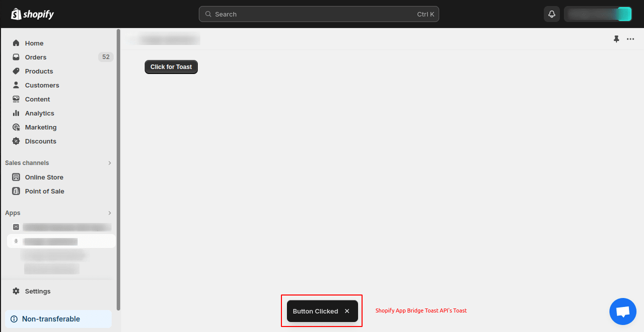
Triggering a toast is a one-line command. Let's see it in action.
Getting Started with Shopify App Bridge - Create a Shopify App
The video 'Getting Started with Shopify App Bridge' from the WeeklyHow channel has a short, clear demonstration of how to trigger a toast message.
Watch the segment from 11:40 to 12:29. Notice how the global Shopify object is used in vanilla JavaScript. We will adapt this to the React useAppBridge hook that is standard in the Shopify CLI template.
In our React-based app, the implementation looks like this. We get the app instance from the useAppBridge hook and call the toast.show() method.
import { Page, Button } from "@shopify/polaris";
import { useAppBridge } from "@shopify/app-bridge-react";

export default function ToastExample() {
  const app = useAppBridge();

  const showSuccessToast = () => {
    app.toast.show("Changes saved successfully!");
  };

  const showErrorToast = () => {
    app.toast.show("Failed to save changes", {
      isError: true,
      duration: 5000, // Show for 5 seconds
    });
  };

  return (
    <Page>
      <Button onClick={showSuccessToast}>Show Success Toast</Button>
      <Button onClick={showErrorToast}>Show Error Toast</Button>
    </Page>
  );
}
The toast.show() method is straightforward: the first argument is the message, and the second is an optional options object where you can control its duration and style (e.g., isError: true).
Focused Interaction with Modals
When you need to get the user's full attention—for a confirmation dialog, a form, or a resource selector—you'll use a modal. As we discussed, App Bridge modals feel native because the Shopify Admin renders them outside your app's <iframe>.
There are two primary ways to create and manage modals.
Method 1: Declarative Modal with Imperative Trigger
This is the most common pattern. You define the modal's structure in your JSX and then open it with a function call.
- Define the Modal: Use the
<Modal>and<TitleBar>components from@shopify/app-bridge-react. Give the modal a uniqueid. - Trigger the Modal: Use
app.modal.show('your-modal-id')from an event handler, like a button'sonClick.
The video you'll watch next demonstrates this pattern by creating a modal and then adding a title bar and buttons.
Getting Started with Shopify App Bridge - Create a Shopify App
Let's return to the 'Getting Started with Shopify App Bridge' video. This section provides a practical walkthrough of creating a modal.
Watch from 14:11 to 17:20. Pay attention to how a ui-modal web component is first created with an ID, and then triggered by calling Shopify.modal.show() with that same ID. The example also shows how to add a title bar and buttons, building a complete interactive element.
Let's look at a complete, practical example in React for a confirmation dialog. This is a pattern you will use constantly as a freelancer.
import { Page, Button } from "@shopify/polaris";
import { Modal, TitleBar, useAppBridge } from "@shopify/app-bridge-react";

export default function ConfirmationModalExample() {
  const app = useAppBridge();

  const handleDelete = () => {
    console.log("Deletion confirmed!");
    app.modal.hide("confirm-delete-modal");
    app.toast.show("Item deleted.");
  };

  return (
    <Page>
      {/* The button that opens the modal */}
      <Button destructive onClick={() => app.modal.show("confirm-delete-modal")}>
        Delete Item
      </Button>

      {/* The Modal definition */}
      <Modal id="confirm-delete-modal">
        <p>This action cannot be undone. Are you sure you want to proceed?</p>
        <TitleBar title="Confirm deletion">
          <button variant="primary" tone="critical" onClick={handleDelete}>
            Delete
          </button>
          <button onClick={() => app.modal.hide("confirm-delete-modal")}>
            Cancel
          </button>
        </TitleBar>
      </Modal>
    </Page>
  );
}
Notice how we use app.modal.hide('confirm-delete-modal') to close the modal programmatically.
Method 2: Controlled Modal with the open Prop
Alternatively, you can control the modal's visibility using React state, just like you would with any other React component. This is useful when the modal's visibility is tied to your application's state rather than a direct, one-off action.
For a detailed look at this and other modal configurations, the Shopify developer documentation is an excellent resource.
The 'Modal Component' API documentation provides a great set of code examples for various use cases. It's a perfect reference for practical implementation.
First, review the example under 'Showing a Modal with the open prop'. This demonstrates how to bind the modal's visibility to a React state variable (modalOpen). Then, look at the example under 'Subscribing to Hide'. This shows the onHide callback, which is useful for cleaning up state when the user closes the modal (e.g., by pressing the Escape key).
Here's how the state-controlled pattern looks:
import { Page, Button } from "@shopify/polaris";
import { Modal, TitleBar } from "@shopify/app-bridge-react";
import { useState } from "react";

export default function ControlledModalExample() {
  const [isOpen, setIsOpen] = useState(false);

  return (
    <Page>
      <Button onClick={() => setIsOpen(true)}>Open Modal</Button>

      <Modal open={isOpen} onHide={() => setIsOpen(false)}>
        <p>This modal is controlled by React state.</p>
        <TitleBar title="Controlled Modal">
          <button variant="primary" onClick={() => setIsOpen(false)}>
            Close
          </button>
        </TitleBar>
      </Modal>
    </Page>
  );
}
Test your understanding!
You need to build a feature where clicking a "Settings" button opens a complex form. The form has its own state and logic. When would you choose the app.modal.show('id') method versus the state-controlled open={isOpen} method?
Show answer
For a complex form, the state-controlled open={isOpen} method is generally better.
The reason is that the form's lifecycle (mounting and unmounting) becomes tied to the isOpen state. When isOpen is true, the modal and its form content will mount, allowing you to fetch data or initialize state in a useEffect. When isOpen becomes false, the modal unmounts, automatically cleaning up its state.
The app.modal.show() method is better for simple, stateless modals like a quick confirmation dialog, where you don't need to manage a complex component lifecycle.
Conclusion
In this lesson, we learned how to create a polished and professional user experience by providing clear feedback through native Shopify UI elements. By using App Bridge actions, we ensure our app feels deeply integrated with the Shopify Admin.
Key Takeaways:
- App Bridge is essential for triggering native UI elements like toasts and modals to maintain a consistent UX.
- Toasts, triggered by
app.toast.show(), are used for simple, non-blocking notifications. - Modals are for focused, blocking interactions and can be created in two main ways:
- Defined with the
<Modal id="...">component and triggered imperatively withapp.modal.show('...'). - Controlled declaratively using React state and the
openprop on the<Modal>component.
- Defined with the
- The choice between these modal patterns depends on the complexity of the modal's content and state.
In our next lesson, we will shift our focus from the admin to the storefront. You will learn about Theme App Extensions, a powerful mechanism that allows your app to inject functionality and UI elements directly into a merchant's online store theme. This is a critical skill for building many types of Shopify apps.