Hello! Welcome to your next lesson.
In our last session, we established a clean, scalable architecture for our custom CSS by organizing it into base, components, and utilities layers. This practice is fundamental for keeping a large project maintainable, which directly aligns with your goal of understanding industry best practices.
This lesson builds directly on that foundation. We'll explore how to extend Tailwind's core functionality using plugins. Specifically, you will learn how to install and apply the official @tailwindcss/forms plugin to style form elements consistently. Forms are a critical part of almost every web application, but they are notoriously difficult to style consistently across different browsers. This lesson will equip you with a powerful and efficient solution.
Part 1: The Challenge of Styling Forms
Before we jump to the solution, it's important to understand the problem. Out of the box, browsers apply their own, often inconsistent, default styles to form elements like text inputs, select dropdowns, and checkboxes. Trying to override these styles with utility classes alone can lead to frustrating results.
For example, a simple text input and a select dropdown might not have the same height even if you apply the same padding utilities. A checkbox's appearance can vary wildly between Chrome, Firefox, and Safari.

To see these challenges in action, the creator of Tailwind CSS, Adam Wathan, demonstrates this very problem in the first part of the following video.
Styling Forms with Tailwind CSS
Watch this segment from the official Tailwind Labs channel. It clearly illustrates the difficulties of styling different form elements with only utility classes, highlighting issues with padding, height, and browser-specific appearances.
Watch from the beginning to 04:34. Pay close attention to how the select element behaves differently from the text inputs when the same styles are applied.
As you saw, achieving a consistent design across all form elements requires a CSS "reset" that normalizes their appearance. This is exactly what the @tailwindcss/forms plugin provides.
Part 2: Installing the Forms Plugin
A Tailwind CSS plugin is a package that extends the framework's functionality, often by adding new styles, variants, or utilities. The @tailwindcss/forms plugin is an official plugin that provides an opinionated but highly customizable reset for form elements.
Let's get it set up. The process involves two simple steps:
- Installing the package from npm.
- Adding it to your
tailwind.config.jsfile.
The next segment of the video walks you through this installation.
Styling Forms with Tailwind CSS
This short clip demonstrates how to install the plugin via npm and register it in your Tailwind configuration file.
Watch from 04:34 to 05:50. Observe how the form's appearance immediately changes once the plugin is added to the config, even before any custom classes are applied.
Your Turn: Install the Plugin
Now, apply these steps to your VueMart project.
- Open your terminal in VS Code.
- Run the installation command:
npm install @tailwindcss/forms - Open your
tailwind.config.jsfile and add the plugin to thepluginsarray:/** @type {import('tailwindcss').Config} */ export default { content: [ "./index.html", "./src/**/*.{vue,js,ts,jsx,tsx}", ], theme: { extend: {}, }, plugins: [ require('@tailwindcss/forms'), // Add this line ], }
Once you save the file and your development server reloads, the plugin is active. It has already applied a basic set of styles to normalize form elements.
For a quick textual reference on plugins, you can always consult the official documentation.
The official Tailwind documentation provides a concise overview of how official plugins work. The section on the Forms plugin is a great quick-reference.
Read the small section titled 'Forms'. It serves as a good reminder of the plugin's purpose and how to register it.
Part 3: Styling Forms with Utility Classes
With the plugin installed, the hard work is done. You can now style form elements consistently using the same Tailwind utility classes you're already familiar with. The plugin works by applying base styles that you can easily override.
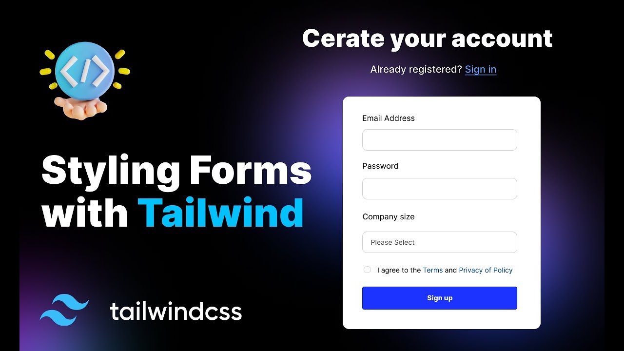
The next part of the video demonstrates how to apply custom styles to text inputs, select dropdowns, and checkboxes, achieving a beautiful and consistent look.
Styling Forms with Tailwind CSS
This is the core of the lesson. Watch how easily you can customize the appearance of different form elements now that the plugin is handling the browser inconsistencies.
Watch from 05:50 to 12:22. Pay special attention to these key points: How the select element now respects padding and height correctly. How a checkbox's color can be changed with a simple text color utility (e.g., text-indigo-600). The importance of always including a type attribute on your <input> elements for the plugin to work correctly.
Hands-On: Create a Practice Form
The mini-project for our next module will involve creating a contact form. Let's practice now so you're ready.
-
In your
src/viewsfolder, create a new file namedFormPracticeView.vue. -
Add the following basic structure to the file. We'll use this as our canvas.
<template> <div class="max-w-md mx-auto p-8"> <h1 class="text-2xl font-bold mb-6">Plugin Practice Form</h1> <form class="space-y-6"> <!-- Text Input --> <div> <label for="name" class="block text-sm font-medium text-gray-700">Full Name</label> <div class="mt-1"> <input type="text" name="name" id="name" placeholder="John Doe"> </div> </div> <!-- Select Dropdown --> <div> <label for="role" class="block text-sm font-medium text-gray-700">Role</label> <div class="mt-1"> <select name="role" id="role"> <option>Frontend Developer</option> <option>Backend Developer</option> <option>Designer</option> </select> </div> </div> <!-- Checkbox --> <div class="flex items-center"> <input id="subscribe" name="subscribe" type="checkbox"> <label for="subscribe" class="ml-2 block text-sm text-gray-900">Subscribe to newsletter</label> </div> <!-- Submit Button --> <div> <button type="submit" class="w-full flex justify-center py-2 px-4 border border-transparent rounded-md shadow-sm text-sm font-medium text-white bg-indigo-600 hover:bg-indigo-700"> Submit </button> </div> </form> </div> </template> <script setup> // No script logic needed for this practice </script> -
To see this form, temporarily update your
src/router/index.jsto point the home route (/) to this new view.// src/router/index.js import { createRouter, createWebHistory } from 'vue-router' // import HomeView from '../views/HomeView.vue' // Comment out or remove import FormPracticeView from '../views/FormPracticeView.vue' // Import the new view const router = createRouter({ history: createWebHistory(import.meta.env.BASE_URL), routes: [ { path: '/', name: 'home', component: FormPracticeView // Use the new view }, // ... other routes ] }) -
Now, apply utility classes to the
input,select, andcheckboxelements inFormPracticeView.vueto give them a consistent style. Try to achieve the following:- Full-width inputs and select boxes.
- A light gray border (
border-gray-300). - Rounded corners (
rounded-md). - A focus state with a blue or indigo ring (
focus:ring-indigo-500). - Make the checkbox indigo when checked (
text-indigo-600).
Part 4: A Better Way: Customizing Plugin Defaults
After styling the form, you probably noticed you were applying the same set of classes (w-full, rounded-md, border-gray-300, etc.) to both the text input and the select box. This is repetitive.
This is where your knowledge from the last lesson on layers becomes incredibly powerful. The forms plugin adds its styles to the @layer base. We can override these defaults by adding our own styles to the base layer in our custom CSS files. Since our custom styles are processed after the plugin's, they will take precedence.
The final part of the video explains this advanced technique.
Styling Forms with Tailwind CSS
This segment connects everything together. It shows how to extract repetitive utility classes and apply them globally to all form elements using the @layer base directive we learned about in the last lesson.
Watch from 12:22 to the end (17:11). The key concept is that you can define new default styles for form elements in your main CSS file, keeping your HTML clean and your styles consistent.
Hands-On: Refactor for Consistency
Let's apply this best practice to your project.
- Identify the common utility classes you applied to the
inputandselectelements inFormPracticeView.vue. - Open your global base styles file:
src/styles/base.css. - Following the video's example, add a new ruleset to this file to define new defaults for your form elements. The selectors used by the plugin are quite specific, so you can copy them from the video or use this simplified version for inputs and selects:
/* src/styles/base.css */ h2 { @apply text-2xl font-bold mb-4 text-gray-800; } /* Add these new styles for forms */ [type='text'], select { @apply w-full border-gray-300 rounded-md shadow-sm focus:border-indigo-500 focus:ring-indigo-500; } - Now, go back to
FormPracticeView.vueand remove all those utility classes from your<input>and<select>tags. - Your form should look exactly the same! The styles are now being applied globally from your
base.cssfile, making your code much cleaner and more maintainable.
Conclusion
Congratulations! You have successfully integrated a powerful Tailwind CSS plugin to solve a common and often frustrating development challenge. You not only learned the "how" but also the "why" and connected it back to our previous lesson on CSS architecture.
Key Takeaways:
- Styling forms is difficult due to inconsistent default browser styles.
- Tailwind plugins like
@tailwindcss/formsextend the framework's capabilities. You install them vianpmand register them in yourtailwind.config.js. - The forms plugin provides a CSS reset, allowing you to style form elements consistently with standard utility classes.
- To promote reusability and maintainability, you can customize the plugin's default styles by adding your own rules to the
@layer basein your global CSS files.
Next Lesson: We will begin the next module, a refresher on HTML structure and semantics. In the mini-project, you'll build a multi-page personal profile site that includes a contact form, giving you the perfect opportunity to apply what you've learned today in a real project.