Welcome back! In our last lesson, we explored the "why" behind Tailwind CSS, focusing on the utility-first approach and its benefits for speed, consistency, and maintainability. You learned that instead of writing custom CSS, we compose styles using small, single-purpose classes.
Today, we're putting that theory into practice. This lesson is all about the "how." We'll dive into the fundamental utility classes that you'll use constantly to build layouts and style your projects. By the end of this lesson, you will be able to use Tailwind's utility classes to control spacing, typography, colors, and build layouts using both Flexbox and Grid.
Let's get started.
1. The Core Building Blocks: Spacing, Sizing, and Colors
Nearly every element you build will involve some combination of spacing (margin/padding), sizing (width/height), colors, and text styles. Tailwind provides an intuitive and comprehensive set of utilities for these properties.
A great way to experiment with these classes without setting up a full project is by using Tailwind Play, an online playground. The following video uses it to demonstrate these core utilities. As you watch, I encourage you to open Tailwind Play in another tab and try out the classes yourself.
Tailwind CSS v4 Full Course 2025 | Master Tailwind in One Hour
This segment from the JavaScript Mastery course is an excellent practical introduction. It will show you how to apply classes for text styling, colors, margins, padding, borders, and sizing.
Watch from 07:42 to 14:55. Pay attention to the naming conventions: Text: text-{size}, text-{color}, font-{weight} Background: bg-{color}-{shade} Sizing: w-{size} (width), h-{size} (height) Spacing: m-{size} (margin), p-{size} (padding). Notice the directional variants like mt- (margin-top), px- (padding-x-axis), and my- (margin-y-axis).
To summarize the key concepts from the video:
- Colors: Applied with prefixes like
bg-for background,text-for font, andborder-for borders. Example:bg-blue-500,text-slate-100. - Typography: Classes like
text-lg(large),text-2xl(2x extra large),font-bold, andtext-centercontrol the appearance of text. - Spacing:
mfor margin andpfor padding. These are combined with a direction (t,b,l,r,x,y) and a size (e.g.,p-4,mx-auto,mb-8). - Sizing:
wfor width andhfor height. You can use fractional sizes (w-1/2), fixed sizes (w-16), or screen-relative sizes (w-screen).
For a quick reference, you can review these concepts in the following article.
A Beginner's Guide to Utility Classes and Basic Usage
This article from Tailgrids provides a concise, written summary of the main utility classes, which can be helpful to reinforce what you saw in the video.
Read the subsections for 'Colors', 'Typography', and 'Spacing'. It's a good way to solidify the naming patterns in your mind.
2. Arranging Elements: 1D Layouts with Flexbox
Once you have styled elements, you need to arrange them. For one-dimensional layouts (arranging items in a single row or a single column), Flexbox is your primary tool. Tailwind makes using Flexbox incredibly simple.
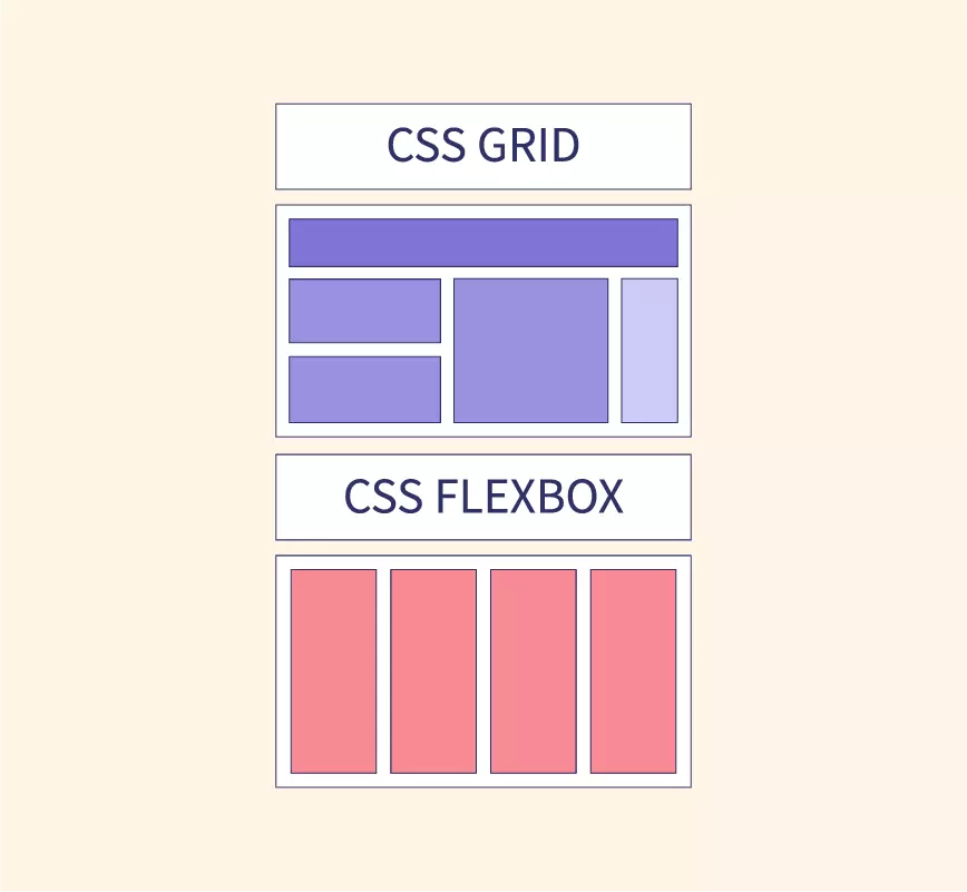
The most common Flexbox utilities you'll use are:
flex: Turns an element into a flex container.flex-row/flex-col: Sets the direction of the main axis.justify-{value}: Aligns items along the main axis (e.g.,justify-center,justify-between).items-{value}: Aligns items along the cross axis (e.g.,items-center,items-start).space-x-{size}/space-y-{size}: Adds a consistent margin between flex items.
Let's see this in action.
Tailwind CSS v4 Full Course 2025 | Master Tailwind in One Hour
The same video provides a clear, hands-on demonstration of Tailwind's Flexbox utilities.
Watch from 18:35 to 21:23. The presenter shows how to create both horizontal and vertical layouts, change alignment, and add space between elements. This is a core skill for building components like navigation bars and card lists.
3. Creating Grids: 2D Layouts with CSS Grid
When your layout is more complex and requires arranging items in both rows and columns, CSS Grid is the right tool. Tailwind's grid utilities are just as straightforward as its Flexbox ones.
The fundamental Grid utilities are:
grid: Turns an element into a grid container.grid-cols-{number}: Defines the number of columns in the grid.gap-{size}: Sets the size of the gap between grid rows and columns.
This next clip demonstrates how to create a simple grid layout.
Tailwind CSS v4 Full Course 2025 | Master Tailwind in One Hour
This short segment will show you how to quickly create a multi-column grid layout.
Watch from 21:23 to 23:11. Notice how simple it is to convert the previous Flexbox layout into a three-column grid using just a few classes like grid, grid-cols-3, and gap-2.
4. Hands-On Application: Building a Component
Now, let's combine everything you've learned. Theory is one thing, but building something solidifies the knowledge. We will now build a complete component—a responsive navigation bar—from scratch. This exercise will force you to use spacing, sizing, colors, and Flexbox utilities together, just as you would in a real project.
The following video is a complete project tutorial. We are going to focus only on the navbar section. Don't worry about the responsive prefixes like md: for now; we'll cover those in detail in the next lesson. Your goal here is to see how the core utilities work together to build a functional piece of UI.
Tailwind Crash Course | Project From Scratch
In this video, Brad Traversy from Traversy Media builds a complete landing page. We will focus exclusively on the navigation bar to practice using Flexbox and spacing utilities in a real-world context.
Watch from 13:16 to 24:14. Follow along in your own index.html file. Focus on how flex, items-center, and justify-between are used to structure the navbar. Pay attention to the spacing classes: mx-auto to center the container, p-6 for padding, and space-x-6 to space out the menu items. Observe how color (bg-bright-red, text-white) and typography (hover:text-dark-grayish-blue) classes are applied to the button and links. You will see prefixes like md:. These are for responsive design. Just type them as shown for now; their function is the main topic of our next lesson.
By completing this exercise, you've taken a significant step from knowing individual classes to understanding how to compose them into a functional component.
Conclusion
Excellent work! You've covered a lot of ground today, moving from the theory of utilities to the practical application of building layouts. These are the classes you will use in almost every single project.
Here are your key takeaways:
- Core Utilities: You now know the basic syntax for styling
colors,typography,spacing, andsizing. - Flexbox for 1D Layouts: You can use
flex,justify-*, anditems-*to arrange elements in a single row or column. This is your go-to for navigation, lists, and aligning items side-by-side. - Grid for 2D Layouts: You can use
grid,grid-cols-*, andgap-*to create multi-column structures for more complex layouts like galleries or dashboards. - Composition is Key: The power of Tailwind comes from combining these simple utilities to build complex and custom designs without writing a single line of custom CSS.
In our next lesson, we will address those md: prefixes you saw. You'll learn how to implement responsive designs using Tailwind's breakpoint system, making your layouts adapt beautifully to mobile, tablet, and desktop screens.