Hello! Welcome to your first mini-project for the JavaScript module.
In our previous lessons, you've built up a powerful toolkit: you can select and modify parts of a web page (DOM manipulation), react to user actions (event listeners), and generate dynamic HTML using template literals and conditional logic. Now, it's time to combine all these skills to build a tangible, professional feature.
Today's learning outcome is to add a light/dark theme toggle to the personal profile site you've already built. This is a classic feature that dramatically improves user experience and will serve as a fantastic practical application of everything you've learned in this module.
Here's an example of what you'll be building:
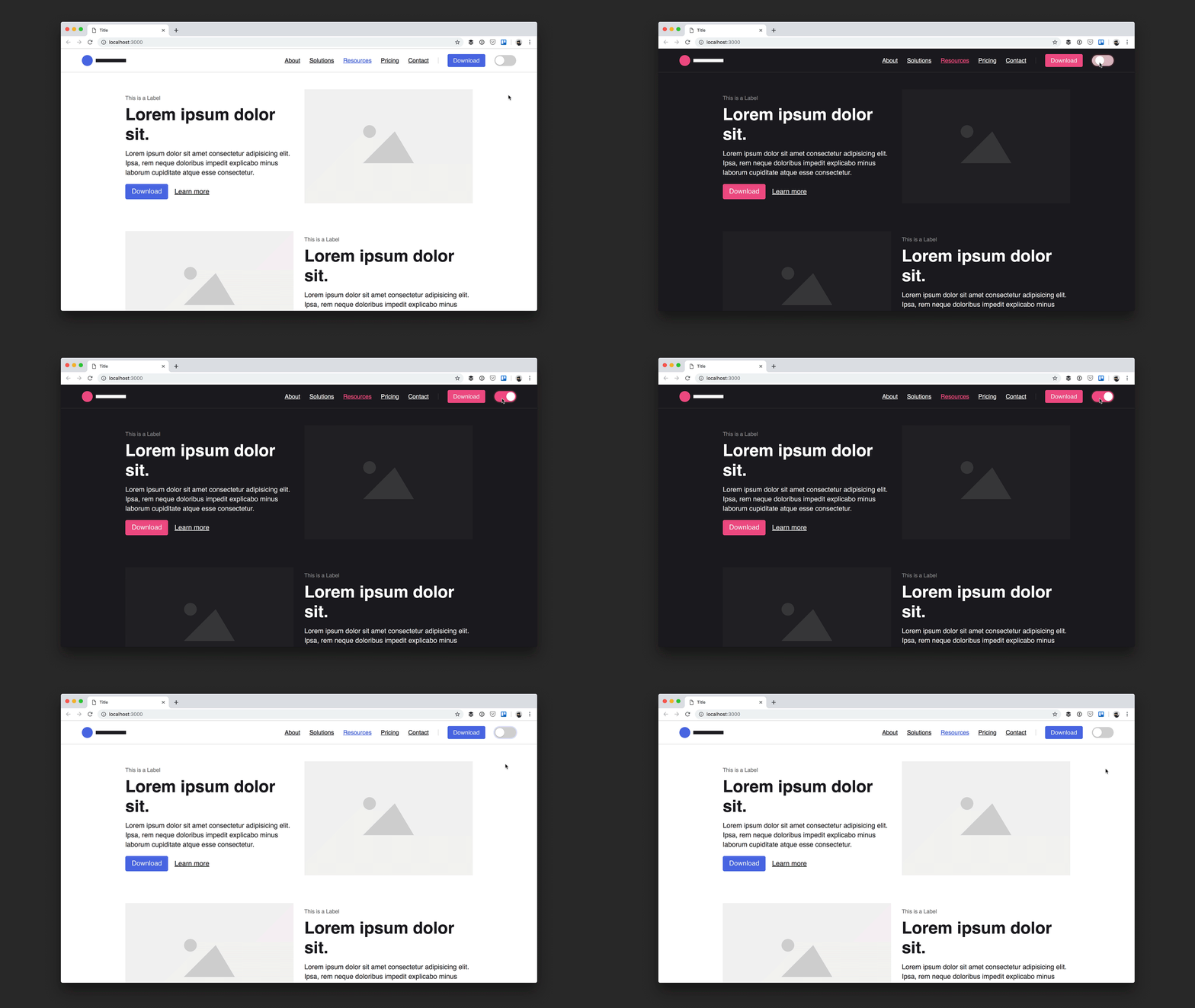
Let's get started.
1. The Strategy: How Theme Switching Works
Before writing any code, it's important to understand the strategy. How can we change the color of every element on the page with a single click? The modern and most efficient way is by using CSS Custom Properties (Variables) and a single attribute on the <html> tag.
The logic is simple:
- We define our color palette (backgrounds, text colors, etc.) as CSS variables for a default theme (e.g., light).
- We create a CSS rule that redefines these same variables when a specific attribute is present, for example,
data-theme="dark". - Our JavaScript will simply add or change this
data-themeattribute on the<html>element. The browser's CSS engine handles the rest instantly.
The best light/dark mode theme toggle in JavaScript
To see this strategy explained, please read the first few sections of the article 'The best light/dark mode theme toggle in JavaScript' from dev.to.
Read the sections titled 'Add a data attribute to your HTML tag' and 'Configure theming via CSS custom properties'. This will give you a clear picture of the CSS setup we'll be using.
2. The Implementation: HTML, CSS, and JavaScript
Now that we have a plan, we can start building. We'll work through the CSS setup, add the button to our HTML, and then write the JavaScript to make it all work.
The core of this project is the JavaScript logic for toggling the theme and, crucially, persisting the user's choice so it doesn't reset every time they reload the page. For this, we will use the browser's localStorage.
The following video provides a complete walkthrough of building a theme toggle, including the persistence logic. It uses a class on the <body> tag instead of a data-theme attribute, but the JavaScript principles are identical and exceptionally well-explained.
How to make a website light/dark toggle with CSS & JS
This video, 'How to make a website light/dark toggle with CSS & JS' by Kevin Powell, is an excellent guide for our project. It covers not just the toggle, but also how to make the user's preference stick around.
Watch the video from the beginning until 10:01, and then from 12:00 until the end. Pay close attention to these key concepts: CSS Setup (00:28): How he uses CSS variables and a .dark-mode class. Introducing localStorage (02:46): Why it's used to remember the theme. Click Handling (05:14): Attaching the event listener and the initial logic. Reusable Functions (07:44): Creating enableDarkMode and disableDarkMode functions. State Management (12:00): The importance of re-checking localStorage on every click. Persistence on Page Load (14:17): The final, crucial step to check the stored theme when the page first loads.
3. Your Turn: The Mini-Project
It's time to apply these concepts to your personal profile site. Open your project folder in VS Code.
Step A: Update Your CSS
First, let's set up the color variables. Open your style.css file.
- At the very top, define your color variables inside the
:rootselector. This will be your light theme. - Then, create a
[data-theme="dark"]selector and redefine those same variables with your dark theme colors.
Here is a sample palette to get you started. Feel free to customize it!
/* Add this to the top of your style.css */
:root {
  --background-color: #f0f2f5;
  --card-background: #ffffff;
  --text-color: #1c1e21;
  --link-color: #007bff;
  --border-color: #ddd;
}

[data-theme="dark"] {
  --background-color: #121212;
  --card-background: #1e1e1e;
  --text-color: #e4e6eb;
  --link-color: #4dabf7;
  --border-color: #393939;
}

/* Now, update your existing CSS to use these variables */
/* Example: */
body {
  background-color: var(--background-color);
  color: var(--text-color);
  /* ... etc */
}

/* Make sure to update colors for your header, cards, links, borders, etc. */
Go through your CSS and replace any hard-coded color values (#fff, black, etc.) with your new variables (var(--card-background), var(--text-color), etc.).
Step B: Update Your HTML
Now, add the toggle button to your index.html (or whichever file has your site header). A good place is inside your main navigation. We'll use an SVG icon inside a button for a clean look.
Building a theme switch component
For the button's HTML, we'll follow best practices for accessibility. This article from web.dev provides an excellent, accessible markup pattern.
Read the sections 'The button' and 'The scalable vector graphic (SVG) icon'. You don't need to dive deep into the SVG mask logic, just focus on the structure of the <button> and the role of the aria-label attribute.
Add this HTML snippet to your site's header/navigation area:
<button id="theme-toggle" title="Toggles light & dark" aria-label="auto" aria-live="polite">
    <svg aria-hidden="true" width="24" height="24" viewBox="0 0 24 24">
        <mask id="moon-mask">
            <rect x="0" y="0" width="100%" height="100%" fill="white" />
            <circle cx="12" cy="4" r="9" fill="black" />
        </mask>
        <circle cx="12" cy="12" r="9" mask="url(#moon-mask)" fill="currentColor" />
    </svg>
</button>
You'll also need a little CSS to style this button. Add this to your style.css:
#theme-toggle {
    background: none;
    border: none;
    cursor: pointer;
    color: var(--text-color);
    padding: 0.5rem;
}


#theme-toggle:hover {
    opacity: 0.8;
}
Step C: Create the JavaScript
This is where the magic happens.
- Create a new file in your project named
theme.js. - Add a
<script>tag to your HTML files (likelyindex.html,about.html,contact.html) right before the closing</body>tag:
<script src="theme.js"></script> - Open
theme.jsand write the code. I've provided a structured template below with comments to guide you. Try to write the code yourself by applying what you learned from the video.
// A structured, readable approach to the JavaScript

// --- 1. Selectors ---
const themeToggle = document.querySelector('#theme-toggle');
const htmlElement = document.documentElement; // This selects the <html> tag

// --- 2. State ---
const storageKey = 'theme-preference';
let currentTheme = localStorage.getItem(storageKey);

// --- 3. On Page Load ---
// Function to apply the theme from localStorage
const applyTheme = (theme) => {
    htmlElement.setAttribute('data-theme', theme);
    currentTheme = theme;
};

// Check for saved theme preference on load
if (currentTheme) {
    applyTheme(currentTheme);
} else {
    // If no preference, you could default to light or check system preference
    applyTheme('light');
}

// --- 4. Handlers ---
const handleThemeToggle = () => {
    // Task 1: Check what the currentTheme is.
    // If it's 'dark', switch to 'light'. Otherwise, switch to 'dark'.
    const newTheme = currentTheme === 'dark' ? 'light' : 'dark';

    // Task 2: Apply the new theme to the document
    applyTheme(newTheme);

    // Task 3: Save the new preference to localStorage
    localStorage.setItem(storageKey, newTheme);
};

// --- 5. Events ---
themeToggle.addEventListener('click', handleThemeToggle);
Work through the handleThemeToggle function to complete the logic. This structure, separating selectors, state, handlers, and events, is a great practice for writing clean and maintainable code, which directly aligns with your goal of understanding industry standards.
Conclusion
Congratulations! You've successfully integrated a major user-facing feature into your project. You combined DOM selection, event handling, conditional logic, and state persistence with localStorage to create a polished and professional light/dark mode toggle.
Key Takeaways:
- CSS Variables are for Theming: They provide a powerful and centralized way to manage your site's color palette.
localStoragefor Persistence: You learned how to store user preferences in the browser so that their experience is consistent across sessions.- Code Structure Matters: Organizing your JavaScript into logical sections (selectors, state, handlers, events) makes it much easier to read, debug, and expand upon.
- Accessibility is Key: Using attributes like
aria-labelensures that your interactive elements are understandable to all users, including those using screen readers.
In our next module, we'll move into the world of asynchronous JavaScript. So far, all our data has been "local"—written directly into our files. We'll start by learning how to validate the contact form in real-time, and then quickly move on to fetching data from external servers using APIs, which is the foundation of building truly dynamic, data-driven applications.