Welcome back. In our last lesson, we examined the trade-offs between built-in HTML5 form validation and custom JavaScript solutions. We concluded that while native validation is simple, a custom approach is often necessary for a branded user experience and, most critically, for accessibility. We saw that default browser error messages often fail to communicate effectively with assistive technologies. Today, we'll tackle that problem head-on.
This lesson introduces ARIA (Accessible Rich Internet Applications), a set of attributes that bridge the gap between custom-built web components and the assistive technologies used by people with disabilities. Our goal is to learn how to apply the most common ARIA attributes—specifically role, aria-label, and aria-hidden—to make your interactive UI components understandable and operable for all users. This knowledge is essential for building modern, professional-grade web applications.
Why ARIA? The Accessibility Tree
Before diving into ARIA attributes, we need to understand how browsers communicate with assistive technologies like screen readers. When a browser parses your HTML, it creates the Document Object Model (DOM), which you're familiar with for styling and scripting. At the same time, it creates a parallel structure called the accessibility tree.
This tree is a simplified representation of the page, containing only the information relevant to accessibility: an element's role (what is it?), its name (what's it called?), its state (is it checked?), and its properties. Assistive technologies read from this tree, not the DOM.
The video "Developer's Guide to Accessibility Mechanics" by Leonie Watson provides a superb explanation of this process.
Leonie Watson - Developer's Guide to Accessibility Mechanics
Watch the beginning of this talk to understand the fundamental relationship between the DOM, the accessibility tree, and platform accessibility APIs.
Pay close attention to the section from the DOM to the accessibility tree. The speaker explains how the browser generates this crucial structure that assistive technologies rely on.
When you use semantic HTML, you get a well-formed accessibility tree for free. A <button> element automatically gets a "button" role, a focusable state, and keyboard interactions. A <nav> element is identified as a "navigation" landmark.
Problems arise when we build custom components using non-semantic elements like <div> and <span>, a very common practice in frameworks such as React. A <div that looks and acts like a button is, to the accessibility tree, just a generic container with no meaning. This is where ARIA comes in. ARIA allows us to manually add the missing information to the accessibility tree.

This diagram illustrates how ARIA attributes augment the information from the DOM to construct a complete and meaningful accessibility tree for assistive technologies.
Core ARIA Concepts: Roles, Properties, and States
The MDN Web Docs provide an excellent overview of the WAI-ARIA specification. The specification defines three main types of attributes you can add to your HTML.
WAI-ARIA basics - Learn web development | MDN
This article from MDN is a foundational guide to ARIA. We will use it to understand the three main features of the specification.
Please read the introductory sections What is WAI-ARIA?. Focus on understanding the distinct purposes of roles, properties, and states.
To summarize the key ideas from that reading:
-
Roles: Define what an element is or does. A
roletells an assistive technology that a<div>isn't just a<div>—it's abutton, adialog, or analert. For example, in our last lesson on form validation, a good implementation would place error messages in a container withrole="alert". This tells screen readers to announce the error message as soon as it appears. -
Properties: Define characteristics of an element that are not likely to change. For example,
aria-labelledbycreates a relationship between an element and the text that labels it. -
States: Define the current conditions of an element, which are expected to change based on user interaction. Examples include
aria-expanded="true/false"for an accordion panel oraria-disabled="true"for a disabled button. These changes are typically managed with JavaScript.
This leads to the First Rule of ARIA: If you can use a native HTML element that provides the semantics you need, do it. Use <button>, not <div role="button">. ARIA is for situations where native HTML falls short, which is common with the complex, custom-built components of modern web apps.
Providing an Accessible Name with aria-label
One of the most common and important ARIA attributes is aria-label. You use it to provide an accessible name for an element when there is no visible text label. A classic use case is an icon-only button.
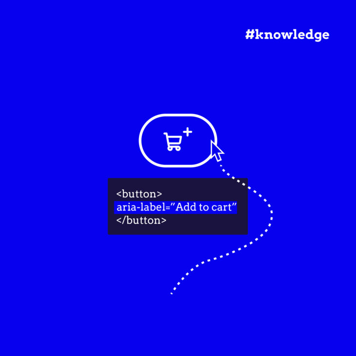
In this example, the aria-label provides the text "Add to cart" for a button that only contains a shopping cart icon. A screen reader will announce "Add to cart, button," making its function clear.
Without aria-label, a screen reader would have no text to announce, leaving the user guessing about the button's purpose.
It's crucial to know how a browser determines an element's accessible name. There's a specific hierarchy. For instance, aria-labelledby (which points to the ID of another element to use as a label) takes precedence over aria-label. The developer tools in modern browsers allow you to inspect this directly.
The following video demonstrates how to use Chrome DevTools to check the accessibility properties of an element, which is an invaluable skill for debugging.
The Only Accessibility Video You Will Ever Need
This video from Web Dev Simplified provides a great practical walkthrough of labeling and how to inspect the result.
Watch from the start of the labeling section to understand the difference between using a <label> element and aria-label. Then, watch the next part on using the accessibility tree view in DevTools. This will show you how to verify which label is being used.
Hiding Content Correctly: aria-hidden and its Pitfalls
Sometimes, you have content that is purely decorative or redundant for screen reader users, and you want to hide it from the accessibility tree. The aria-hidden="true" attribute does exactly that.
However, its behavior is widely misunderstood and can lead to major accessibility problems if used incorrectly. The article "Know your ARIA: 'Hidden' vs 'None'" explains the nuances perfectly.
Know your ARIA: 'Hidden' vs 'None' | scottohara.me
This article by Scott O'Hara is a clear and concise guide to the proper use of aria-hidden. It will help you avoid common mistakes.
Read the section What does aria-hidden do? to understand its primary function and how it differs from CSS display: none. Then, read the section on Inappropriate use to learn about the most critical pitfall.
The most important takeaway is this: aria-hidden="true" does not prevent an element from receiving focus. If you have a focusable element (like a link or button) inside a container with aria-hidden="true", a keyboard user can still tab to it. This creates a "ghost control" scenario where the screen reader is silent, but the user's focus has moved to an invisible, interactive element. This is extremely confusing and a severe accessibility failure.
Here is a summary of how to hide things:
- To hide content from everyone (visually and from assistive tech): Use CSS
display: none;or the HTMLhiddenattribute. - To hide content only from assistive tech (e.g., a decorative icon next to visible text): Use
aria-hidden="true". Make sure the content inside is not focusable. - To remove an element's semantics but not its content (e.g., removing list semantics from
<li>elements used for layout): Userole="presentation"orrole="none".
Putting It All Together: An Accessible Custom Component
Let's see how these concepts combine to make a custom interactive component accessible. In the "Developer's Guide to Accessibility Mechanics" video, Leonie Watson builds a "toggle tip"—a custom button that reveals extra information. This is a perfect example of a component you might build in a framework like React using <div>s and <span>s.
Leonie Watson - Developer's Guide to Accessibility Mechanics
This segment shows the step-by-step process of making a custom UI component fully accessible.
Watch the section on the toggle tip design pattern. Notice how each attribute is added to solve a specific problem: tabindex="0" makes the <span> focusable. role="button" tells the screen reader it's a button. aria-expanded communicates its state (collapsed/expanded). aria-describedby links the button to its content. hidden toggles the visibility of the tip content for all users. aria-live announces the new content when it appears.
This example demonstrates how a few ARIA attributes, combined with JavaScript, can transform a non-semantic, inaccessible <span> into a rich, fully functional interactive component for all users.
Conclusion
You now have a solid foundation for using ARIA to make your web applications more accessible. While the specification is large, understanding the core principles and a few key attributes will solve the vast majority of common accessibility issues you'll encounter when building custom components.
Key Takeaways:
- The Accessibility Tree: Browsers build this tree for assistive technologies. Semantic HTML populates it automatically; ARIA allows you to add information manually.
- Use Native HTML First: ARIA is a powerful tool, but it's for situations where a native HTML element isn't sufficient.
roleDefines Purpose: Use roles likebutton,alert, ornavigationto give meaning to non-semantic elements.aria-labelProvides a Name: It's essential for elements without visible text, like icon buttons.aria-hidden="true"Creates Traps: It hides elements from screen readers but not from keyboard focus. Never put focusable elements inside anaria-hiddencontainer.- States and Properties Communicate Change: Attributes like
aria-expandedandaria-disabled, managed via JavaScript, are crucial for conveying the state of dynamic components.
This lesson concludes our first module on HTML. We've journeyed from the structural differences in HTML5 to semantic layouts, SEO, and now, the critical layer of accessibility with ARIA.
In our next lesson, we will shift our focus from structure to presentation. We'll begin our deep dive into CSS, starting with one of its most fundamental and often tricky concepts: specificity and the cascade. You'll learn the precise rules browsers use to decide which style rule "wins" when multiple rules target the same element.