Welcome back. In our previous lessons, we isolated the two most critical variables in darkroom printing: determining exposure with f-stop based test strips, and selecting an appropriate contrast grade by assessing the negative. You now have the foundational skills. The objective of this lesson is to integrate them into a single, cohesive workflow. We will move beyond the trial-and-error phase to a systematic process for creating a "work print"—a well-exposed, full-range print that serves as the definitive baseline for all further creative adjustments.
This lesson bridges the gap between theory and a repeatable, efficient practice. It's about taking the guesswork out of the initial print and establishing a solid technical foundation, much like defining the parameters and establishing a baseline in an engineering experiment before optimization.
The Work Print: Your Foundation
Before we dive into the process, let's clarify our goal. A work print is a straight print, made with a single contrast filter, that successfully translates the full tonal range of your negative onto the paper. It should have distinct, detailed highlights, deep and rich shadows (but not crushed blacks), and a smooth gradation of midtones between them.
This print is not necessarily the final artistic statement. It is, however, the most important print you will make for any given negative. It proves your technical choices of exposure and contrast are correct. From this point, all subsequent creative decisions—like dodging, burning, or split-grade printing—are built upon this solid foundation.
A Systematic Workflow: Expose for the Highlights
In the last lesson, you learned that when evaluating a test strip, if the highlights and shadows require different exposure times, your contrast is incorrect. This insight is the key to a systematic approach. The classic, and most effective, method is often summarized as: Expose for the highlights, and control the shadows with contrast.
Let's break this down into a clear, step-by-step process. Sroyon Mukherjee's article "Cat-and-Mouse with Exposure and Contrast" provides an excellent exploration of this technique, moving away from what he calls the "cat-and-mouse" game of guesswork.
Cat-and-Mouse with Exposure and Contrast - by Sroyon Mukherjee
This article section lays out the core principles of a systematic printing workflow. It directly addresses the problem of determining both exposure and contrast without endless guessing.
Please read the section titled "Determining Grade 2 exposure and contrast". Pay close attention to the three steps outlined under the heading "Expose for the highlights". This is the fundamental workflow we will be following. Also, absorb the alternative framing, "SERC", as it's a powerful and memorable diagnostic rule.
To summarize the workflow:
- Make a test strip at your chosen starting contrast (usually Grade 2 for a normal negative, as we discussed).
- Evaluate the test strip for ONE thing only: the highlights. Find the exposure time where the brightest parts of your image that still contain detail (what photographers call Zone VII-VIII highlights) look correct. Ignore the midtones and shadows for now. Let's say this is 12 seconds.
- Now, look at the shadows in that 12-second strip.
- If the shadows are too light and washed out, your negative needs more contrast. The highlights "arrived" before the shadows. You need to switch to a higher contrast filter (e.g., Grade 3 or 4).
- If the shadows are too dark and blocked up, your negative needs less contrast. The shadows "arrived" before the highlights. You need to switch to a lower contrast filter (e.g., Grade 1 or 0).
- If the shadows look just right, with good detail, then you've found the perfect exposure and contrast combination. You're ready to make your work print.
The video from Acromatica School of Photography provides a perfect visual demonstration of this diagnostic process in action.
How to Chose Contrast and Exposure from the Test Strip
This video shows the iterative process of evaluating a test strip, diagnosing the contrast, and making a new strip to correct it.
Let's re-watch two key segments from the previous lesson to see this workflow in practice. First, observe the evaluation of the initial test strip from evaluating the strip. The presenter correctly identifies that the highlights look good at one time, while the shadows require more time. His diagnosis: contrast is too low. Next, watch him evaluate the second strip from the second test strip. Here, the opposite occurs. The shadows are good at a short exposure, but the highlights need more time. His diagnosis: contrast is too high. His third test strip finally finds the balance.
The Exposure Compensation Problem
This iterative process is reliable, but it presents a new challenge. As the articles and videos emphasize, when you change the contrast filter, the required exposure time almost always changes.
Simply making a new test strip with the same time increments as the first is one way to proceed, but it's not the most efficient. Given your background, you'll appreciate that we can do better by being more predictive. Let's explore three methods, from simple to advanced.
Method 1: The New Test Strip (Iterative)
This is the method shown in the Acromatica video. After deciding to change contrast from Grade 2 to Grade 4, you simply make a new test strip at Grade 4. It's straightforward and always works, but may consume more time and paper.
Method 2: The F-Stop Trick (Predictive)
This clever technique, demonstrated in the video from DistPhoto, leverages the f-stop test strip you already know how to make. The key insight is that on a calibrated system, the visual effect of adding a half-grade of contrast is similar to adding about 1/3 of a stop of exposure to the shadows.
Get AMAZING Darkroom Prints With This EASY Trick!
This video presents a highly efficient workflow for determining both exposure and contrast from a single test strip.
Watch from the beginning to the end of the explanation. The process is: Make a 1/3-stop increment test strip at Grade 2, focusing on a key highlight area (making the strip). Find the exposure where the highlights are perfect. Let's say it's 12.7 seconds. Look at the shadows in that same 12.7s strip. They look weak. Now, look across the test strip at the more exposed sections. You find that the shadows look correct in the strip that received 20.2s of exposure. This is two 1/3-stop increments more than your highlight exposure. The "trick" (the trick) is that each 1/3-stop increment corresponds to needing roughly a half-grade of contrast. Since you needed two increments, you need 2 x 0.5 = 1 full grade of more contrast. You should move from Grade 2 to Grade 3.
This is a powerful, predictive method that minimizes waste by extracting more information from a single test strip. However, it does rely on one final piece of the puzzle...
Method 3: The Calibration Test (The Engineer's Approach)
When you switch from a Grade 2 to a Grade 3 filter, how do you adjust the exposure time to keep the highlights the same? The DistPhoto video mentions applying a "factor." This factor comes from a one-time calibration test. The "Cat-and-Mouse" article provides a brilliant guide to performing this test yourself, without any specialized equipment.
This is an optional but highly recommended activity. Investing an hour to perform this test will save you countless hours and sheets of paper in the long run by creating a predictive model for your specific enlarger and paper combination.
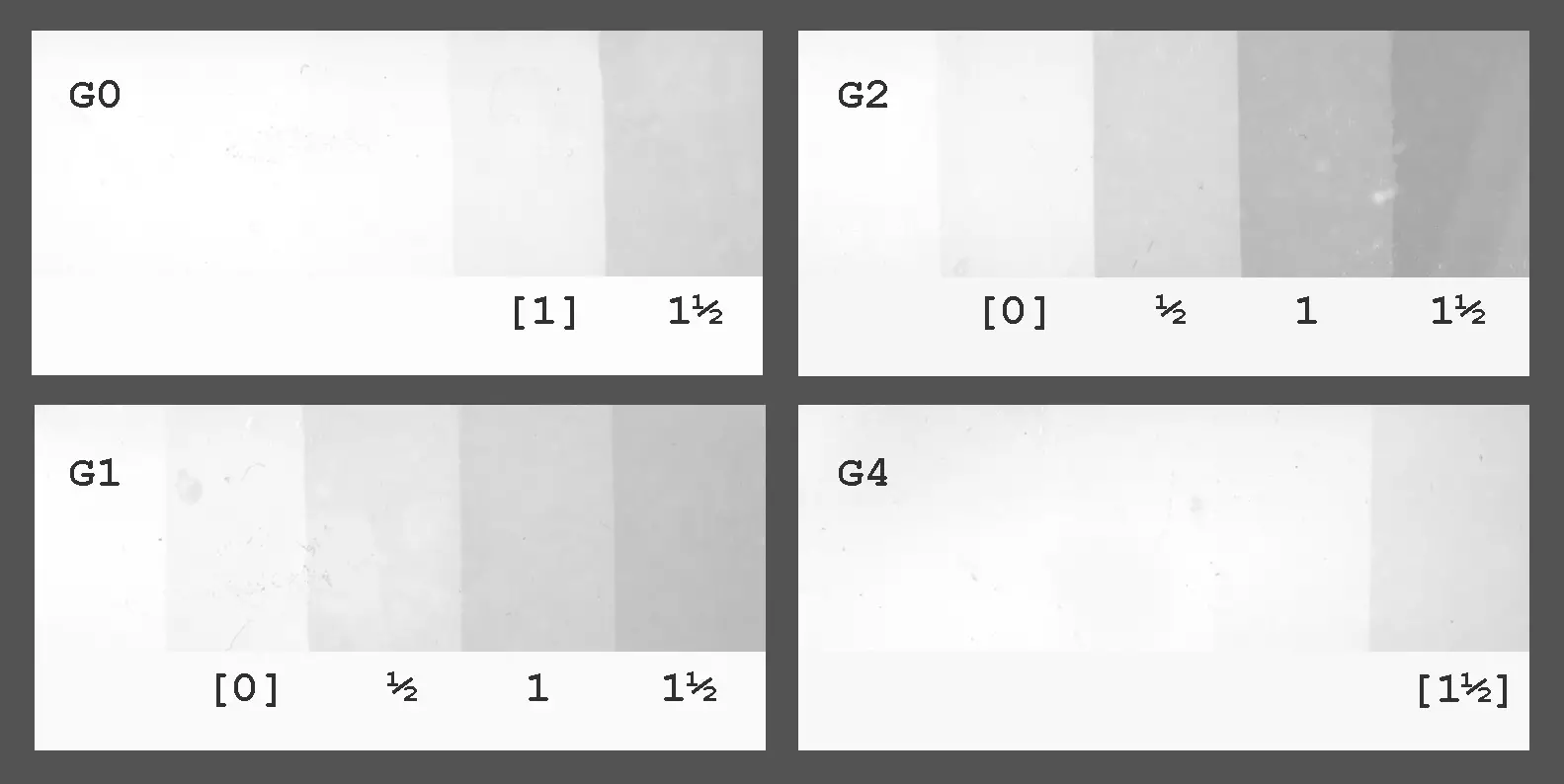
Cat-and-Mouse with Exposure and Contrast - by Sroyon Mukherjee
This section details a method to create your own exposure compensation table. This is the key to unlocking a truly efficient and predictive printing workflow.
Read the section titled "Exposure compensation test". The author walks you through testing for both whites (highlights) and blacks (shadows). The goal is to produce a "Compensation table" like the one in the article. This table will tell you exactly how much to change your exposure when moving between contrast grades to keep either the highlights or shadows constant. For example, his table shows that to keep highlights constant when moving from Grade 2 to Grade 4, he needs to add +1.5 stops of exposure. This is the "factor" the DistPhoto video mentioned.
Putting It All Together: The Final Work Print
Let's walk through one complete example from the "Cat-and-Mouse" article, which synthesizes all these concepts.
Cat-and-Mouse with Exposure and Contrast - by Sroyon Mukherjee
This is a masterclass in applying the systematic workflow to a real-world print.
Study the section "Print 1: Millennium Bridge". Follow the author's logic: He makes a Grade 2 test strip and identifies the highlight exposure (5 secs at f/11). He observes that at this exposure, the shadows are too light. His diagnosis: increase contrast. He moves to Grade 4. Using his pre-calibrated compensation table, he knows the new highlight exposure will be 5 secs + 1.5 stops, which is ~14 secs at f/11 (or 7 secs at f/8). He makes a new test strip at Grade 4 centered around this predicted time. He finds that at 7 secs at f/8, both highlights and shadows look correct. He exposes the final work print. With two small test strips, he has nailed the exposure and contrast for a complex negative. This is the efficiency we are aiming for.
Once you have determined the correct time and contrast grade, you are ready. Place a full sheet of paper in the easel and make your exposure. Process it with the same care you would a final print. The result is your work print—the solid, reliable foundation for your art.
Conclusion
You have now integrated the core skills of darkroom printing into a powerful, systematic workflow. By moving beyond guesswork, you can produce a technically excellent work print with efficiency and confidence.
Key Takeaways:
- A work print is a full-tonal-range print made with a single filter, serving as the baseline for creative adjustments.
- The core workflow is "Expose for the highlights, control the shadows with contrast."
- Evaluate your first test strip for the correct highlight exposure, then check the shadows at that exposure to diagnose your contrast needs.
- When changing contrast, you must compensate the exposure. You can do this iteratively (new test strips), predictively (the f-stop trick), or with maximum precision by creating a personal compensation table.
- This systematic approach saves time, paper, and frustration, allowing you to move more quickly to the creative aspects of printing.
Next Lesson Preview:
Making a work print is a crucial skill. But what if you could determine your base exposure for any negative even faster, often without a test strip at all? Your calibrated work print is the key. In our next module, we will learn how to use a good work print to calibrate your Ilford EM10 printing lightmeter, transforming it into a powerful tool for rapid exposure calculation.
