Hello! Welcome back to our second module, where we are exploring the core principles of design.
In the last lesson, we discussed balance, and you learned how symmetrical compositions create stability while asymmetrical ones create dynamism. We briefly touched on how contrast is essential for making asymmetrical balance work. Today, we're going to put contrast in the spotlight.
This lesson is dedicated to one of the most powerful principles in a designer's toolkit. By the end, you will be able to apply the principle of contrast to create visual hierarchy and emphasis. Mastering this skill is fundamental to your goal of becoming a professional designer, as it's the key to directing a viewer's attention and communicating a message clearly and effectively. Without it, designs can feel flat, confusing, or uninteresting.
What is Contrast?
At its core, contrast is simply the difference between two or more visual elements. When something is different from its surroundings, it stands out and grabs our attention. A design with no contrast is monotonous and hard to navigate, while a design that uses contrast effectively is engaging and easy to understand.
There are many ways to create contrast in a design.
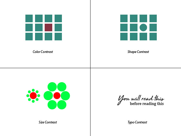
To get a better sense of this principle, let's start with a short video that defines contrast and its purpose.
‘Contrast’ Design principle of Graphic Design Ep9/45 [Beginners guide to Graphic Design]
This video by Gareth David Studio introduces the principle of contrast. Pay attention to how contrast is used to generate impact, create visual interest, and give meaning to elements within a composition.
Please watch from 01:43 to 04:52. This section covers the definition of contrast and shows clear examples using shapes, color, and scale.
As the video demonstrates, contrast is what makes a design "pop." It creates interesting relationships between elements and helps our eyes make sense of what we're seeing.
The Purpose of Contrast: Hierarchy and Emphasis
So, why is creating difference so important? The primary goal of using contrast is to create emphasis and establish a visual hierarchy.
- Emphasis is the technique of making a particular element or area the focal point of a design. It's what you want the viewer to see first.
- Visual Hierarchy is the arrangement of all elements in a design in order of their importance. It tells the viewer what to read first, second, third, and so on.
In short, you use contrast to create emphasis, and the strategic use of emphasis across your design creates a clear visual hierarchy. This guides the viewer's eye through the content in the exact order you intend.
Let's explore the different ways you can use contrast to achieve this.
Design Principles: Drawing Emphasis Using Contrast
The article 'Design Principles: Drawing Emphasis Using Contrast' from Almax Agency provides an excellent breakdown of this topic. It details several types of contrast you can use to create emphasis.
Read the sections titled 'Understanding How Contrast Can Draw Emphasis' and 'Ways to Draw Emphasis: Types of Contrast'. Focus on the different methods discussed: color, typography, size/scale, texture, and isolation.
As you just read, you have several tools at your disposal:
- Size/Scale: Making an element larger makes it seem more important. This is the most common way to create a headline.
- Color/Tone: A bright color against a muted background, or a dark element on a light background, will immediately draw the eye.
- Typography (Weight/Style): BOLD or italic text stands out from regular text. Using a different typeface for a heading also creates contrast.
- Isolation (Space): Surrounding an element with negative space (or whitespace) separates it from everything else, making it a focal point.
Now, let's watch how these methods are combined to build a clear hierarchy.
‘Hierarchy’ Design principle of Graphic Design Ep10/45 [Beginners guide to Graphic Design]
This next video, also from Gareth David Studio, is about hierarchy itself. It directly explains how hierarchy is created using contrast and shows powerful examples of how changing one element (like color or size) can completely shift the focus of a design.
Watch from 01:39 to 05:41. Notice how the video demonstrates shifting hierarchy by changing the contrast in scale, color, overlap (space), and focus.
From Messy to Organized: Hierarchy in Action
Let's look at a practical before-and-after example. On the left is a block of information without any hierarchy. On the right, contrast has been applied to organize the same information.

In the "Organized" version, notice how:
- "Vegan Tacos" is the focal point. It has the most visual weight due to its large size and bold font (contrast of scale).
- The price and the "Add to cart" button stand out because of their unique color and placement (contrast of color and isolation).
- The description and ingredients are in a smaller, lighter font. They are subordinated, meaning they are clearly less important than the title and call to action.
This is a perfect illustration of your learning goal for today. The designer has applied contrast to create emphasis, resulting in a clear visual hierarchy that is both functional and appealing.
Test your understanding!
Imagine you are designing a simple poster for a film festival. The poster needs to include the following information:
- Name of the festival: "Indie Film Fest 2024"
- Date: "October 18-20"
- Location: "The Grand Cinema"
- Website for tickets: "indiefilmfest.com"
- Tagline: "Stories that matter."
What is the most important piece of information? What is the least important? Describe how you would use at least three different types of contrast (e.g., size, weight, color, isolation) to create a visual hierarchy for this poster.
Show answer
There can be multiple correct answers, but a common hierarchy would be:
- Most Important (Focal Point): The festival name, "Indie Film Fest 2024". I would use contrast of scale by making this the largest text on the poster. I might also use a unique, bold typeface for contrast of typography.
- Secondary Information: The date ("October 18-20") and location ("The Grand Cinema"). These are crucial details. I would make them smaller than the title but larger than the other text. I might place them together to show they are related.
- Call to Action: The website, "indiefilmfest.com". To make this stand out, I could use contrast of color (e.g., putting it in a colored box or making the text a different color) or contrast of isolation by surrounding it with more empty space.
- Least Important: The tagline, "Stories that matter." This adds flavor but isn't critical information. I would use the smallest font size for this, perhaps in an elegant, lighter-weight font to set a mood without demanding attention.
By doing this, a person looking at the poster immediately knows what it's for, then where and when it is, and finally how to get tickets. The hierarchy guides them through the information logically.
Putting It All Together in Figma
The resource library from Figma itself has great, concise advice on applying these principles. As you work on your own projects, keep these tips in mind.
13 core graphic design principles + how to apply them
Let's review Figma's official take on these principles. This article will reinforce what you've learned and connect it directly to the tool you are using.
Read the short sections for Principle 2: Contrast, Principle 4: Hierarchy, and Principle 11: Emphasis. Pay attention to the simple, practical 'How to apply' tips for each.
The key takeaway is to be intentional. Before you start designing, ask yourself: "What is the single most important thing I want my viewer to see?" Make that your focal point using strong contrast. Then, ask "What's the next most important thing?" and use less contrast for that, and so on.
Conclusion
Excellent work today! You've tackled a principle that is absolutely essential for effective communication in graphic design. By guiding the viewer's eye, you control how your message is received.
Here are the key takeaways from this lesson:
- Contrast is the use of noticeable differences between elements to create visual interest and guide attention.
- The main purpose of contrast is to create emphasis on a focal point and establish a clear visual hierarchy.
- You can create contrast using size, color, shape, typography (weight, style), and isolation (space).
- A strong hierarchy makes your design easy to scan and your message easy to understand.
In this lesson and the previous one, we've focused on how to arrange individual elements to create balance and hierarchy. But what about making elements feel like they belong together? In our next lesson, we will explore the principles of alignment and proximity, which are all about how to group and organize elements to create a clean, structured, and professional-looking composition.