Hello! Let's get started with today's lesson.
In our last session, you did the fantastic work of bringing one of your "Aura Coffee" logo sketches to life as a clean vector logomark in Figma. You've already practiced the essential technical skills of a designer using shape tools and the pen tool.
Today, we'll add another crucial layer to the brand's identity: typography. A brand's voice is heavily influenced by the fonts it uses. Our goal is to select and pair typefaces for a brand identity system. By the end of this lesson, you will have chosen a headline and a body font that work together to express the "Aura Coffee" brand personality, and you'll combine your logomark with a professionally typeset brand name to create a complete logo.
Step 1: Define Your Typographic Direction
Before you start scrolling through hundreds of fonts, you need a strategy. The right font choice isn't just about what looks "nice"; it's about what effectively communicates the brand's message.
Think back to the (fictional) "Aura Coffee" brief: a brand that is modern, elegant, calm, and high-quality. These keywords are your guide. They define the mood or "visual inflection" your typography needs to convey.
You also need to consider the use case. For a brand identity, you'll typically need at least two types of fonts:
- Headline Font: For the logotype, titles, and other attention-grabbing text. It can be more expressive.
- Body Font: For paragraphs, descriptions (like on a menu or website), and longer text. It must be highly readable.
How to choose fonts: Step by step
The video 'How to choose fonts: Step by step' from Flux Academy provides an excellent framework for this process. This first segment explains how to use a brief to guide your font selection.
Watch from 00:34 to 03:22. Pay attention to how Ran Segall breaks down a brief into keywords and considers the mood, emotion, and use case (e.g., headline vs. body copy) before even looking at fonts.
Step 2: Learn the Art of Pairing
Once you have a direction, the next step is finding fonts that work together harmoniously. The key to successful font pairing is to create contrast, not conflict. This means the fonts should be different enough to create a clear visual hierarchy, but complementary enough that they don't clash.
There are several proven strategies for pairing fonts.
Strategy 1: Use a Superfamily
The safest and often most elegant method is to use different weights or styles from the same typeface family. For example, you could use a bold or black weight for headlines and the regular weight for body text. This guarantees harmony because the fonts were designed to work together.
Strategy 2: Contrast Serif and Sans-Serif
This is a timeless and versatile combination. Pairing a classic, elegant serif for headlines with a clean, modern sans-serif for body text (or vice versa) almost always works well. The structural differences provide clear contrast.
Strategy 3: Pair a Display Font with a Neutral One
If you want to use a highly decorative or expressive font (a "display" font), pair it with a very simple, neutral workhorse font for body text. This allows the headline to be the star without sacrificing the readability of your main content. A good rule of thumb is to use only one expressive typeface per design.
How to choose fonts: Step by step
Let's return to the Flux Academy video to see these principles in action. This section is packed with practical tips and visual examples.
Watch from 31:25 to 39:50. This is a crucial part of the lesson. Notice the examples of pairing within the same family (Arkevo), pairing distinct typefaces (serif + sans-serif), and the warning against pairing fonts that are 'too close for comfort'.
For a more detailed look at these principles, the following article provides excellent visual explanations.
How to Pair Fonts: A Practical Guide | IxDF
The article 'How to Pair Fonts: A Practical Guide' from the Interaction Design Foundation reinforces these concepts with clear Do's and Don'ts.
Read the sections 'Before You Begin: Context and Content,' 'Best Methods of Type Pairing,' and 'Additional Options for Type Pairing.' Focus on the principles of limiting your choices, using contrast, and utilizing scale. The visual examples are very helpful.
Test your understanding!
Why is it generally a bad idea to pair two very similar sans-serif fonts, like Poppins and Century Gothic?
Show answer
When fonts are too similar but not identical, they create visual dissonance or a "clash." The viewer's eye may sense that something is slightly "off" without knowing why. Good pairing relies on clear, intentional contrast to create hierarchy and visual harmony.
Step 3: Find and Evaluate Your Fonts
Now you're ready to start searching. As you want to use free software for your freelance work, Google Fonts is the best place to start. It's a massive library of high-quality, open-source fonts that are free for commercial use.
When evaluating a font, consider these factors:
- Appropriateness: Does it fit the mood of "Aura Coffee" (elegant, calm, modern)?
- Readability: Can you read it easily at small sizes? This is non-negotiable for body copy.
- Functionality: Does the font family include the weights you need (e.g., Regular, Bold)? Having multiple weights gives you more versatility.
- Licensing: All fonts on Google Fonts use licenses that allow for commercial use, so you are safe to use them in projects for clients.
Typography Guide - How to Choose Fonts
This clip from the Kayla video gives a quick, useful checklist for evaluating fonts.
Watch from 01:51 to 06:07. She covers five key criteria: readability, appropriateness, language availability, kerning quality, and price/licensing. This reinforces what to look for as you browse.
Step 4: Your Turn - Select and Pair Fonts for "Aura Coffee"
It's time to apply what you've learned. Your task is to choose a headline font and a body font for the "Aura Coffee" brand and test them in Figma.
Your Task (Approx. 20 minutes):
-
Explore Google Fonts:
- Go to fonts.google.com.
- Use the filter options. You could search for categories like "Serif" or "Sans-serif" and filter by characteristics like "thickness" or "width".
- Type "Aura Coffee" into the preview text box to see how different fonts look.
-
Select Your Pair: Choose one font for your headlines and one for your body text based on our principles. Here are some classic pairing ideas that could fit the "Aura Coffee" brief to get you started:
- Serif Headline + Sans-Serif Body: Playfair Display + Lato
- Sans-Serif Headline + Serif Body: Raleway + Merriweather
- Sans-Serif Superfamily: Using different weights of a versatile font like Inter or Montserrat.
The article "39 impressive font pairings" (LINK) from Figma is a great source of inspiration if you're feeling stuck. Pairings like Playfair Display + Lato or Raleway + Merriweather are good examples of the elegant style we're aiming for.
-
Test in Figma:
- Open your "Aura Coffee" logo file in Figma.
- Create a new page or frame called "Typography."
- Create a text box and type the brand name, "Aura Coffee." Apply your chosen headline font. Try it in a bold or semi-bold weight. This will become your logotype.
- Create another text box with a sentence like: "Experience the perfect cup, crafted with care and precision." Apply your chosen body font in a regular weight.
- Place your logomark from the previous lesson next to your new logotype. Adjust the size and spacing until they feel balanced.
- Look at your headline and body text together. Do they create a clear hierarchy? Do they feel like they belong to the same brand?
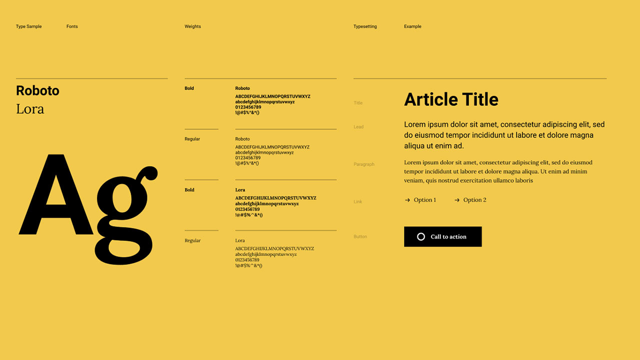
Here is an example of how you might lay out your test. Notice the clear hierarchy between the bold headline and the regular body text.
Conclusion
Excellent work! You've tackled one of the most important and nuanced aspects of brand design. Choosing typography is about giving a brand its voice, and you now have a solid process for making informed, strategic decisions.
Key Takeaways:
- Start with Strategy: Analyze the brand's keywords and intended mood before choosing fonts.
- Pair for Contrast: The best font pairings rely on clear contrast in style (Serif vs. Sans-Serif), weight (Bold vs. Regular), or scale. Avoid pairing fonts that are too similar.
- Prioritize Readability: Your body font must be legible and comfortable to read in long-form text.
- Test and Refine: Always test your font pairings in a real layout to see how they interact.
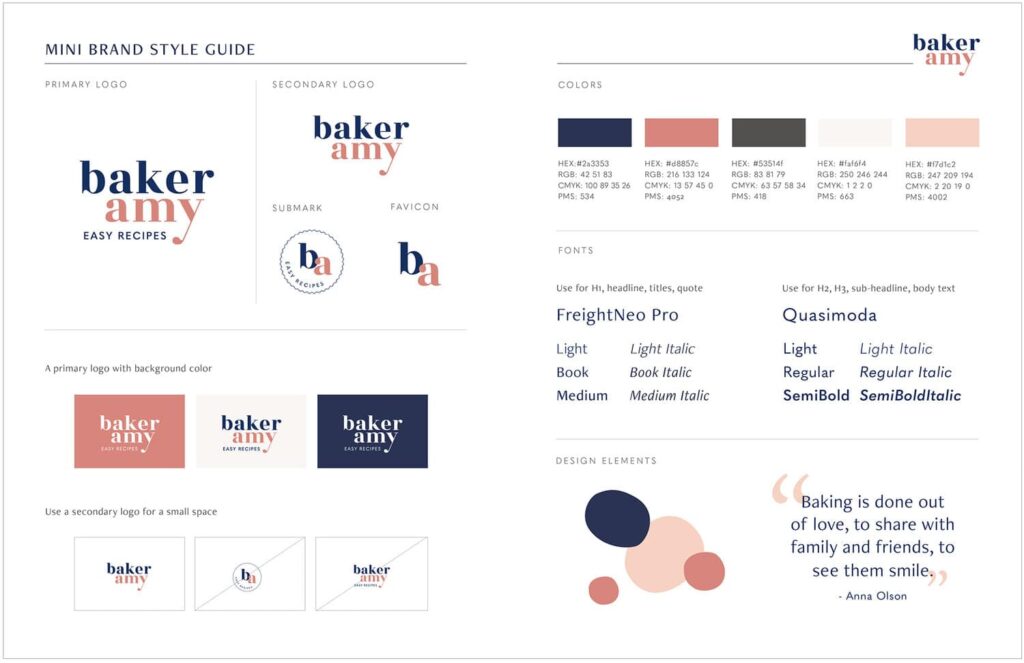
In our next lesson, we will formalize all the creative decisions you've made. You'll learn how to create a basic brand style guide, documenting your logo, color palette, and the typographic system you established today. This will be the capstone of our brand identity module, resulting in a professional document you can use to guide all future designs for "Aura Coffee."