Hello! Welcome back to the next step in building your brand identity skills.
In our last lesson, you created an excellent one-page brand style guide for "Aura Coffee". You documented the logo, color palette, and typography, and even created reusable Color and Text Styles in Figma. This was a huge step toward ensuring brand consistency.
Today, we're going to take the concept of reusability to a much more powerful level. The learning outcome for this lesson is to create reusable components in Figma for brand assets like logos and buttons. While Styles let you reuse properties like color, Components let you reuse entire elements and update them all at once. Mastering components is a non-negotiable skill for any professional designer because it saves enormous amounts of time and makes your designs scalable and easy to maintain.
We will continue working on your "Aura Coffee" brand, turning your logo and a new button into intelligent, reusable assets.
1. What are Components?
At its core, a component system in Figma is built on two parts:
- Main Component: This is the "master" or "template" element. It has a special purple, four-diamond icon in the Layers panel. Any changes you make to the Main Component will automatically apply to all its copies.
- Instance: This is a linked copy of the Main Component. It has a single, hollow purple diamond icon. You can have hundreds of instances of one component throughout your design file.
Think of it like a function in programming: you define the function once (the Main Component), and you can call it many times throughout your code (the Instances). If you update the function's logic, all the places where it's called will reflect that change.
This video from Flux Academy provides a great introduction to this concept.
Figma components and variants for beginners
Watch this first section from 'Figma components and variants for beginners' to get a clear definition of what components are and why they are so useful.
Watch from 00:27 to 01:44 to understand the basic idea of a component as a reusable template.
2. Creating Your First Component: The Logo
Let's start with a simple and practical application: your "Aura Coffee" logo.
- Navigate to the page in your Figma file where you have your final logo design (the logomark and logotype grouped together).
- Select the group that contains all the elements of your primary logo.
- In the toolbar at the top of the screen, click the Create Component icon (the four diamonds). Alternatively, you can use the shortcut
Ctrl + Alt + K(Windows) orCmd + Option + K(macOS).
You'll see the outline of your logo group turn purple. In the Layers panel, its icon will change to the four-diamond Main Component icon. Congratulations, you've made your first component!
Now, let's see it in action:
- Go to the Assets panel in the top-left (it's next to the Layers panel). You should see your new logo component listed under "Local components".
- Drag an instance of your logo from the Assets panel onto your canvas.
- Now, go back and select the Main Component. Make a small change, for example, slightly change the color of the logotype.
- Look at your instance—it updated automatically!
This is the power of components. If this logo were used on 50 different designs (a website, a business card, a menu), you would only need to edit it in one place to update it everywhere.
3. Creating a Button Component with Variants
Buttons are the perfect subject for learning about the full power of components because they often have multiple states and styles. We'll now create a button for "Aura Coffee" and turn it into a versatile component with different variants.
Variants are different versions of a component that live within a single component set. For example, a button can have variants for its state (default, hover, pressed) or its style (primary, secondary).
Step 3.1: Build the Basic Button
First, let's design the button itself. This will be good practice for using Auto Layout.
This official Figma guide, 'Design your first button', walks you through the foundational steps of creating a button using Text, Auto Layout, and styling. We will follow these steps to build our button before turning it into a component.
Follow the steps in the sections 'Add a text layer', 'Convert the text layer into an auto layout frame', and 'Style the button'. Use the color and text styles you created in the last lesson for 'Aura Coffee' to style your button. For example, use your Accent color for the fill and your Body text style for the label.
After following those steps, you should have a single, well-styled button. Now, select your button frame and click the Create Component icon to turn it into a Main Component, just like you did with the logo.
Step 3.2: Create Variants and Properties
A single button component is useful, but what if you need a version for when a user hovers over it? Or a secondary style with just an outline? This is where variants and properties come in.
- Variants: Different visual states (e.g., Default vs. Hover).
- Component Properties: Dynamic controls for an instance, like changing its text (
Textproperty) or toggling an icon's visibility (Booleanproperty).
This next video is a detailed walkthrough of how to build out a button component with these features. We'll apply these concepts to your "Aura Coffee" button.
Figma components and variants for beginners
The 'Figma components and variants for beginners' video is an excellent, hands-on guide. We will use it to add variants and properties to the button component you just created.
Watch from 01:44 to 11:47. The video will first explain the concepts of variants and properties, and then walk you through creating a button component from scratch. Since you've already built the basic button, you can apply these steps to your existing 'Aura Coffee' button. Focus on: Adding Variants for state (e.g., 'default' and 'hover'). Creating a Text Property to let you change the button label on any instance. Creating a Boolean Property to show or hide an element, like an icon.
Your Task:
Apply the techniques from the video to your "Aura Coffee" button component:
- Select your main button component. On the right-hand Design panel, you'll see a section for Properties. Click the
+icon and select Variant. - Figma will create a copy of your button inside a purple dashed line. This is now a component set.
- Create State Variants:
- Rename the default property from "Property 1" to "State".
- The first variant's State should be "Default".
- Select the second variant. In the Design panel, change its State to "Hovered".
- Change the appearance of the "Hovered" variant slightly (e.g., make the fill color a bit darker) to give visual feedback.
- Create a Text Property:
- In your Main Component, select the text layer inside both variants.
- In the Content section of the Design panel (on the right), click the "Create text property" icon.
- Name it "Label" and keep the default value. Click "Create property".
- Now, drag an instance of your button onto the canvas. You'll see a dropdown to switch between "Default" and "Hovered" states, and a text field to change the "Label"!
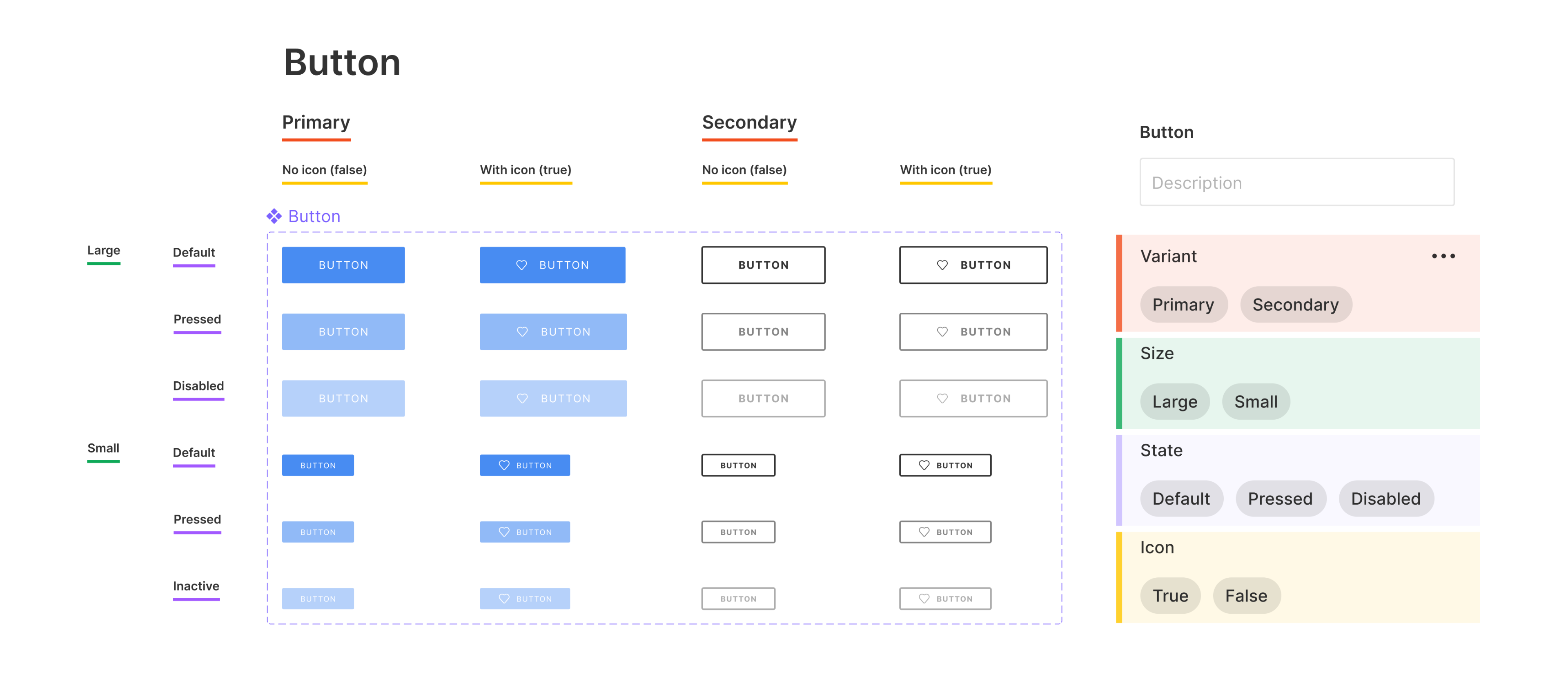
This is the workflow for creating a powerful, flexible design system. A well-built button component set can look quite extensive, but it's all built from these same principles.
Test your understanding!
You want to add a secondary button style for "Aura Coffee" that has a transparent background and a colored border. Should you create a new Component Property or a new Variant?
Show answer
You should create a new Variant. A secondary style is a distinct visual variation of the button, which is exactly what variants are for. You could add a new variant property called "Style" with values like "Primary" and "Secondary".
Conclusion
Fantastic work today! You've moved beyond static design elements and have started building a dynamic, intelligent design system. This is a huge leap in workflow efficiency and is a core skill that employers and clients look for.
Key Takeaways:
- Components consist of a Main Component (the master) and Instances (the copies).
- Changes to the Main Component propagate to all instances, ensuring consistency.
- Variants are used to create different versions of a component based on its state or style (e.g., hover, primary/secondary).
- Component Properties (like Text and Boolean properties) allow you to customize instances without detaching them from the main component.
In our next lesson, you'll immediately put these new skills to use. The learning outcome is to design a business card applying the established brand identity. You'll be able to drag instances of your new logo and button components right into your design, saving time and ensuring everything is perfectly on-brand.