Hello! Welcome to your next lesson on your journey to becoming a graphic designer.
In our last session, you designed a 3-slide social media carousel, mastering how to tell a short visual story across multiple frames. We focused on grabbing attention and guiding the user through a sequence. Today, we will apply those same principles of attention and guidance to a single-page format. Your goal for this lesson is to design a digital flyer with a clear hierarchy and call-to-action.
Flyers are classic marketing tools, and designing effective digital versions for email, social media, or websites is a common task for freelance designers. This lesson will sharpen your layout and typography skills, teaching you how to organize information so a viewer can understand it at a glance and know exactly what to do next.
1. The Anatomy of an Effective Flyer
Before opening Figma, the most important step is planning. A flyer that tries to say everything will end up saying nothing. You need to define its purpose and gather the essential content.
First, let's get a clear, step-by-step overview of the entire flyer design process, from planning to exporting.
How to design a flyer: A step-by-step guide for beginners
This article from the Figma resource library, 'How to design a flyer,' provides an excellent framework. It will guide you through the key stages of creating a successful flyer.
Please read Step 1: Define your goal and audience and Step 2: Gather your essentials. Pay close attention to the list of key information that should always be included.
As the article mentioned, every flyer needs a core set of information. What that information is depends on the flyer's goal. Let's look at some specific examples.
Flyer Design Guide: How to Make a Flyer Your Audience Will Love
This video from Visme, titled 'Flyer Design Guide,' breaks down the specific content you need for different types of flyers, such as for an event or a sale.
Watch the segment from 03:43 to 05:17. Notice how the required information changes slightly depending on whether you're promoting an event, a sale, or just general brand awareness.
To summarize, before you design, you should have this content ready:
- A powerful headline: The main hook that grabs attention.
- Key details: The who, what, where, when, and why.
- Supporting visuals: Images or graphics that reinforce the message.
- Contact information: A website, social media handle, or phone number.
- A Call to Action (CTA): The specific action you want the viewer to take.
With the content decided, the next question is: how do you arrange it so it makes sense? This is where visual hierarchy comes in.
2. Mastering Visual Hierarchy
Visual hierarchy is the principle of arranging elements to show their order of importance. It’s how you guide the viewer's eye through the design, ensuring they see the most critical information first. In the previous lesson's AIDA model, hierarchy is what you use to get Attention and build Interest.
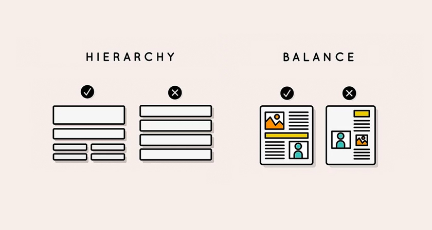
To truly master this, let's dive deep into the specific techniques you can use to create a strong hierarchy.
The ONLY Video On Visual Hierarchy ANY Graphic Designer Needs
The video 'The ONLY Video On Visual Hierarchy ANY Graphic Designer Needs' from Satori Graphics is a fantastic resource. It covers the core theories and practical methods for controlling where a viewer looks.
Please watch the following segments. Focus on how these techniques work together: 00:30 - 01:34: Understand the 'Attract, Intrigue, Deliver' process. This is the journey you want to take your viewer on. 01:34 - 04:10: Pay attention to the primary tools for creating hierarchy: size, color, and typography (font weight, style). 09:04 - 10:34: Learn about the F-pattern and Z-pattern. These describe how people naturally scan a page and are fundamental to laying out your content. 10:34 - 11:58: Grasp the three-level sizing structure: the hook (largest), secondary detail, and finisher (smallest, often the CTA).
By combining these techniques—using a large, bold headline (size), placing it at the top-left (Z-pattern), and using a contrasting color—you create a powerful entry point for your viewer.
Test your understanding!
Imagine you are designing a flyer for a local concert. You have the band's name, the date/time, the venue, the ticket price, and a "Buy Tickets Now" button. Using the three-level sizing rule (hook, secondary detail, finisher), how would you assign these elements to each level?
Show answer
There can be more than one right answer, but a very effective structure would be:
- Hook (Largest): The band's name. This is the main attraction and what will grab a fan's attention.
- Secondary Detail (Medium): The date, time, and venue. This is the essential information the viewer needs after their interest is captured.
- Finisher (Smallest): The ticket price and the "Buy Tickets Now" button. This is the final action-oriented information the viewer reads once they are committed.
3. The All-Important Call-to-Action (CTA)
You've attracted the viewer and given them information. Now what? The Call-to-Action (CTA) answers this question. It is arguably the most important part of a marketing flyer because it converts a viewer's interest into a measurable result—a sale, a booking, a follow, or a visit. A flyer without a clear CTA is a missed opportunity.
Let's revisit the Visme video to focus specifically on the CTA.
Flyer Design Guide: How to Make a Flyer Your Audience Will Love
This short clip from the 'Flyer Design Guide' explains why a CTA is essential and what it accomplishes.
Watch from 13:02 to 13:54. Note the key idea: you must not only give people a reason to invest but also guide them towards that action.
A CTA needs to be obvious. You can use several design techniques to make it stand out:
- Placement: Often placed at the bottom, following the F or Z pattern, where the eye's journey concludes.
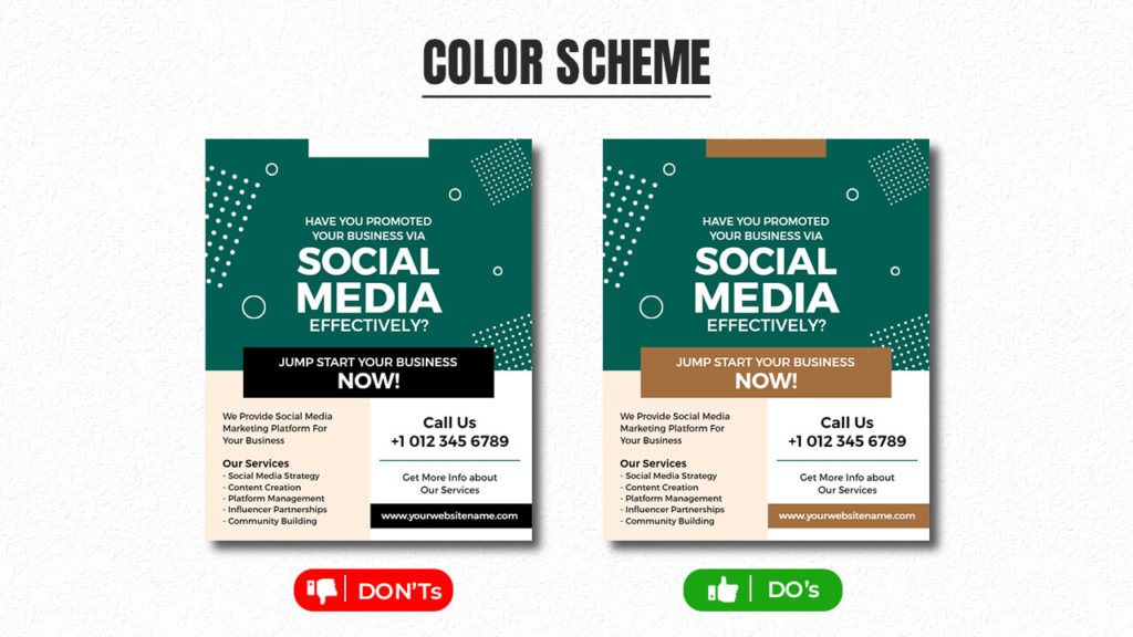
- Contrast: Use a button with a contrasting color that pops from the background.
- Whitespace: Give it breathing room so it doesn't get lost in other text.
- Clear Language: Use strong, action-oriented words (e.g., "Book Now," "Learn More," "Get 50% Off").
4. Your Turn: Design a Digital Flyer in Figma
Now it's time to put all this theory into practice. You will create a digital flyer for a fictional coworking space. This project has a specific constraint—black and white only—which is a great exercise for forcing you to rely on hierarchy, typography, and spacing instead of color.
This entire exercise is based on a fantastic project from Baseline.
Create a Flyer Design in Figma
This guide, 'Create a Flyer Design in Figma,' provides the full brief and technical setup for your project. We will follow its instructions closely.
First, read the Explanation section to understand the design brief for the 'Rework' coworking space. Take note of the target audience and the required text. Then, follow the instructions under 'Set up your Figma file' and 'Set up your grid'. For the frame, select Paper -> A5. For the grid, you can use the six-column grid they suggest or create your own.
With your Figma file set up, let's design the flyer.
Step-by-Step Guide:
-
Plan Your Hierarchy:
- Look at the text provided in the brief.
- Decide on your hook, secondary details, and finisher (the CTA). What is the most important message? (Hint: It's probably the brand name "Rework" and the new location). What are the supporting details? (The paragraph about benefits). What is the action? (Book a free trial).
-
Lay Out Your Content:
- Start placing the text elements onto your A5 frame.
- Use the Text tool and experiment with different font sizes, weights (Bold, Regular, Light), and styles (ALL CAPS, sentence case).
- Remember the F and Z patterns. Place your most important element where the eye will naturally start.
- Use the grid you created to align your text and create a structured, professional layout.
-
Refine and Iterate:
- Pay attention to proximity: group related items together. The contact details (phone, email) should be near the "Book a day's free trial" CTA.
- Use whitespace generously. Don't crowd your elements. Space helps define groups and makes the design easier to read.
- Step back and look at your design from a distance. Does the main message stand out immediately? If not, increase the size/weight of your hook. Is the CTA clear?
-
Export for Digital Use:
- Once you are happy with your design, select the A5 Frame.
- In the Export panel on the right sidebar, choose PNG or JPG. These formats are ideal for digital flyers.
- Click the "Export" button.
For reference, the Baseline article includes an example of a finished flyer. After you've spent some time on your own version, feel free to look at their solution in the article's "Example solution" section to see how they approached it.
Conclusion
Fantastic work today! You have successfully designed a digital flyer by focusing on two of the most critical principles in graphic design: clear visual hierarchy and a compelling call-to-action. You've learned that effective design is not just about making things look good, but about guiding your audience and inspiring them to act.
Key Takeaways:
- An effective flyer starts with a clear goal and audience.
- Visual hierarchy, created using size, weight, and placement, is essential for guiding the viewer's eye to the most important information first.
- Reading patterns like the F-pattern and Z-pattern provide a natural framework for your layout.
- Every marketing flyer needs a clear Call-to-Action (CTA) that tells the viewer exactly what to do next.
In the next lesson, you'll build on this foundation as you design a two-sided event invitation. This will introduce the challenge of maintaining a cohesive design across two separate but related surfaces. Keep up the great work