In our last lesson, we explored how to use color to set the mood and create a visually appealing foundation for your designs. Now that we have our canvas and our color palette, it's time to add the most important part: your message. This lesson focuses on making sure that message is not just seen, but understood clearly and quickly.
Today, we will tackle typographic hierarchy. This is the art of arranging text to guide the viewer's eye through your content in a specific order of importance. By the end of this session, you will know how to use the three key levers of typographic hierarchy—font size, weight, and style—to create text that is both readable and engaging, a crucial skill for capturing attention on busy social media feeds.
Part 1: What Is Typographic Hierarchy?
Imagine you're telling a story. You'd emphasize certain words, pause for effect, and lower your voice for an aside. Typographic hierarchy does the same job visually. It's a system for organizing text that tells the reader what to look at first, what's second most important, and what the supporting details are.
Without hierarchy, all text competes for attention, leading to a confusing and uninviting block of words that users will likely scroll past. With good hierarchy, you create a clear path for the reader's eye.

For social media graphics, a simple and effective way to think about this is the three-level approach:
- Level One (Headline): This is your main message, the hook. It should be the most prominent text on the design, instantly grabbing the viewer's attention.
- Level Two (Subheading): This text supports the headline. It can provide context, break the design into sections, or highlight key features. It should be clearly secondary to the headline.
- Level Three (Body Text): This is for the details—the full message, contact information, or a description. The main priority here is readability, as the font size will be smaller.
To solidify this concept, let's read a short section from Canva's guide on visual hierarchy.
The ultimate guide to visual hierarchy
This article from Canva explains the core principles of visual organization. We'll focus on the part that defines the three levels of typographic hierarchy.
Please read the section titled Typographic Hierarchy: Start With 3 Levels to Organize Your Design. As you read, focus on the definitions and purposes of the three levels of typography. This framework will be our guide for the rest of the lesson.
Part 2: The Tools of Typographic Hierarchy
Now that you understand the three-level structure, let's look at the specific tools you'll use to build it. While there are many ways to create emphasis, we will focus on the three most powerful and easy-to-use variables: size, weight, and style.
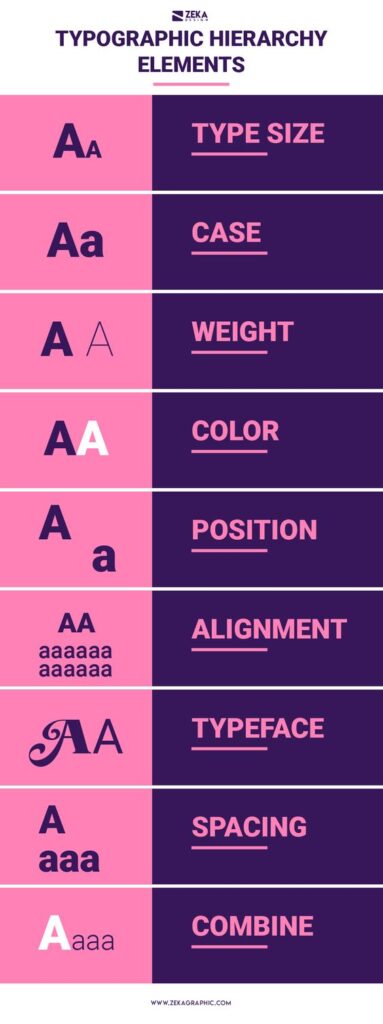
- Size: As we saw in the "Right vs. Wrong" example, size is the most effective tool for creating hierarchy. Larger text is perceived as more important. Your Level One text should be significantly larger than your Level Two, which in turn should be larger than your Level Three.
- Weight: This refers to the thickness of the font's characters (e.g., Light, Regular, Bold, Black). Using a bold weight for a headline and a regular or light weight for body text creates strong contrast without having to change the font family. This is a great way to create a clean, cohesive look.
- Style and Case: Using italics, underlining, or changing the case (e.g., ALL CAPS) can create emphasis for specific words or phrases. However, use these sparingly. Italics are best for quotes or short asides, and all caps can be effective for short headlines but can be difficult to read in long sentences.
To see how these tools work together in a practical guide, please read through the following article. It offers some excellent tips that will be immediately useful.
How to create a typographic hierarchy
This guide from Pangram Pangram foundry provides concise, actionable advice for creating effective text layouts.
Please read the following sections: Start with this section to understand the importance of prioritizing your content first. Then, read the section on using size. Note the general size relationships it suggests. Next, read about using weight and style for emphasis. Finally, read the section titled Test your system. Pay close attention to the "squint test," a simple and powerful technique to check if your hierarchy is working.
Part 3: Building Hierarchy in Canva
Theory is essential, but practical application is our goal. Let's move into Canva and see how to use these tools to format text for a social media graphic. The following video from Canva provides a fantastic, step-by-step walkthrough of working with text. We'll watch it in segments to focus on specific skills.
2. Working with Text in Canva | Skills
This "Skills" video from Canva is a practical tutorial on how to manipulate text directly within the editor. It perfectly aligns with our goal of getting hands-on.
First, watch the beginning of the video to learn the absolute basics of adding and formatting text. Pay attention to how to access the font, size, and color options in the toolbar. Adding and styling text Next, see how hierarchy begins to take shape by creating a distinct subheading. Notice the use of both size and the "bold" style to separate it from the main heading. Creating a subheading Now, watch the section on formatting body text. This part is crucial for ensuring readability. Focus on the tools for adjusting alignment and spacing (both between letters and lines). Formatting body text Finally, here's a fantastic feature for beginners. Canva offers pre-designed font pairings that already have a strong hierarchy built-in. This is an excellent way to start creating professional-looking graphics quickly. Using font combinations
By following the techniques in this video, you can create a clear three-level hierarchy. For example:
- Level One: Add a "Heading" and choose a bold, impactful font. Make it the largest text element.
- Level Two: Add a "Subheading." Use the same font family but in a smaller size and perhaps a regular weight.
- Level Three: Add "Body text." Make it the smallest and use a light or regular weight to ensure it's easy to read but doesn't compete with the other levels.
Remember the squint test you read about: once you have your text arranged, step back from your screen and squint your eyes until the text blurs. Can you still tell which part is the most important? If so, your hierarchy is working.
Conclusion
You've now added another fundamental design skill to your toolkit. By consciously applying typographic hierarchy, you transform text from a simple block of information into a dynamic and persuasive message that guides your audience's attention.
Here are the key takeaways from today's lesson:
- Hierarchy Guides the Eye: The primary goal of typographic hierarchy is to create a visual path for the reader, emphasizing what is most important.
- Start with Three Levels: Use the headline, subheading, and body text structure as a simple and effective framework for your designs.
- Master the Core Tools: Size, weight, and style are your most powerful instruments for establishing clear hierarchy.
- Use the Squint Test: This simple trick is a highly effective way to quickly evaluate whether your hierarchy is successful.
- Leverage Canva's Shortcuts: Don't be afraid to use Canva's pre-made font combinations. They are an excellent way to apply good hierarchy while you're still learning.
In our next lesson, we will move into Module 2 and take a broader tour of the Canva interface. You'll learn how to navigate the platform confidently and locate key tools, including templates, design elements, and the text options we've discussed today. This will prepare you to start creating your own graphics from start to finish.