In our last lesson, you created a reusable header and footer, establishing a consistent structure across your multi-tool platform. This was a crucial first step in applying the "Don't Repeat Yourself" principle to your app's design. Now, we'll build on that foundation by focusing on the visual details—the colors, fonts, and spacing that define your app's aesthetic.
Today, you will learn to master Bubble's Style system. Your background in graphic and web design will serve you well here, as the concepts will be familiar, but Bubble's implementation is powerful and unique. By the end of this lesson, you will be able to apply this system to maintain a consistent and professional look for your entire platform, ensuring every button, title, and piece of text adheres to a cohesive design language.
Why Use a Style System?
Before we dive into Bubble, let's consider the "why." You could manually set the color, font, and size for every single element you add to a page. But what happens when you decide your primary brand color needs a slight tweak? You would have to find and edit every single element that uses that color. This is not only tedious but also highly prone to inconsistencies.
A style system centralizes all your design decisions. You define your color palette and typography rules once, and then apply them throughout your app. A change in one central place automatically updates every element linked to it. This is the essence of creating a scalable and maintainable design system.
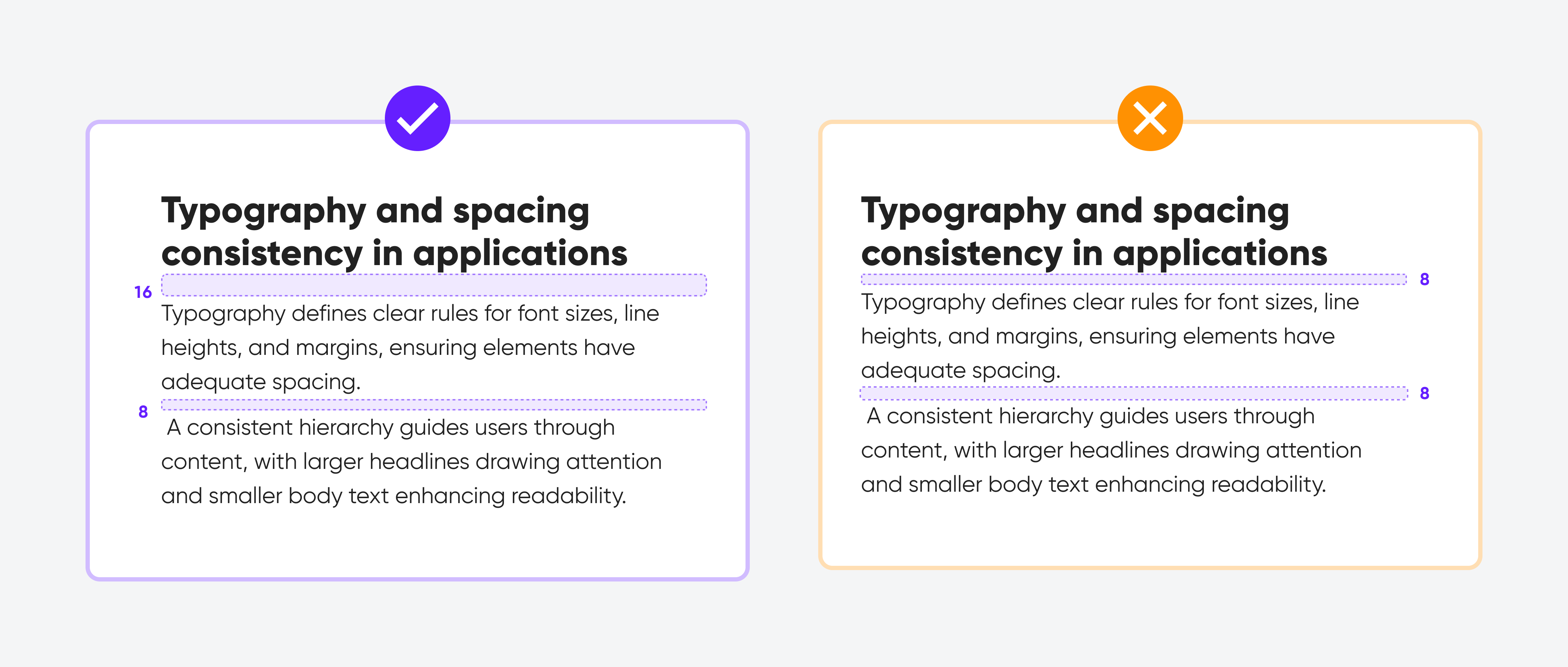
The Hierarchy of Styles in Bubble
Bubble's design system has a clear hierarchy. Understanding it is key to using it effectively:
- Style Variables (The Foundation): These are your raw ingredients. You define your core color palette (e.g.,
primary-blue,neutral-grey) and fonts (e.g.,app-font) here. They are global and can be used anywhere. - Styles (The Recipes): These are templates for specific element types. For example, you might create a "Button - Primary Action" style that uses your
primary-bluecolor variable for its background and yourapp-fontfor its text. - Element-Level Overrides (The Garnish): This is when you take an element that has a Style applied and make a one-off change to a single property (e.g., making one specific button's text bold).
The most efficient workflow is to make changes at the highest level possible. If you want to change your brand color, you edit the Style Variable, not hundreds of individual elements.
Let's begin by getting a formal overview from Bubble's documentation.
This document provides the official explanation of Bubble's Style system. It covers the core concepts and the "why" behind using them.
Start by reading the introduction to understand what styles are and their benefits. Then, jump to the section on defining styles. Finally, read the brief section on using style variables to see how they form the foundation of this system.
Part 1: Defining Your Color Palette with Variables
Your first practical step is to establish the color palette for your multi-tool platform. A well-structured palette goes beyond just picking colors; it involves naming them semantically so their purpose is clear (e.g., Primary, Success, Warning, Danger).
The following video from Buildcamp offers a professional, streamlined approach to creating a color system that is both simple and powerful. It's a fantastic real-world guide that moves beyond the basics.
Build a color system in Bubble | Tutorial
This tutorial presents a practical, minimalist color system and shows how to implement it in Bubble. Pay close attention to the logic behind the color choices.
First, watch the section explaining the core color system (Neutral, Primary, Secondary, Success, Warning, Danger). This is a standard and effective way to organize your palette. Next, see how this system is set up in Bubble's Style Variables. This will show you exactly where to go in the editor. Finally, and most importantly, understand the logic for choosing specific shades for different interaction states. The concept of using a 700 shade for default, 800 for hover, and 900 for press is an invaluable pro-tip.
Your Task (10 minutes):
- Go to the Styles tab in your Bubble editor.
- Under Style variables, select Colors.
- Decide on a primary color for your brand. You can use a tool like colors.ui.com (mentioned in the video) or Material Design's color tool to find a primary color and generate its shades.
- Define your primary colors. Following the video's advice, find a base color and its shades. Map them to Bubble's existing variables:
- Set
Primaryto a500or700shade. - Set the
Primary-10throughPrimary-80variables to the corresponding shades from your generator.
- Set
- Define your neutral colors. These are your grays for text, borders, and backgrounds. Replace the
Dark-contrastvariables with your own neutral shades (e.g.,Neutral-100,Neutral-300,Neutral-600,Neutral-800). - (Optional) Define your
Success,Warning, andAlertcolors for future use in notifications.
Part 2: Defining Your Typography
Next up is your font. Consistent typography is crucial for readability and creating a clear visual hierarchy.
The official Bubble channel has a great video that walks through setting up fonts and integrating them with styles.
Styles, colors, and fonts for mobile (Lesson 1.3)
This video covers the full scope of styles, but we will focus on the typography section.
Watch the segment from "style variables" to understand how to set a global app font. The video gives excellent advice on choosing a sans-serif font from Google Fonts and understanding font weights, which you'll use to create headings and body text styles.
Your Task (5 minutes):
- In the Styles tab, under Style variables, select Fonts.
- Choose a main font for your application from the dropdown. Almost any font from Google Fonts is available. A clean sans-serif font like Inter, Poppins, or DM Sans is a safe and professional choice.
- Set this font as the
Default app font.
Part 3: Creating and Applying Element Styles
With your color and font variables defined, you can now create the "recipes"—the Styles for your elements. We'll start by creating styles for a primary button and your main page headings.
- Navigate to the Styles Tab: In the main list, you'll see all the default styles Bubble provides. You can either modify these or create new ones. Let's create a new one for clarity.
- Create a New Style: Click "Add a new style".
- Give it a descriptive name, like
Button - Primary. - Set the "Style's element type" to
Button.
- Give it a descriptive name, like
- Configure the Style: A property editor will appear. Now, use your variables!
- Font: It should already inherit your
Default app font. - Background style: Set this to
Flat color. For the color, don't pick a fixed hex code. Instead, click the color box and select yourPrimarycolor variable from the swatch. - Borders: Remove any default borders by setting them to
None. - Shadow: Add a subtle shadow if you like.
- Font: It should already inherit your
- Configure Conditional States: This is where you bring your interaction colors to life.
- Click the Conditional tab.
- Click
+ Define another condition. - Set the condition to
When This button is hovered. - Select the
Background colorproperty to change, and choose yourPrimary-800(or equivalent darker shade) color variable. - Add another condition for
When This button is pressedand set the background color to yourPrimary-900(darkest) variable.
The process for text is similar. Create a new style named Text - Page Heading, set the element type to Text, and define its font size, color (using a dark neutral variable), and font weight (e.g., 700/Bold).
Now, let's see how you apply these.

Your Task (15 minutes):
- Create the
Button - Primarystyle as described above, complete with hover and pressed states. - Create a
Text - Page Headingstyle (e.g., Font size 36, Bold, dark neutral color). - Create a
Text - Bodystyle (e.g., Font size 16, Regular, slightly lighter neutral color). - Go to your
indexpage,categorypage, and theheaderreusable element. - Select your main buttons and headings. In their property editor, apply the new styles you just created from the Style dropdown.
- Preview your page. Hover over your button to see the conditional styling in action. Notice how all elements using the style look identical. If you edit the style, they will all update instantly.
Conclusion
Excellent work. You've now established a robust and scalable design system for your platform. This goes far beyond just making things look good; it's a professional workflow that will save you immense time and ensure a high-quality user experience as your application grows.
Here are the key takeaways:
- Style Variables for colors and fonts are your global source of truth for design tokens.
- Element Styles are reusable templates that consume those variables and define the look of specific components like buttons and text.
- Conditional Styling within a Style allows you to define interaction states (like hover and press) in one central place.
- This system of Variables -> Styles -> Elements allows for maximum consistency and efficiency.
You now have a consistent structure (reusable elements) and a consistent aesthetic (styles). In our next lesson, we will tackle the final piece of the core UI puzzle: responsiveness. You will learn how to use Bubble's responsive editor to ensure your beautifully designed layouts adapt perfectly to mobile, tablet, and desktop screens.